Contents
- The short version
- Our case: CheckMyRate, the rate before the form
- What digital account opening is
- Three paths to an account
- Climate First Bank, live: the rate at every step
- 12 bank websites that stay in the memory
- Kiwibank: character over a template
- GXBank: a bank as a comic book
- Wio: an editorial layout
- NexBank: a brand for institutions
- ubank: the rate as the hero
- Kuda: us and other banks, in one table
- Vancity: goals in place of products
- Ryt Bank: "I want to"
- Atom: three proofs under the headline
- Alpian: private banking as technology
- Zempler: the whole path in view
- Climate First Bank: the number that walks with you
- Our measurement: what ChatGPT and a phone see
- ChatGPT is already choosing the account
- Trust marks that are becoming mandatory
- What a bank can take from Ukraine
- Bank website checklist, stage by stage
- Frequently asked questions
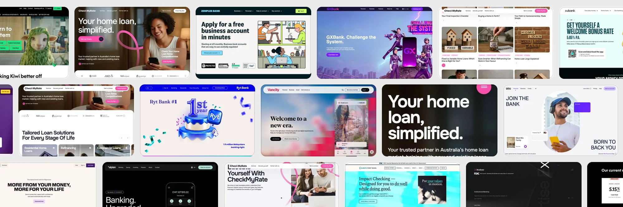
A yellow rubber glove holding a phone in a kitchen sponge at ubank, a 3D sheep in a bank branch at Kiwibank, superheroes over a city at GXBank. Twelve bank websites, the path from the first screen to an opened account, and our own measurement of how ChatGPT and a phone see each of them.
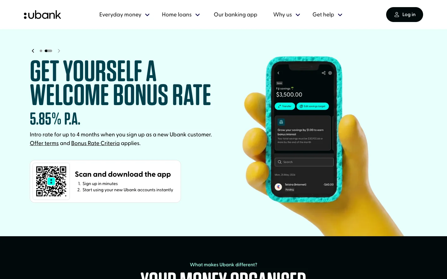
On ubank's first screen a yellow rubber glove holds a phone wrapped in a turquoise kitchen sponge. Beside it, in big letters: 5.85% a year, a welcome rate for up to four months. Under the rate sit a QR code and two steps: "Sign up in minutes", "Start using your new Ubank accounts instantly". The Australian bank's site asks for one thing: point your camera.
That kind of directness is rare. In the US in 2025, for every account opened online all the way through, 3.36 applications were abandoned. Roughly one person in four who started reached the end. The same year J.D. Power described bank websites and apps as "consistent but unmemorable": the gap between the best and the worst was the smallest it had ever measured.
This article is for marketing and digital teams at banks, credit unions and licensed digital banks. We took apart 12 banks from five continents that stay in the memory from the first screen, walked one of them to the application button, and measured all 12: page weight, speed and what ChatGPT sees of them. Fintechs and neobanks each have their own page, fintech website examples and neobank design; this one belongs to banks.
The short version
- The path to an account has a name and metrics. Digital account opening, or DAO: find, compare, start the application, pass the check, fund, make the bank the main one. Most people drop out at the identity check: 43% of all abandoned applications.
- The rate sells before the brand. 80% of customers say the rate matters when they choose a bank. Only 47% know their own savings rate. ubank, Kiwibank and Climate First put the number up front.
- Seven banks out of twelve open accounts only in the app. Their site has one job: get the person to install it. ubank puts a QR code right on the first screen.
- A quarter of the banks are closed to assistants. Three sites out of twelve answer a plain request from outside a browser with an error or a dropped connection. FAQ markup appears on zero of the twelve, while nearly every one has a block of questions.
- The trust mark is becoming a required spot on the page. In the US, by 1 April 2027, the FDIC sign has to sit on the home page, the login page and the first screen of account opening, next to the bank's name.
Our case: CheckMyRate, the rate before the form
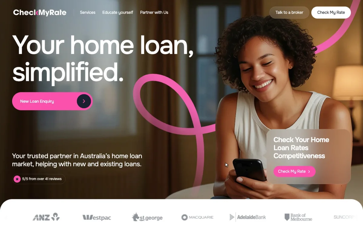
CheckMyRate, from Melbourne, helps homeowners check whether their mortgage rate is still competitive and find a better one. Its founder, Brandon Ngadino, came with a simple brief: a modern, clear website for a mortgage broker that helps people judge their loan and brings in new clients across Australia.
In Australia a mortgage sells on trust and a number. Someone already paying off a loan arrives with one question: am I overpaying? So the first screen holds one promise, "Your home loan, simplified", and one action, the rate check. The questionnaire waits further on, once the visitor has seen which lenders the broker works with, the loan types for every stage of life and what the founder has to say.
The principle we took from it: explain first, sell second. The company's mission is a transparent mortgage market, and the site carries it out to the letter. The educational blog sorts its articles by category: fixed or variable rate, refinancing, a first home. Every article ends with related reading and a way to talk to a broker, so reading turns into a conversation. On a phone the eight loan types sit in a carousel of photo cards: one fills the screen, the next peeks from the edge, so it is clear there is more to swipe.
The project took two months and five stages: research, prototypes, concepts and design, Webflow development, testing and support after launch. Seven sections and two templates, one for articles and one for seminars.
Figmatica team quickly understood our vision and delivered a website that feels clear, trustworthy, and on-brand. It looks really great and helps us reach and convert more users across Australia.
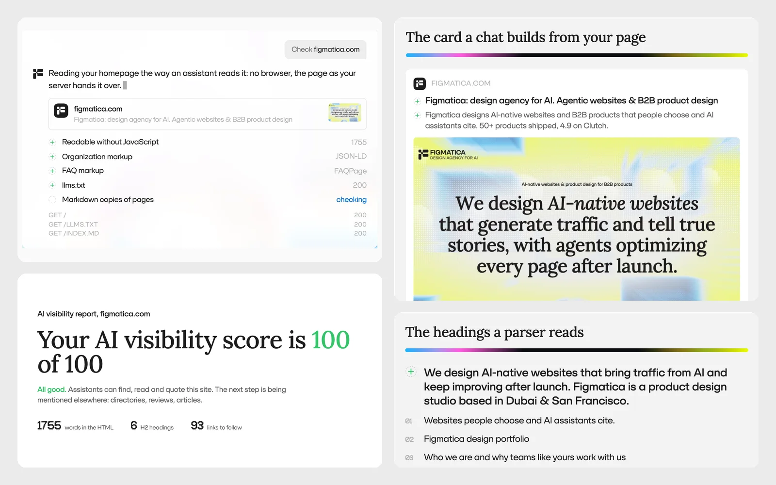
Free check
How does ChatGPT see your bank's website?
Enter your site's address and see what an assistant reads from your home page: the text, the markup, llms.txt and whether OpenAI's crawler gets in. Then ask for the full report by email.
The same six checks we ran on the 12 banks. The result appears in about ten seconds.
What digital account opening is
Digital account opening, DAO for short, means a person opens an account by themselves, quickly and safely, from a phone or a laptop. FICO lists the minimum steps: capture the person's details, assess risk and fraud, verify identity, fund the account in real time and bring the customer into the bank's core system.
On a website that becomes six stages. At each one the customer asks a question of their own, and the team measures a number of its own.
| Stage | The customer's question | What to measure | Where it lives on the site |
|---|---|---|---|
| 1. Find | Is this bank in Google's or ChatGPT's answer? | Impressions, clicks, share of traffic from AI | Product pages in text, FAQ, markup |
| 2. Compare | How much will I earn, and how much will I pay? | Click-through from the product page to the application | The rate on the first screen, a fee table, a calculator |
| 3. Start | How long will it take, and what will I need? | Share of visitors who start an application | A button, "in 5 minutes", a QR code, a document list |
| 4. Check | Is it safe, and will I be approved? | Abandonment rate, decline rate | Steps with progress, the deposit insurance sign |
| 5. Funding | How do I put the first money in? | Share of funded accounts | Funding methods, the minimum amount |
| 6. Main bank | Should my salary come here? | Direct deposits, active transactions | A bonus for moving your salary, account switching |
The numbers by stage come from a Cornerstone Advisors study of 184 banks and credit unions. The average abandonment rate for deposit accounts was 55%. 43% of all abandoned applications fell at identity verification. Another 22.7% fell at funding, and where accounts were funded through trial micro-deposits, more than 30%. A call or an email from staff to those who dropped out brought zero lift. On average, 29.75% of applications were declined.
Every abandoned application is expensive. By Curinos's figures, winning one new customer cost US banks $663, 125% more than before the pandemic. At regional banks it cost $868.
So a bank's website is, above all, preparation for stage 4. A person who knows in advance that they will need a passport, an address and five minutes reaches the end more often.
Three paths to an account
The twelve banks in this article lead people to an account by three paths, and the path decides what the site does.
- An application on the site. Zempler, Climate First, Vancity and Kiwibank open the account right in the browser. The site leads from the first screen to the form, and every step in between either moves people toward the application or loses them.
- The app only. Kuda, GXBank, Wio, ubank, Atom, Alpian and Ryt Bank open accounts only in the app. The site has one job: get the person to install it. ubank puts a QR code on the first screen, GXBank's Download now button scrolls straight to one, and Atom calls its yellow card with the code "Scan to apply now".
- A conversation. NexBank works with institutions and businesses: its Learn More buttons lead to contacts, and the account opens after a conversation. Alpian pairs the app with a Talk to an expert button, because a private client wants to speak to a person.
The second dimension is the product. Savings sell on the rate: in Accenture's global study, 80% of customers called the rate important when choosing a bank. Most would move their savings only for a gain of 2.5 percentage points. A checking account runs on habit: by a Bankrate survey, Americans keep one for 19 years on average. A mortgage sells on trust, a business account on speed.
Climate First Bank, live: the rate at every step
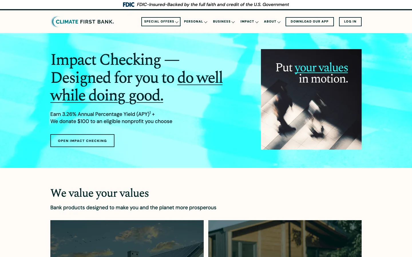
Climate First Bank is a US community bank that lends to climate projects. The site opens with a turquoise band and a serif headline: "Impact Checking — Designed for you to do well while doing good". Above it runs a thin strip with the FDIC sign.
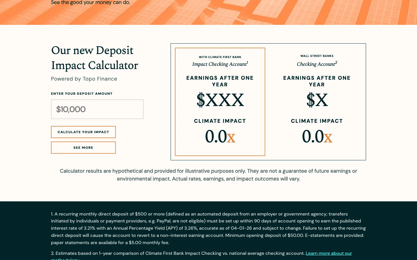
Under the headline, two promises share one line: 3.26% a year, and $100 the bank donates to a nonprofit you choose. There is one button: Open Impact Checking. Below it sits a deposit impact calculator: type $10,000 and see how many climate projects your money funds. The conditions stand next to the number: $500 in direct deposits a month to earn the rate. The minimum first deposit is $50.
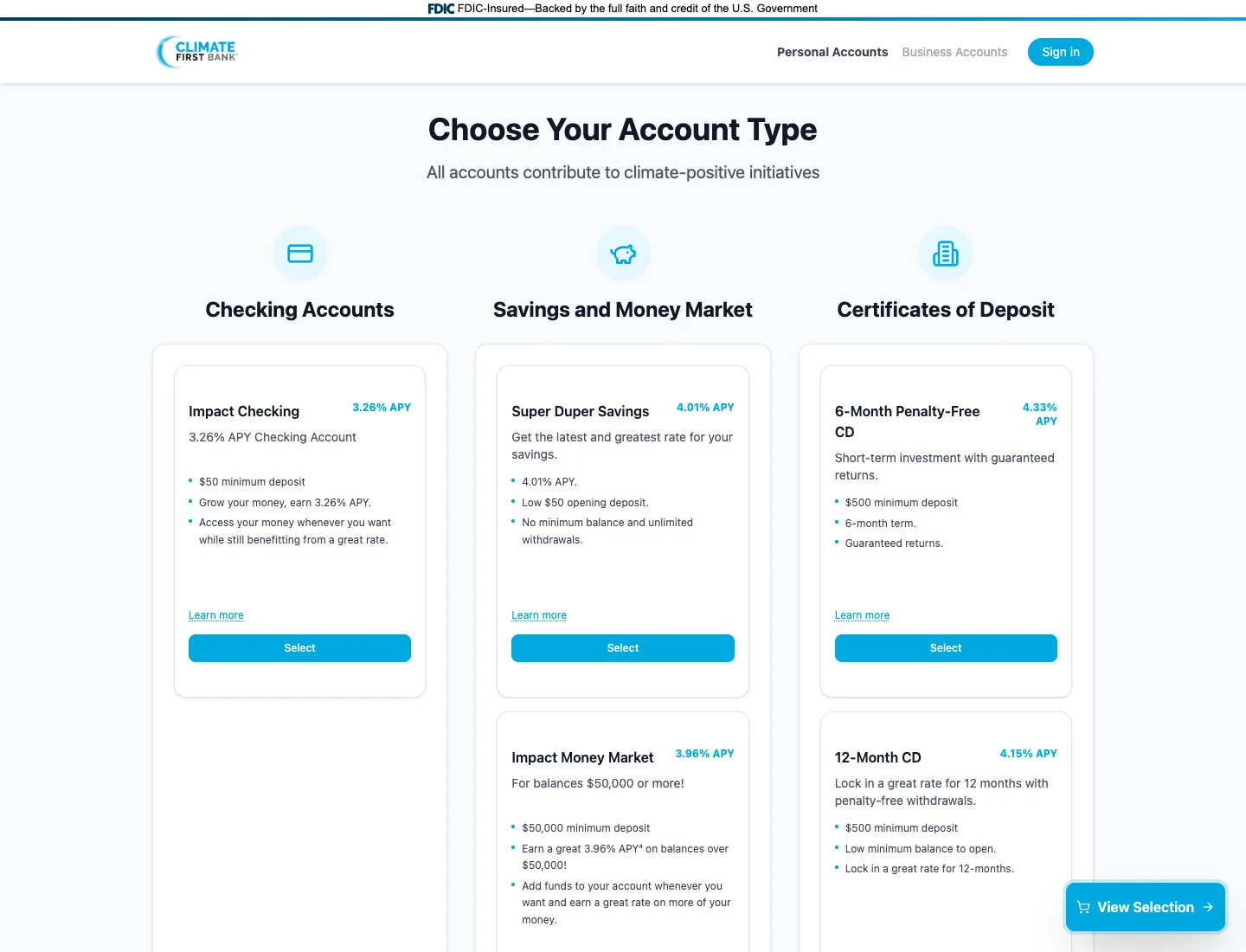
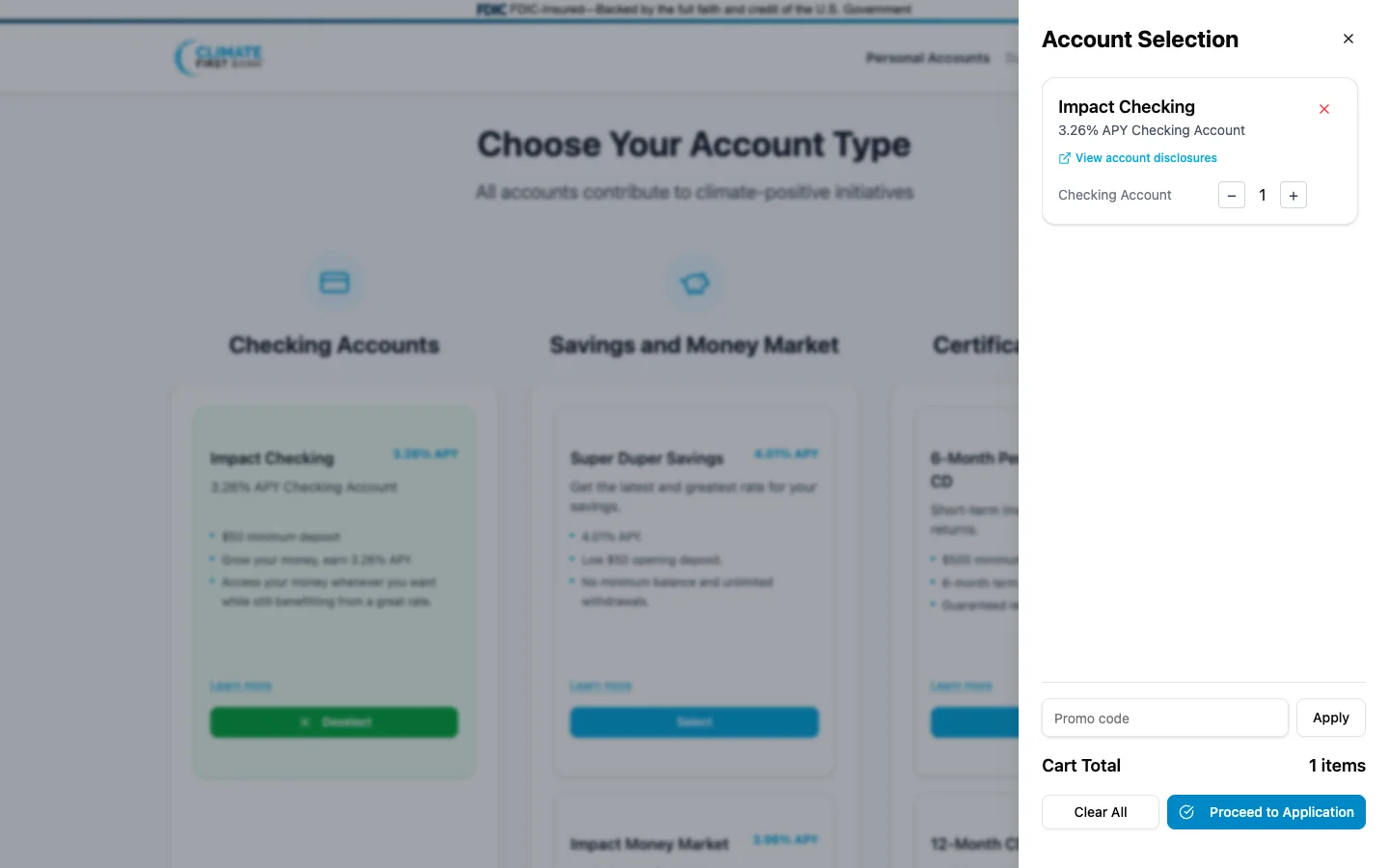
The button leads to a Choose Your Account Type page. Three columns: checking, savings and money market, certificates of deposit. Each card carries its own rate: Impact Checking 3.26%, Super Duper Savings 4.01%, a six-month penalty-free certificate 4.33%, Impact Money Market 3.96%. You pick an account, press Continue with 1 Account, then Proceed to Application. A promo code field sits alongside. Here we stopped: the form comes next.
The lesson is simple. From the first screen to the form, the rate stays in view: the number walks beside the person at every step. Stages 2 and 3 merge into one.
12 bank websites that stay in the memory
Each bank below has one move worth borrowing, and its last line names it.
Kiwibank: character over a template
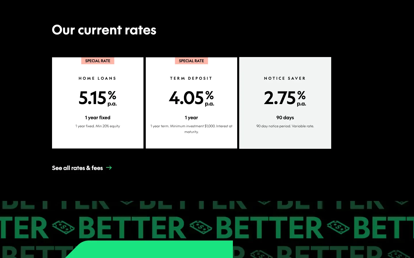
New Zealand's Kiwibank opens with a video of Buck, a 3D sheep with bright green fleece, sitting in a bank branch. Above him: "Banking wants the status quo", and the headline "We were born to buck the system". A black background, neon-green buttons and eight entry tiles, among them savings, home loans, help, branches and scam safety. Further down come the rates: a home loan fixed for one year at 5.15%, a term deposit at 4.05%, a notice saver at 2.75%. The Join page starts with one question, "I'd like an account for…", and a list.
Take away: the brand's voice and the rates on one page.
GXBank: a bank as a comic book
Malaysia's digital bank GXBank turned its site into a superhero campaign. Three people in purple suits against a city skyline, lightning, a glowing phone and graffiti: "Challenge the system. If you hate it, change it". Under the emotion sit exact facts: more than a million customers, an account and a credit decision in minutes, deposits insured up to RM 250,000 per depositor.
Take away: a campaign can live on the site when the numbers stand beside it.
Wio: an editorial layout
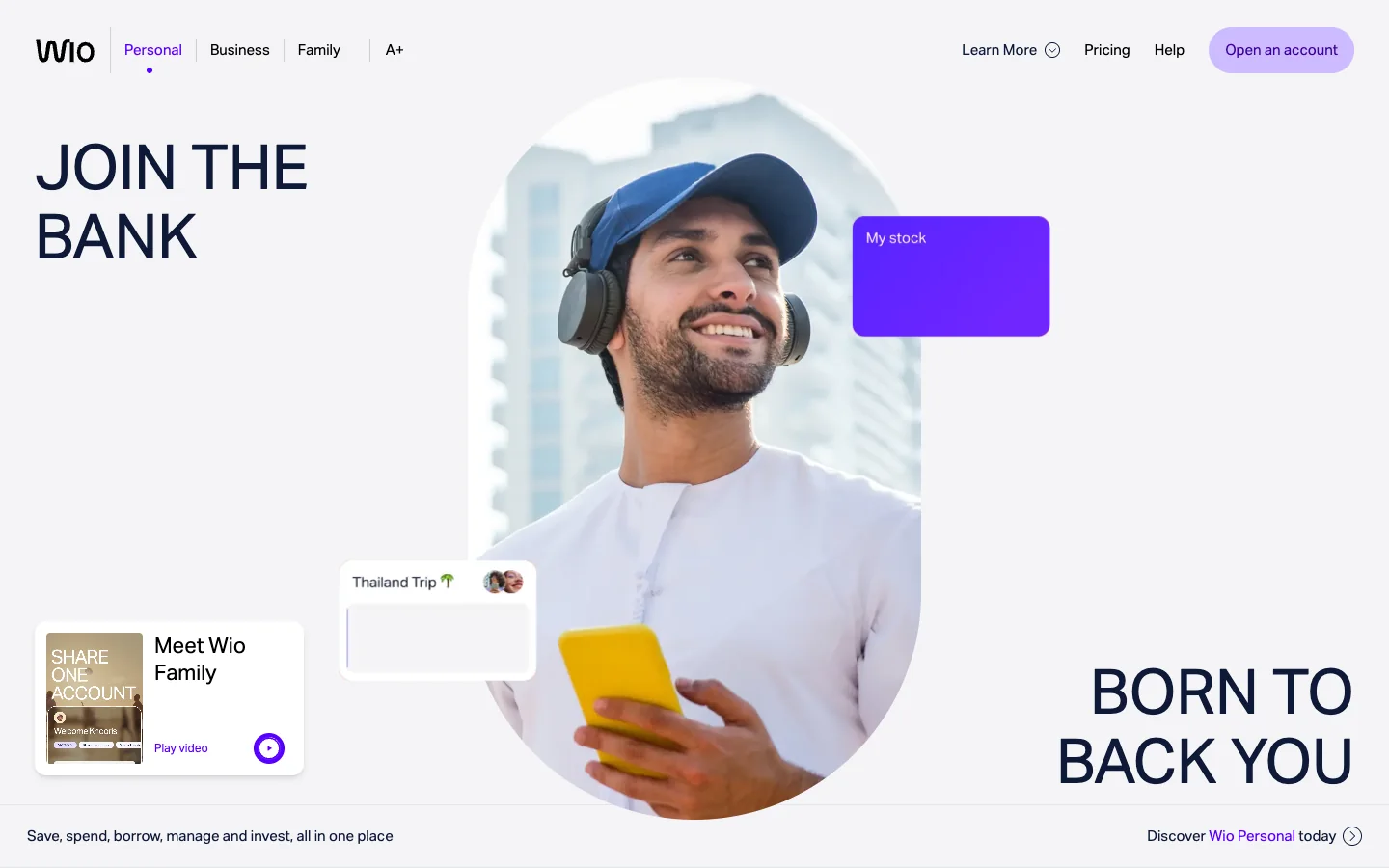
Wio, from the UAE, lays out its first screen like a magazine cover: "Join the bank" top left, "Born to back you" bottom right, and between them a portrait in an arch with violet interface cards. Then come "0 branch visits, 0 paperwork", up to 6% a year, and an account you can open with a work visa before you move.
Take away: an argument for one specific audience, here expats, right on the home page.
NexBank: a brand for institutions
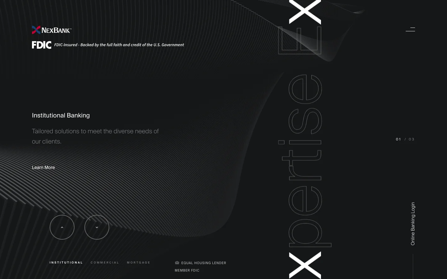
America's NexBank works with institutions, businesses and mortgages. The site is dark, with fine 3D sculptures, a slowly turning wireframe X and huge outlined words, Execution and Flexibility, scrolling sideways. Accounts open through a conversation, and the site sells reputation.
Take away: for a bank that sells a conversation, the first screen works as a handshake.
ubank: the rate as the hero
The glove with the sponge opens this article. The 5.85% rate stands on the first screen in place of a headline, the QR code beside it, and a sticky bottom bar holds six entry points: a spend account, a bills account, savings, refinancing, buying a home, calculators.
Take away: for a product that sells on the rate, the number is the headline.
Kuda: us and other banks, in one table
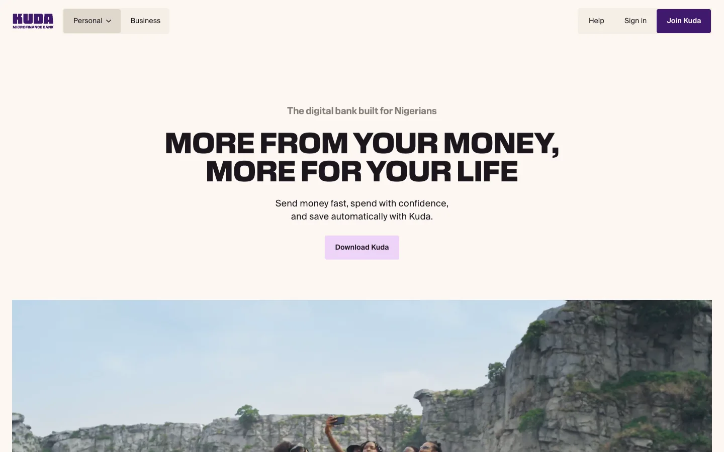
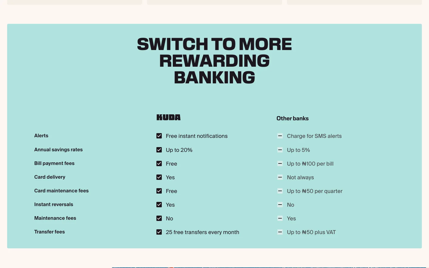
Nigeria's Kuda writes in big caps, "More from your money, more for your life", and paints palm trees, a party and its purple app icon by hand. Its main argument is a table, "Switch to more rewarding banking": savings rates up to 20% against up to 5% at other banks. Bill payments are free, against up to ₦100 elsewhere. Transfers come 25 free a month. Beside the table: 8 million customers and a 4.8 rating on the App Store.
Take away: a comparison with "other banks", left unnamed, answers the question of stage 2.
Vancity: goals in place of products
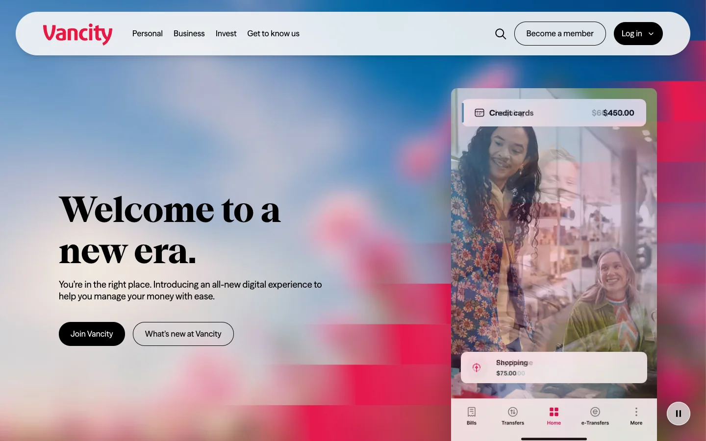
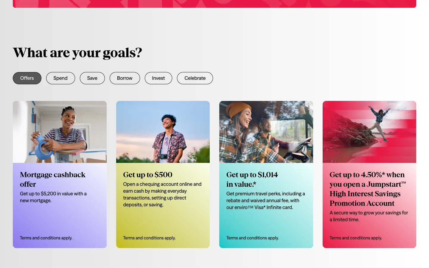
Canadian credit union Vancity opens with a serif "Welcome to a new era" over a blurred photo crossed by pink stripes. Offers filter through goal buttons: save, spend, borrow, invest, celebrate. The joining page lays membership out in two steps: check that you're eligible (a British Columbia resident with a social insurance number and $5 for a membership share), then open an account online "in as little as five minutes".
Take away: people arrive with a goal, and the site starts from it.
Ryt Bank: "I want to"
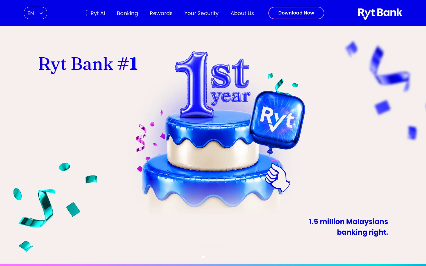
Malaysia's Ryt Bank calls itself the first AI-powered bank and shows a glossy 3D cake for its first year and 1.5 million customers. Serif headlines in electric blue sit on pale pink, and the product picker is a hand-drawn pointing finger: "I want to ☞". The opening promise reads "As fast as 2 minutes", and a phone already shows the first step, entering a mobile number.
Take away: show the first screen of the application while the visitor is still on the site.
Atom: three proofs under the headline
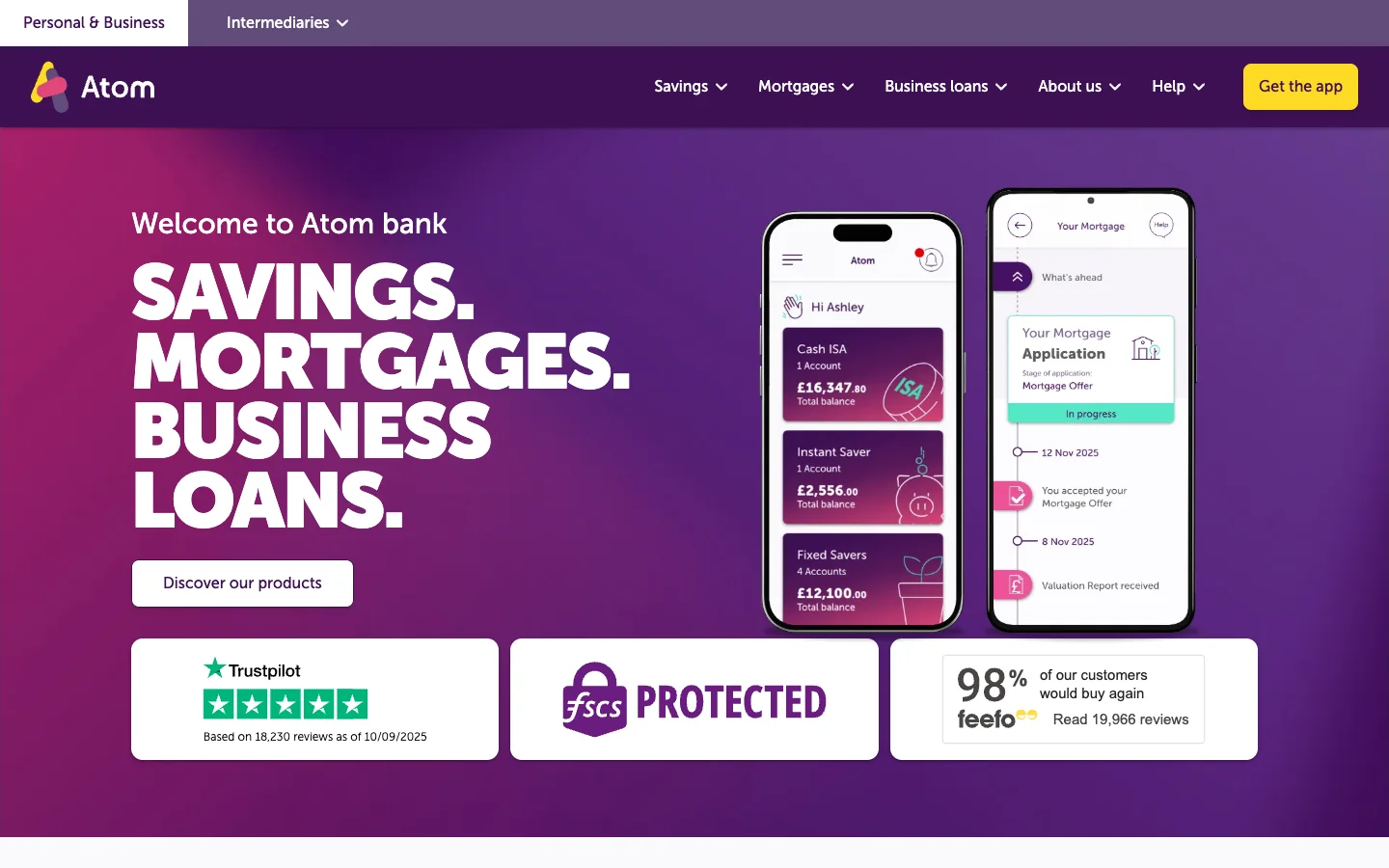
Britain's Atom shouts in a purple-to-magenta gradient: "Savings. Mortgages. Business loans." Under the headline sit three trust cards: Trustpilot with 18,230 reviews, the FSCS badge, and Feefo, where 98% of customers would buy again. Phones beside them show the real state of a mortgage application.
Take away: proof of trust on the first screen, before any scroll.
Alpian: private banking as technology
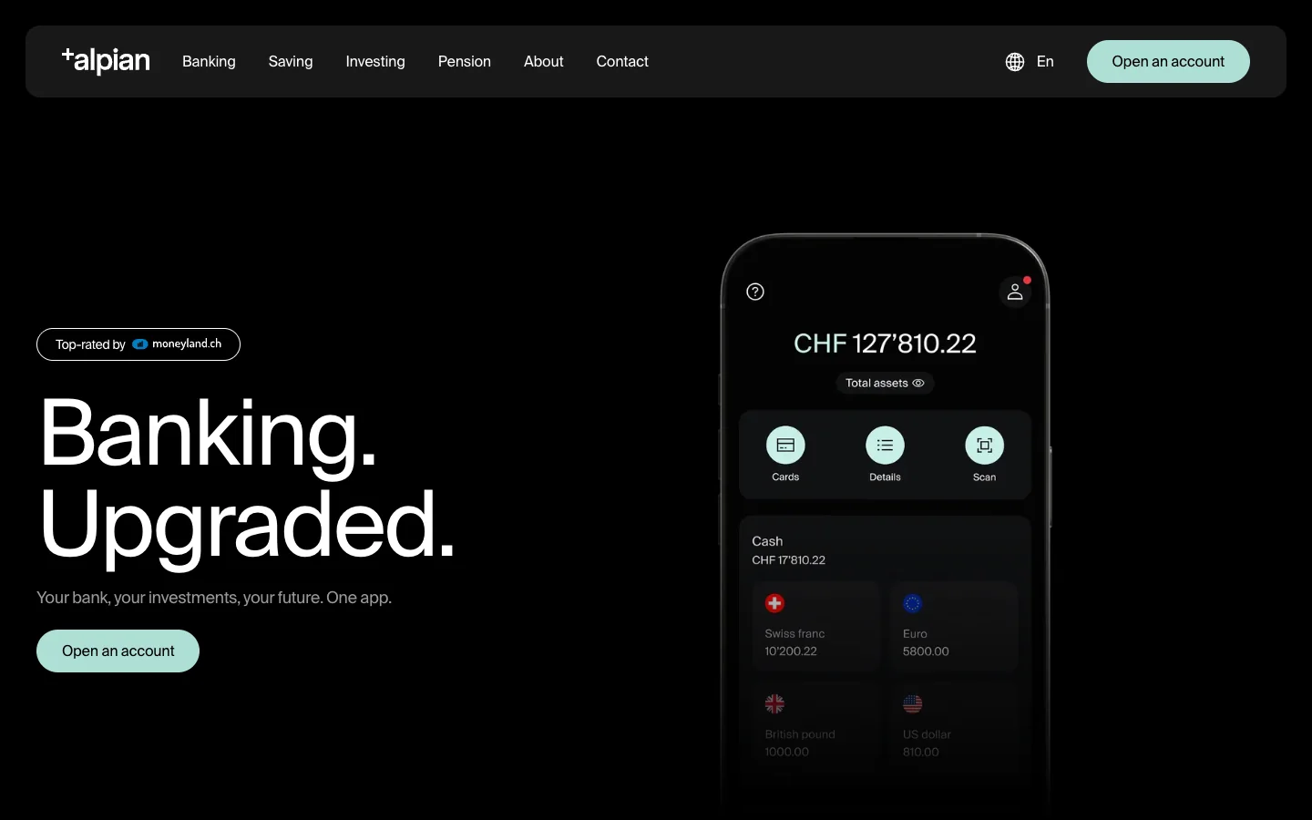
Switzerland's Alpian is a digital private bank, and its site is black, with a big grotesk "Banking. Upgraded.", cinematic photos and 3D objects: a temple, a purple cube, a metal card. The promise is an account in the app "in under 10 minutes", with an investment calculator and a button to talk to an expert alongside.
Take away: premium can be shown through material and light.
Zempler: the whole path in view
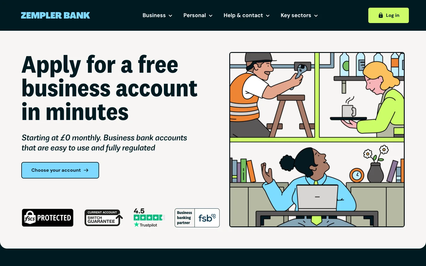
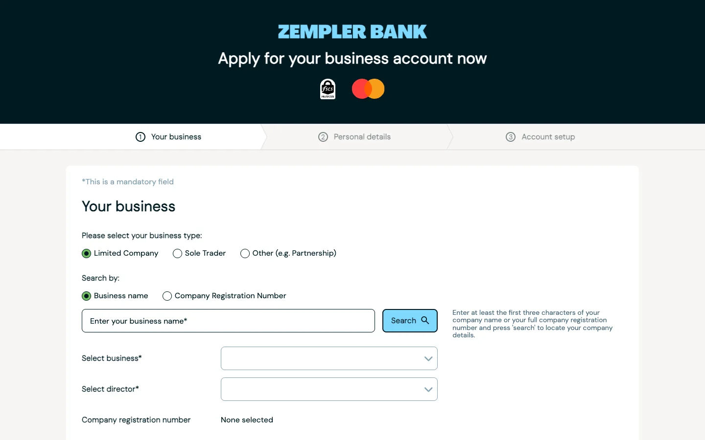
British business bank Zempler draws in comic panels: a tradesman with a wrench, a barista, a woman at a laptop. The headline is set at 84 pixels: "Apply for a free business account in minutes". Under it sit the FSCS badge, the account switch guarantee and Trustpilot 4.5. Its path is the clearest of the twelve: a table of three plans from £0 to £19 a month, a Start here button, and an application with a three-step progress bar: business, personal details, account setup.
Take away: show the full length of the path before the person starts.
Climate First Bank: the number that walks with you
Walked through above. Take away: the rate in view at every step, from the first screen to the form.
Our measurement: what ChatGPT and a phone see
We measured the home pages of all 12 banks: six readiness checks for AI assistants, sent as plain requests from our network, and Lighthouse in mobile emulation, three runs per site, taking the medians. The raw data is in an open CSV file.
| Bank | Page weight | Main content shown, measured | Lighthouse | Plain request | Checks out of 6 |
|---|---|---|---|---|---|
| NexBank | 3.4 MB | 2.2 s | 69 | answers | 3 |
| Zempler | 1.2 MB | 2.3 s | 49 | answers | 2 |
| Atom | 1.3 MB | 2.5 s | 61 | answers | 3 |
| Vancity | 2.3 MB | 2.8 s | 36 | 429 | 0 |
| Kuda | 23.7 MB | 2.9 s | 57 | answers, llms.txt | 4 |
| Climate First | 5.3 MB | 4.1 s | 55 | answers | 2 |
| Kiwibank | 2.9 MB | 4.2 s | 45 | drops the connection | 0 |
| Alpian | 7.1 MB | 4.2 s | 32 | answers, llms.txt | 4 |
| GXBank | 4.0 MB | 4.3 s | 55 | answers | 2 |
| ubank | 4.3 MB | 4.5 s | 24 | 403 | 0 |
| Wio | 9.9 MB | 4.5 s | 33 | GPTBot gets 403 | 1 |
| Ryt Bank | 6.3 MB | 4.8 s | 55 | answers, llms.txt | 4 |
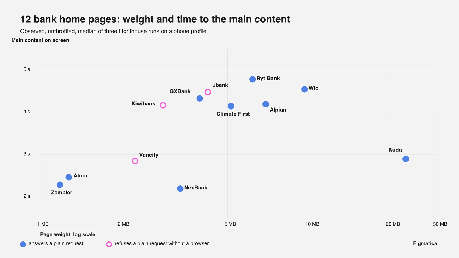
The median home page weighs 4.2 MB and shows its main content in 4.2 seconds. The heaviest, Kuda, weighs 23.7 MB because of video, and still shows its main content in 2.9 seconds. The three fastest, NexBank, Zempler and Atom, fit within 2.5 seconds, and among them is Zempler's comic at 1.2 MB: bold design and a light page live together.
Three banks, Kiwibank, ubank and Vancity, answer a plain request from outside a browser with an error or a dropped connection, the same for an ordinary agent and for OpenAI's agents. This is bot protection at work. An assistant then takes these banks' rates and terms from other people's sites. Our requests went out from our own network, while OpenAI's crawler works from its own servers, and that caveat covers the whole table. What a site needs so that assistants and agents can read it, we explain in what an agentic website is.
Three banks have llms.txt: Kuda, Alpian and Ryt Bank. FAQ markup, which helps an assistant quote an answer, appears on zero of the twelve.
ChatGPT is already choosing the account
By Adobe's data, traffic from generative AI to US banking sites grew 1,200% between July 2024 and February 2025. 27% of people had already turned to AI with banking questions. The most common request, at 42%, was a recommendation for a checking or savings account. These visitors spend 45% more time on a bank's site.
In July 2026 J.D. Power found that 34% of Americans name AI as a key source of financial guidance. Their own bank gets 35%. The assistant has nearly caught up with the bank.
For a website this means three things. Rates, fees and terms stand as text in the HTML, where an image or a script would hide them. Customer questions get FAQ markup. Bot protection lets through the search agents the bank trusts: OAI-SearchBot, Googlebot, Bingbot.
Trust marks that are becoming mandatory
In the US the FDIC has updated its rule on the digital deposit insurance sign. Banks must comply by 1 April 2027. The sign goes on the home page, the login page and the first screen of deposit account opening, and the example in the rule itself places it near the top of the page, next to the bank's name. Credit unions follow the NCUA rule: the sign goes on the page where they take deposits or open accounts.
In Britain, the FSCS guidance of December 2025 asks banks to display its badge prominently and link from it to an explanation of deposit protection up to £120,000. Atom and Zempler put it on the first screen.
Accessibility has become a legal matter too. In 2018, at the peak, at least 133 website accessibility lawsuits were filed against US banks and credit unions.
What a bank can take from Ukraine
We are a Ukrainian studio, and for us opening an account from a phone in a few minutes is an ordinary Tuesday. Since October 2020 the National Bank of Ukraine has allowed accounts to be opened remotely with the digital passport in Diia, the state app, with the paper document left at home. The NBU's BankID system, through which banks verify identity, is available to more than 99.7% of Ukrainians with bank accounts.
Hence our view of stage 4. The identity check is where 43% of abandoned applications are lost, and in Ukraine it has become one button. A Western bank has its own rules and its own registries, and it can still take the principle: design the check as part of the product, with a clear list up front, a progress bar and a promise of time the bank keeps. The strongest sites in this article already bring the application onto the home page: Zempler lays out its three steps, and Ryt Bank shows the first one on a phone.
Bank website checklist, stage by stage
- Find. Rates, fees and terms as text on product pages. An FAQ with FAQPage markup. Bot protection that lets OAI-SearchBot and search agents through. An llms.txt that lists the products.
- Compare. The rate on the product's first screen. A fee table or a comparison with "other banks". A calculator: earnings, payment, impact.
- Start. One main action on the first screen. The time it takes to open and the list of documents needed. A QR code for banks that open accounts in the app.
- Check. Progress in steps. The FDIC, NCUA or FSCS sign next to the bank's name. A word on why the bank needs each piece of data.
- Funding and the main bank. The minimum deposit and the ways to fund it, shown before the application. A bonus for moving your salary. An account switching page.
Websites and products we shipped
 BloxFi80+ country pages from one template: how a fintech API went global
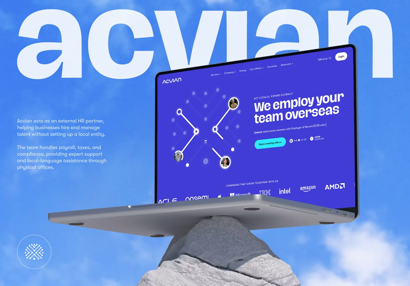 Acvian30+ pages in 60 days: a new Webflow site for a global HR partner
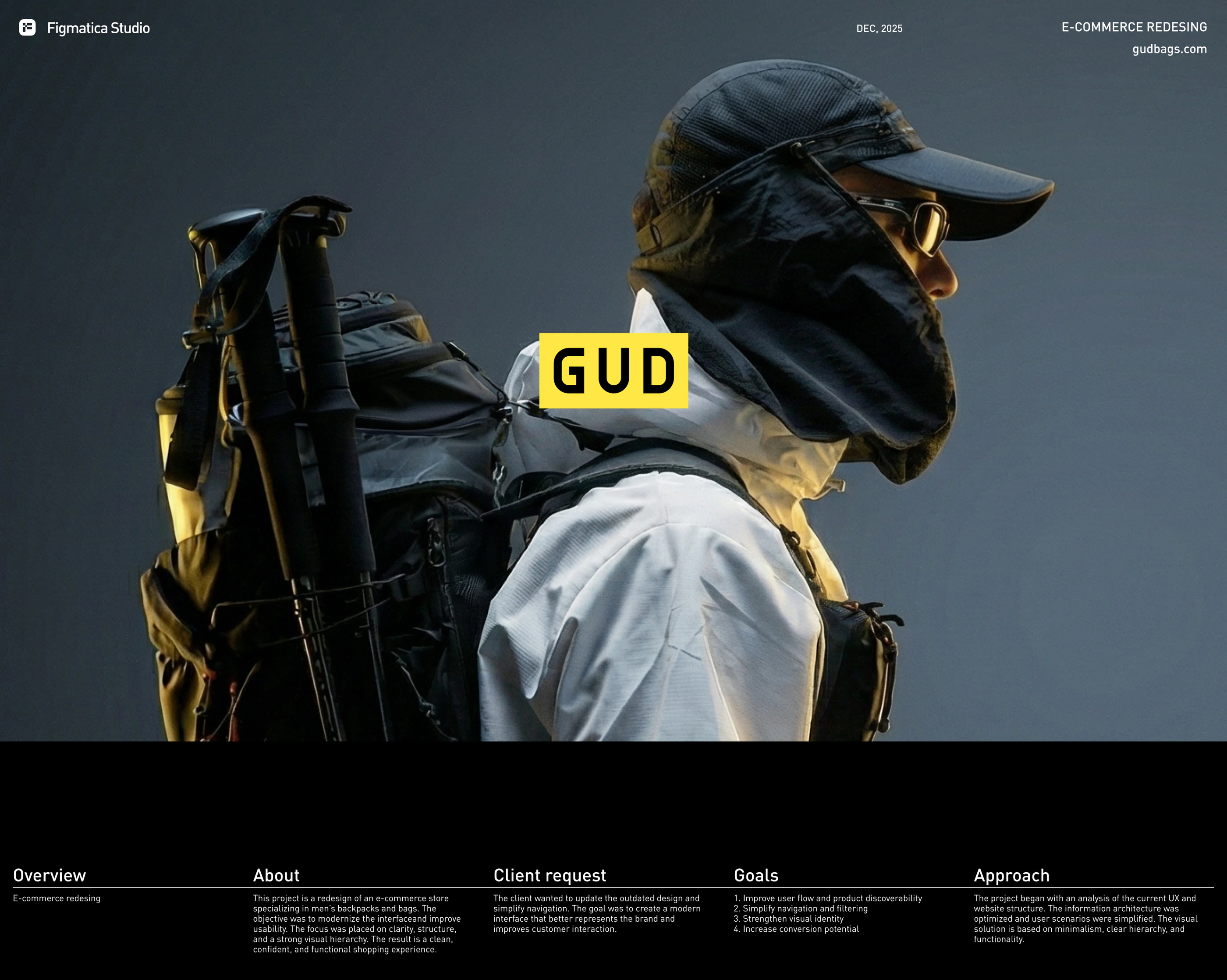 GUD5.5 weeks from research to final design: an online store redesign for a backpack brand
Want the same for your site? 30 minutes, free.
Book a free call ↗Sources
- 2026 Digital Banking Performance Metrics, Cornerstone Advisors and Alkami, 2026
- Get digital account opening to beat, CU Management (Cornerstone Advisors study), 2024
- 2025 U.S. Banking and Credit Card Mobile App Satisfaction Studies, J.D. Power, 2025
- Digital account opening, FICO
- According to the data, CPAs continue to soar, Curinos, 2024
- Global Banking Consumer Study 2025, Accenture, 2025
- Checking account fees survey, Bankrate and YouGov, 2025
- Traffic to US retail websites from generative AI sources jumps 1,200 percent, Adobe Analytics, 2025
- July 2026 Financial Health Report, J.D. Power, 2026
- FDIC Official Signs and Advertising Requirements, final rule (91 FR 3801), Federal Register, 2026
- 12 CFR 740.4, Requirements for the official sign, NCUA (eCFR)
- Protected badge guidance for deposit takers, FSCS, 2025
- ADA lawsuits tied to websites mount, American Banker, 2019
- Bank accounts can be opened with the digital passport in Diia, National Bank of Ukraine, 2020
- BankID keeps working steadily under martial law, National Bank of Ukraine, 2022