Contents
- BloxFi by Figmatica: a fintech brand where money moves on screen
- The short version
- What a neobank is and how it makes money
- The neobank funnel through the customer's eyes
- Decision 1: the card as a billboard
- Decision 2: a mood and one action on the first screen
- Decision 3: an account in minutes, not a visit
- Decision 4: money with a name, pots, pockets and jars
- Decision 5: a voice and a character
- Decision 6: support as part of the product
- Decision 7: growth built into the product
- Decision 8: plans as a shop window
- Banking app design concepts: where the screens are going
- Why others shut down: loved apps without an engine
- Entering a new country: seven design moves
- Show the money before the sign-up
- Neobank examples: thirteen banks side by side
- Neobank app and website design checklist
- Frequently asked questions
Our own BloxFi brand in motion first, then a card that looks like a melting ice lolly, a bank for gamers lit like an arcade, a sun in sunglasses as the face of a bank, a desk on a mountain top, a gold membership for $5 a month. Eight design decisions from Lunar, Up, Mercury, Monzo, Revolut, bunq, Robinhood and Nubank, a concept of where banking apps are heading, the money engine behind each screen, and what the neobanks that closed were missing.
Summer in Denmark. A Danish bank sells its travel plan with a picture of a card made of pink ice, melting on a stick: your whole summer already in the card. Across the world, in Melbourne, another bank opens its site with a yellow sun in black sunglasses, arms in the air, and one line: life's better on the upside. More than a million Australians bank with it.
On the same continent, a neobank with a beautiful app and a savings rate that made people switch returned AU$252 million to 37,884 customers and closed. People liked it. It had no way to earn on them.
This page sits between those stories. We opened the sites of the neobanks that grew, and of a few that looked the boldest, read their annual reports and interviews, went through the ones that closed, and added a concept of where banking apps are going. What we found is a set of design decisions, from the colour of the card to the way support answers, and behind every one of them a business reason. Below, eight of those decisions with the screens they live on, the money engine each one serves, and what a fintech can take into its own brief. For fintech sites beyond banks, from payment APIs to mortgage brokers, see our fintech website examples.
BloxFi by Figmatica: a fintech brand where money moves on screen
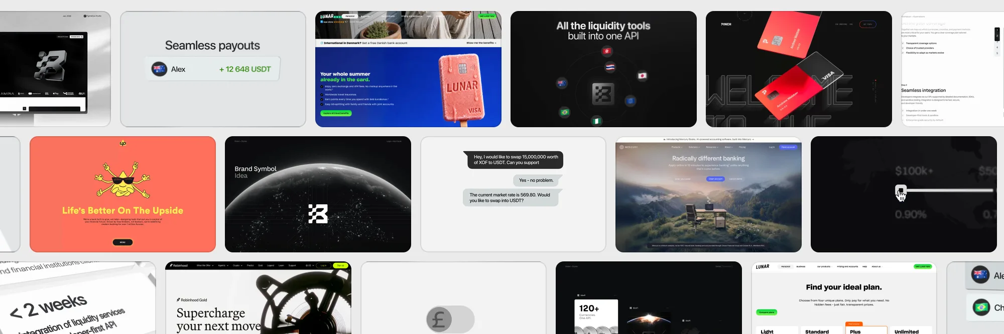
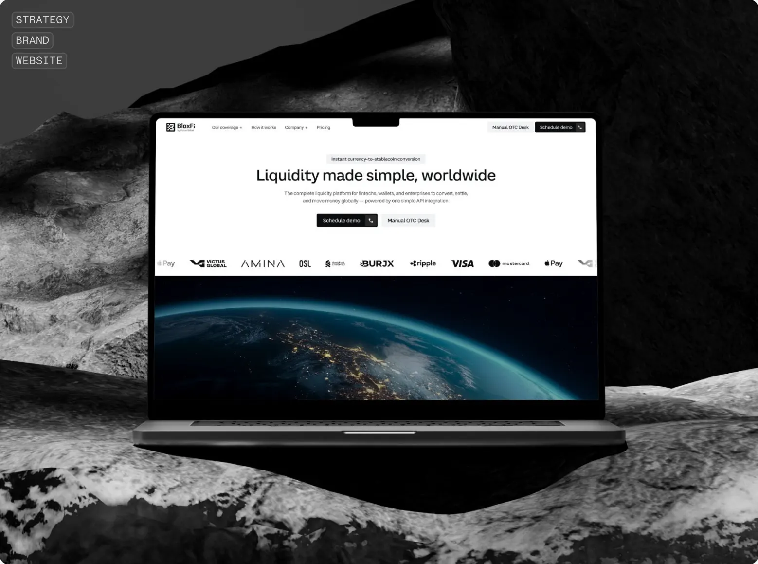
Before the banks of other people, our own. BloxFi is a global API for currency conversion and cross-border settlement in 120+ currencies, built for fintechs, digital wallets and large businesses. We made its brand, its motion and its Webflow site as one team, and the rule for the motion was simple: each feature gets one small animation that shows money doing something.
Watch the reel above for the details. A client in a chat asks to swap 15 million West African francs into USDT, and the reply comes back with a rate. A euro coin slides a toggle across. A globe made of dots turns under global settlements. A payout of 12,648 USDT lands next to a name. None of these clips lasts longer than a few seconds, and each one replaces a paragraph of copy a buyer would skip.
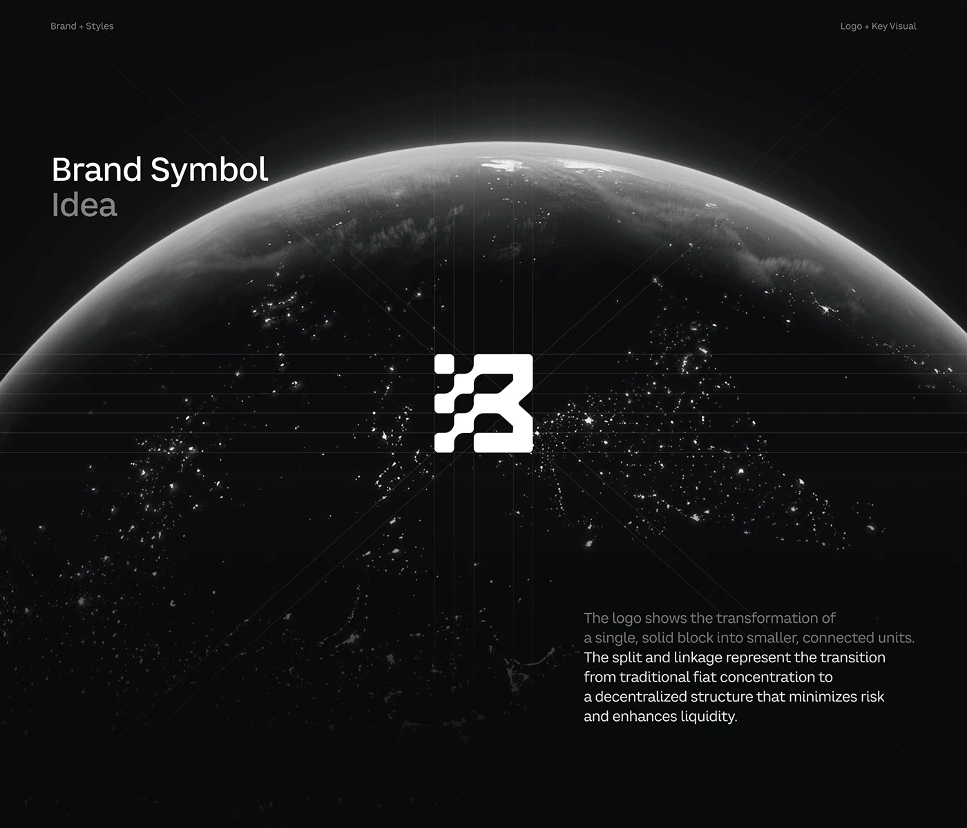
The first screen does what Mercury's mountain does further down this page: it sets a mood before it asks for anything. Black, one line, the simple path to global liquidity, and the mark in chrome, turning slowly. The mark is a solid block that splits into connected units, the same thing BloxFi does with fragmented payment rails, so the logo is also the product explained.
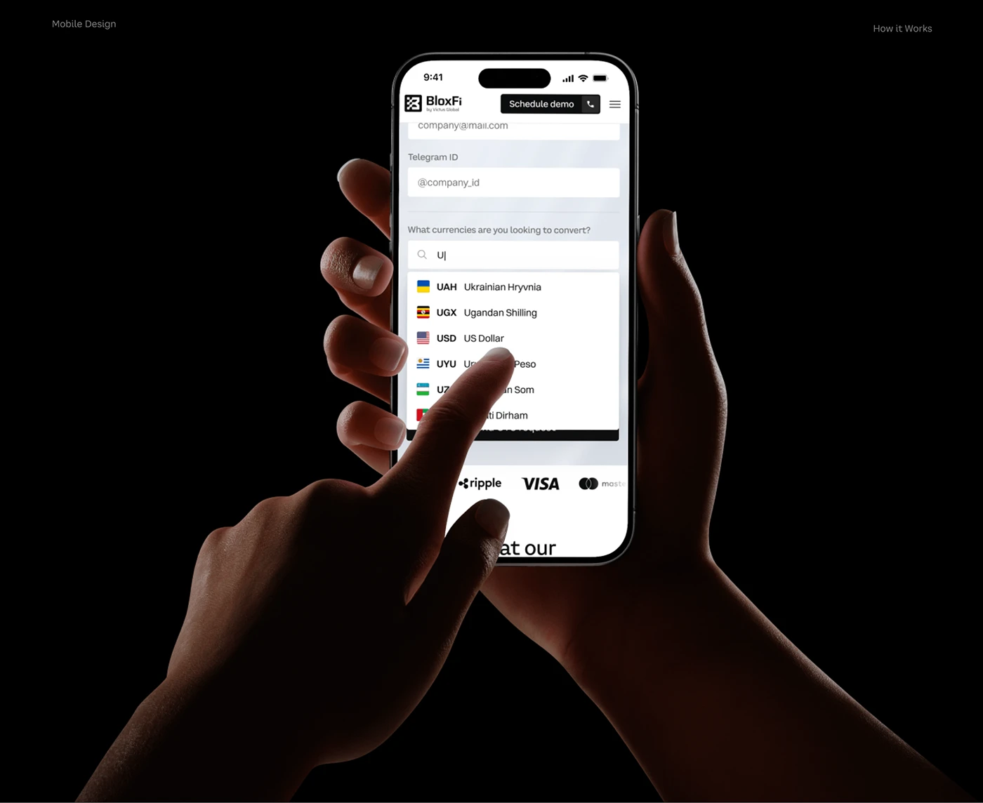
How it works is where most fintech sites put a diagram. We gave each step its own dark card that changes as you scroll: a consultation opens as a chat, country flags orbit the mark next to 80+ countries and 100+ currencies, a terminal icon says integration in under two weeks, a dollar sign turns into a stablecoin sign under the word instant, and the last step is the Earth at sunrise. A buyer reads four lines and sees four state changes of their money.
Rates depend on currency pairs and volume, so a static price table would mislead half the readers. The request form works like a calculator: pick the business type, open a region, tap the countries by their flags, drag the monthly volume, and the form already knows what to quote. The Earth at night sits beside it, lit where the money goes.
Every country BloxFi covers needed its own page, the same problem a neobank faces when it enters a new market. We designed one coverage template in Webflow and let the CMS build the rest: a world map, a hero photo of the country, why choose BloxFi there, customer stories, a local call to action. Adding a market is one more CMS entry. The full story is in the BloxFi case.
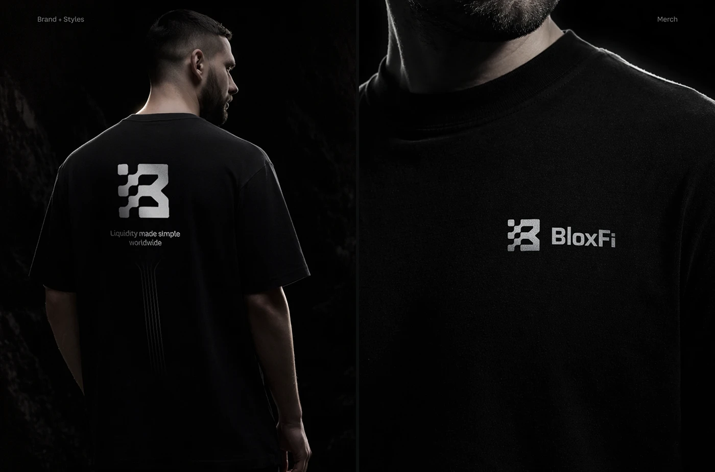
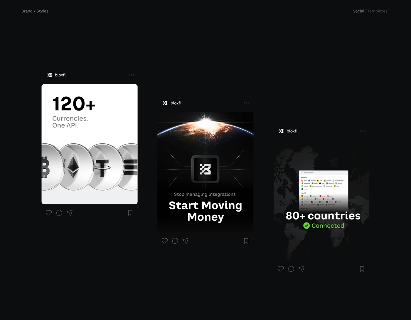
The brand leaves the site the way a neobank's card leaves the app: black T-shirts with the block mark, and social posts in the same dark, precise language: 120+ currencies, one API; 80+ countries, connected. The client summed up the brief in one line: we needed more than just a website.
The short version
- Most customers come from friends. Nubank acquired 80–90% of customers organically in 2021, Monzo 79% by word of mouth, Wise more than two-thirds. Design is the ad people pass on.
- The card is a billboard. Lunar's ice-lolly card, Monzo's coral, Nubank's purple, a gamers' bank card flying through neon letters: the card is the only piece of a neobank people see in the street.
- The first screen is a mood, then one field. Mercury puts a desk on a mountain, Up a sun in sunglasses; both ask for one thing only.
- Money gets a name. Pots, Pockets, Money Boxes and jars turn a balance into goals.
- Plans are a shop window. Four plans side by side, one marked most popular, the top one with a metal card.
- Every screen serves a money engine. Card fees, a credit card first, subscriptions, a thin fee on volume. The neobanks that closed had the design and missed the engine.
- Show the money before the sign-up. In our fintech work, the price or the saving appears before the form: a volume slider at BloxFi, a rate check at CheckMyRate.
What a neobank is and how it makes money
A neobank is a bank that lives in a phone: no branches, an account opened in minutes, support in a chat. The hard part sits behind the screen. Across the industry only a small share of them earn money: in a count of 249 digital challenger banks, 13 had broken even, and an average customer brings a neobank $70–80 a year in the US. So every design decision has to carry revenue somewhere, and the winners each built on one clear engine.
| Money engine | How it works | Who runs on it | What the design pushes |
|---|---|---|---|
| Card fees | A small fee on every card payment | Chime, about three quarters of revenue | Everyday spending with the card |
| Credit first | A credit card as the first product, then loans | Nubank | Applying for the card, growing the limit |
| Subscriptions | Paid plans with better limits and perks | Revolut, $936m from subscriptions; Lunar, bunq, Robinhood Gold | The plan page, the metal card |
| Thin fee on volume | A transparent fee on every transfer | Wise, 0.52% | The calculator on the first screen |
| Merchant fees and memberships | Shops pay for pay-later checkouts; users pay for membership | Klarna, 2m paying members | Checkout buttons, the shopping app |
The neobank funnel through the customer's eyes
Marketing teams call it acquisition, onboarding, activation and retention. The customer lives it as seven moments, and each moment has a screen that decides it.
| What happens to the person | The question the product answers | What is measured | Example |
|---|---|---|---|
| Hears about it from a friend | Why did I even hear of you? | Share of customers from referrals, cost per customer | Nubank: 80–90% organic in 2021 |
| Opens an account in minutes | Will I have to visit a branch? | Minutes to a card, drop-off on the way | bunq: three steps, five minutes, a video selfie |
| Holds the card | Do I want to take it out? | Physical cards ordered, unboxing posts | Nubank's purple welcome kit |
| Makes the first payment | Does it work in real life? | Share who paid at least once | Monzo counts a referral after the friend's first card payment |
| Lives with it every day | Does it help me with money? | Days a week in the app, goals created | bunq: up to 25 Pockets, each with its own IBAN |
| Writes to support | Will a person answer, and how fast? | Time to reply, support score | Nubank NPS 90 in 2021 |
| Tells a friend | Am I proud to recommend it? | Friends invited per customer, lifetime value | Monzo: 79% by word of mouth |
Decision 1: the card as a billboard
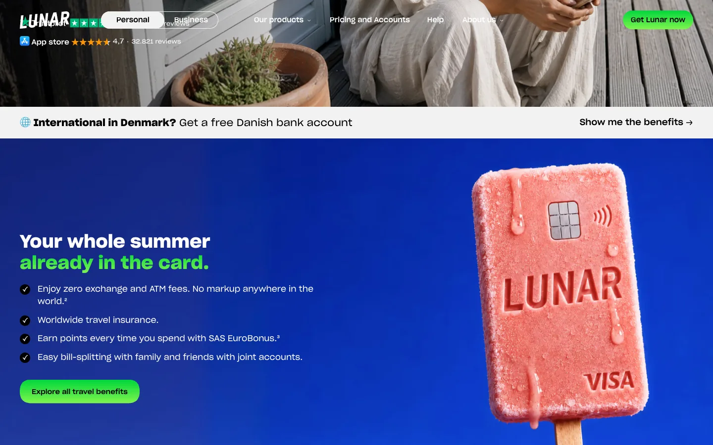
A neobank has no branch on the high street, so its card is the only piece of it anyone sees in the physical world. The boldest treat it as an object you could put on a poster. Lunar, a Danish bank with a million users, sells its travel plan with the card turned into a pink ice lolly, melting on a stick, next to four lines: zero exchange and ATM fees anywhere, travel insurance, airline points on every purchase, bills split with friends. Nobody reads a fee table in July. Everybody understands a lolly.
Pinch, a checking account and debit card for fans of streamers and creators, shown here from its pre-launch site, goes further. The page is dark, the letters are outlines that light up in red and blue neon as you scroll, welcome to the gamers bank, and the coral card flies through them like a pickup in a game. Then the design does something rare: it explains the money engine out loud. Traditional banks make money from swipe fees; with Pinch, part of that fee goes to the creator you choose. The card is the product, the billboard and the business model on one screen.
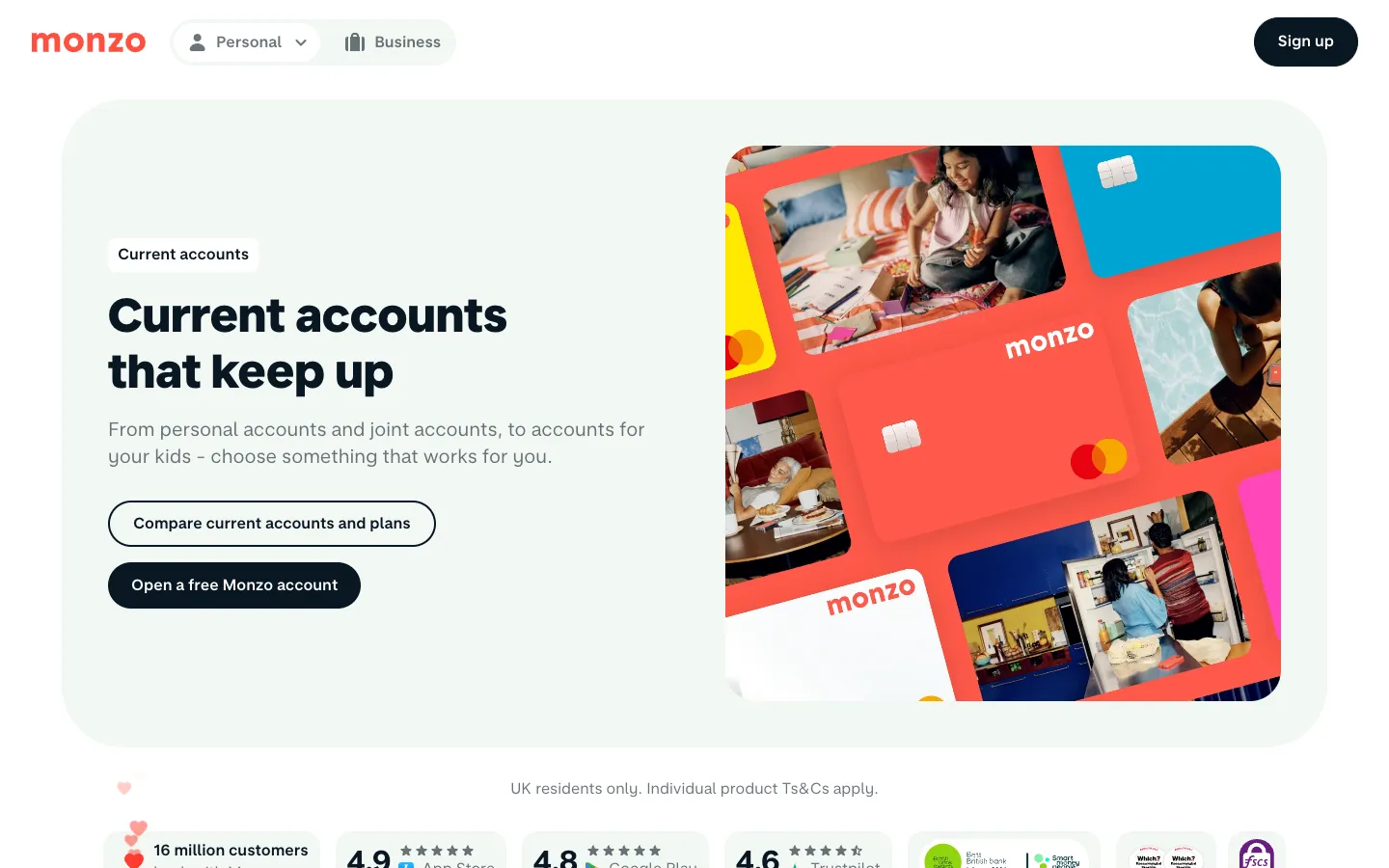
Colour does the same job at scale. Monzo's hot coral was meant only for the prototype. It stayed because people turned their heads at checkouts; the bank now says the colour stands for its warmth and human quality. Nubank's founder wanted the card to be the most anti-bank object possible, so it is purple, and Nubank also designed the moment it arrives: a welcome kit that went through five versions, a hashtag for the unboxing post, and a fake card inside so people photograph the kit without showing their real number. The unboxing became an ad the customer makes for free.
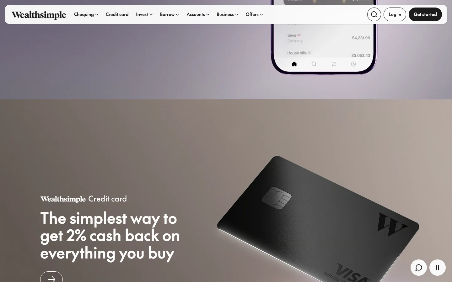
Wealthsimple, the Canadian money app, shoots its black credit card the way a watch brand shoots a watch: soft light, a shadow, one line about 2% cash back on everything. Revolut turns the card into the price list, with a card per plan from coloured plastic to platinum-plated, and N26 sells a metal one. The card is how a subscription becomes something you can hold.
What to take: design the card as the brand's most visible surface. One colour, material or image nobody else has, and the moment it arrives designed as carefully as the app.
Decision 2: a mood and one action on the first screen
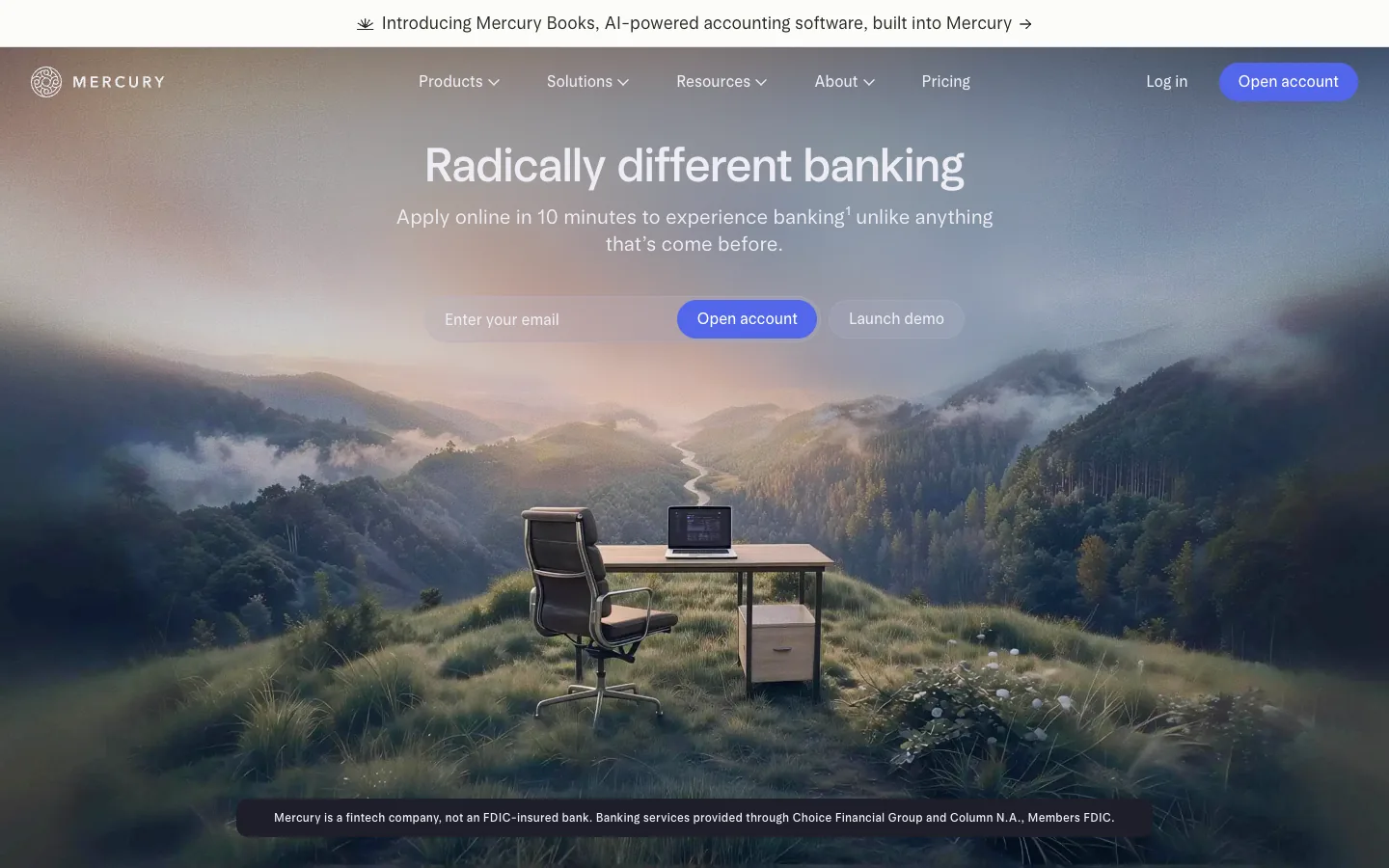
Mercury banks startups, and its first screen has nothing about banking in the picture: a desk and an office chair stand on a mountain top above the clouds. Radically different banking, apply online in 10 minutes, one email field, one blue button. The image says what the founder feels on a good day; the field asks for the smallest possible commitment. Further down, the proof: loved by more than 300,000 entrepreneurs, and a founder's quote that everything can be done in the app in a minute or two.
Up, the Australian neobank, opens with its mascot: a yellow sun in black sunglasses with four arms in the air, on coral. Life's better on the upside, a bank built to give, not take, for more than a million Australians. As you scroll, the page turns yellow, a phone tilts in with a circuit-board wallpaper, a crowd of little triangle characters appears under better with mates, and a live board shows where customers are spending abroad right now, with the number of countries in the last hour. Every screen has one button.
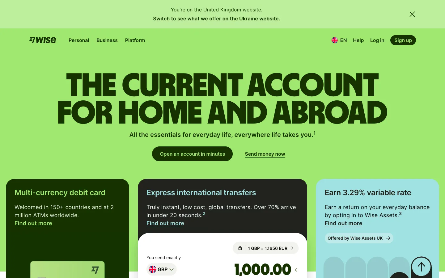
Wise puts its calculator on the first screen instead: type an amount and see the fee and the arrival time before you meet a sign-up form. Nubank asks for one field, the tax number every Brazilian knows by heart.
What to take: one image that carries the mood, one promise that names the old pain, and one action that costs the visitor a few seconds. A single field or a calculator beats a menu of products.
Decision 3: an account in minutes, not a visit
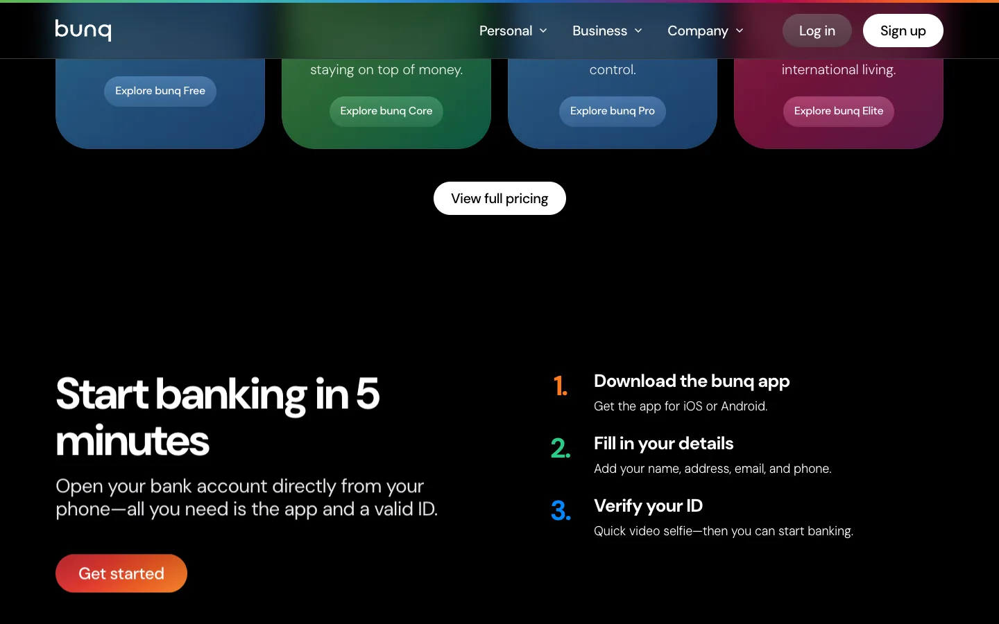
Opening an account used to mean a branch, a queue and a stack of paper. bunq, the Dutch neobank, calls itself the bank of the free and puts the whole thing in three numbered steps: download the app, fill in your name and address, verify your ID with a quick video selfie. Five minutes, written in the headline.
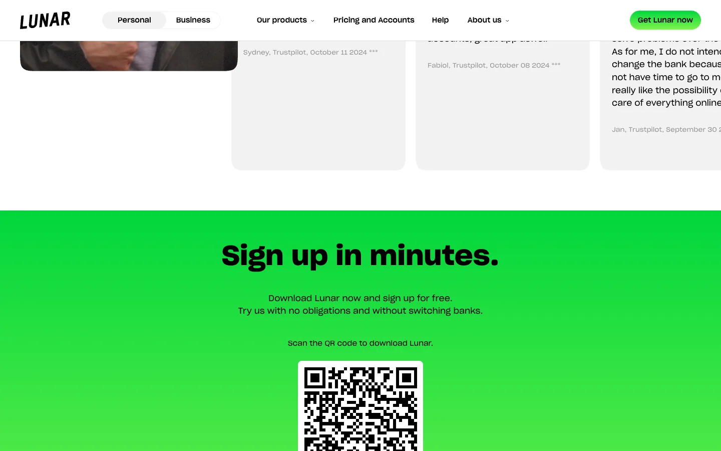
Lunar closes its home page with a slab of acid green and a QR code: sign up in minutes, try us without switching banks. The last sentence is the design decision. A visitor who is asked to leave their bank hesitates; a visitor asked to try a second one scans.
The next moment matters as much. Monzo pays a referral only after the invited friend makes their first card payment, which tells you what the bank counts as a real customer: someone who used the card, not someone who signed up.
What to take: count the steps to the first payment, not to the account, write that count on the site, and ask for a try, not a switch.
Decision 4: money with a name, pots, pockets and jars
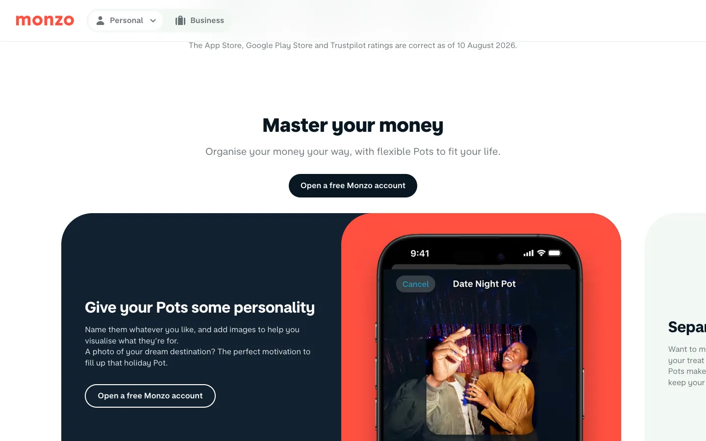
A balance is a number. A pot with a name is a plan. Monzo's pots came from its customers: the idea of folders or buckets for money started as a thread on the bank's community forum. Today a pot gets a name and a photo, a dream destination for the holiday pot, up to 20 of them, and bills can be paid straight from one. bunq gives up to 25 Pockets, each with its own IBAN, so rent and travel money have their own addresses. On Nubank's English site a customer from Mexico explains the whole idea in one sentence: she uses the Money Boxes because she can see the money growing.
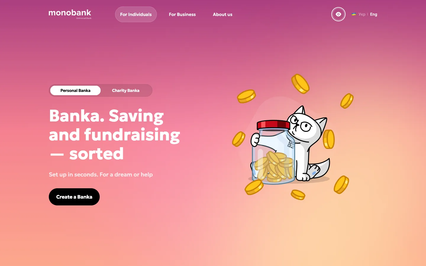
monobank's version shows how far a named goal can go. Its Banka is a glass jar with a cat hugging it; creating one takes a couple of seconds, and anyone can top it up from any bank in the world, with Apple Pay, Google Pay or an IBAN, no monobank card needed. That one decision turned a saving tool into the way Ukraine raises money together: ₴147 billion through jars from 15 million donors.
What to take: let people name their money. A goal with a name and a picture keeps them in the app, and a goal others can add to brings new people in.
Decision 5: a voice and a character
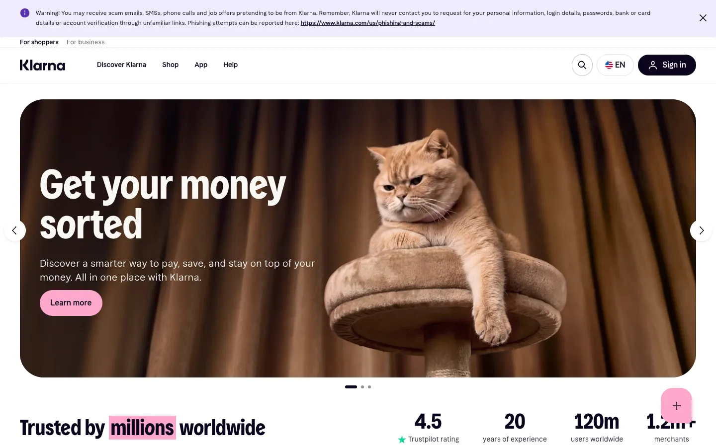
Up's sun and its triangle mates are one way to give a bank a face. Klarna owns a pink so recognisable it works without the logo, and opens its site with a ginger cat on a scratching post and four words: get your money sorted. monobank's cat grew out of a viral photo of a co-founder's cat in a carrier backpack and now has many outfits on loading and success screens; when friends split a bill, the cat picks who pays. Monzo publishes its tone-of-voice guide for anyone to read.
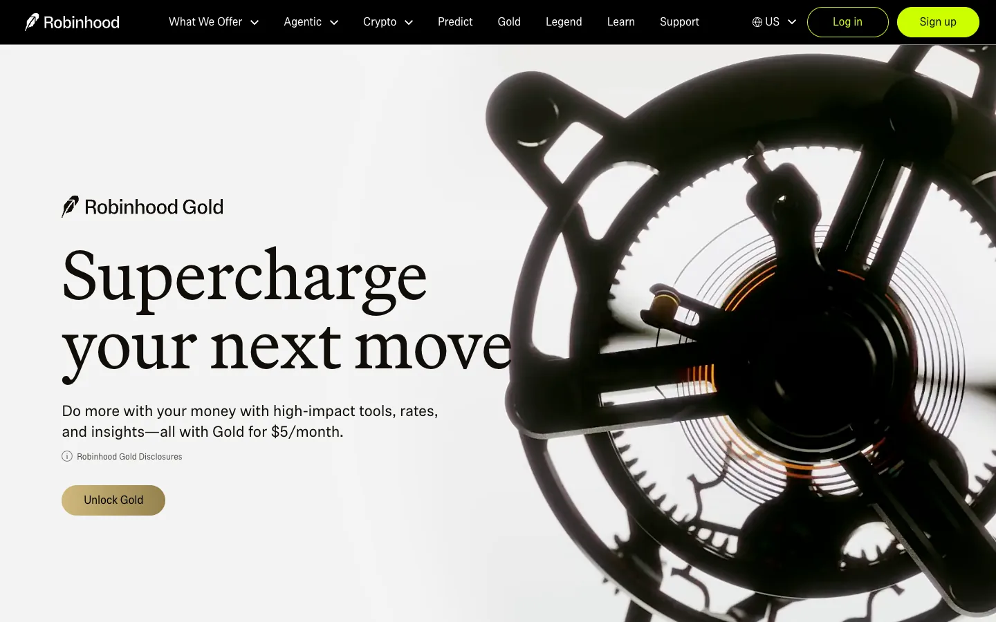
A voice can also be a typeface and a material. Robinhood's Gold pages switch from the app's usual sans to a large serif, black and warm gold, with a close-up of a black mechanical sculpture next to the headline. It reads like a private bank, and the price under it is $5 a month. The voice sells the upgrade before the benefits list does.
What to take: give the brand a character or a material that can appear on the screens nobody designs twice, loading, success, errors, and let it speak the way your customers talk.
Decision 6: support as part of the product
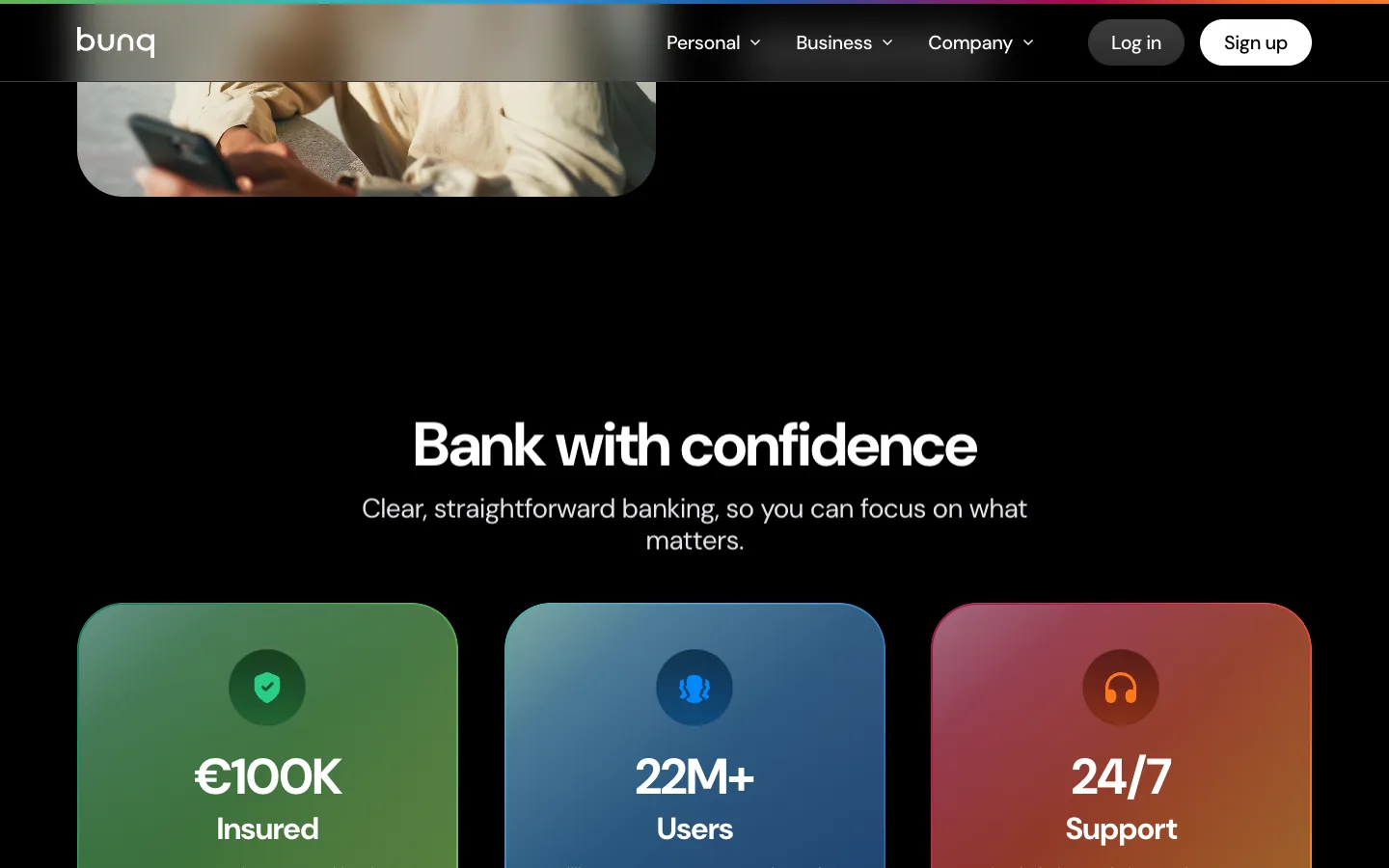
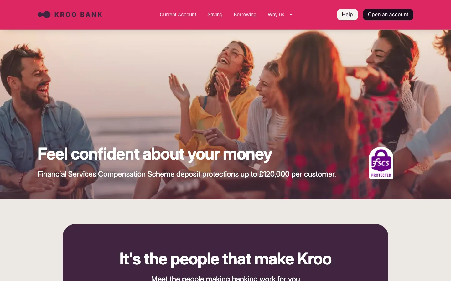
A bank without branches has one place where a person meets a person: the support chat. bunq puts it next to deposit insurance and its user count, three tiles of the same size: €100K protected, 22 million users, 24/7 support. Kroo, a British bank, gives a whole block to the line it's the people that make Kroo. Nubank's team sends small gifts and handwritten notes after conversations that mattered; its NPS stood at 90 in Brazil in 2021.
The other side of the coin: a pay-later giant that replaced support staff with AI later admitted lower quality and brought people back, and a payments app was fined $175 million, partly because customers could not reach a human. Lunar now puts an AI assistant on its home page; the lesson from both stories is to add the assistant and keep the humans one tap away.
What to take: design support as a screen of the product, visible on the site, in the channels people already use, with a human voice.
Decision 7: growth built into the product
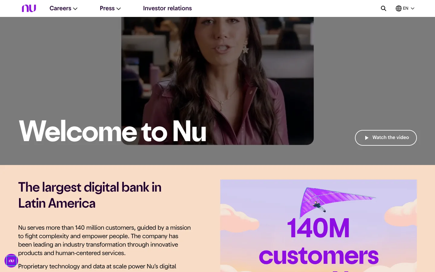
The winners grew through their customers. In 2021 Nubank acquired 80–90% of its customers organically at about $5 each, and its English site says it plainly: the business model thrives on customer love and lower costs, feeding a flywheel of growth and profitability. Monzo says 79% joined by word of mouth, Wise more than two-thirds.
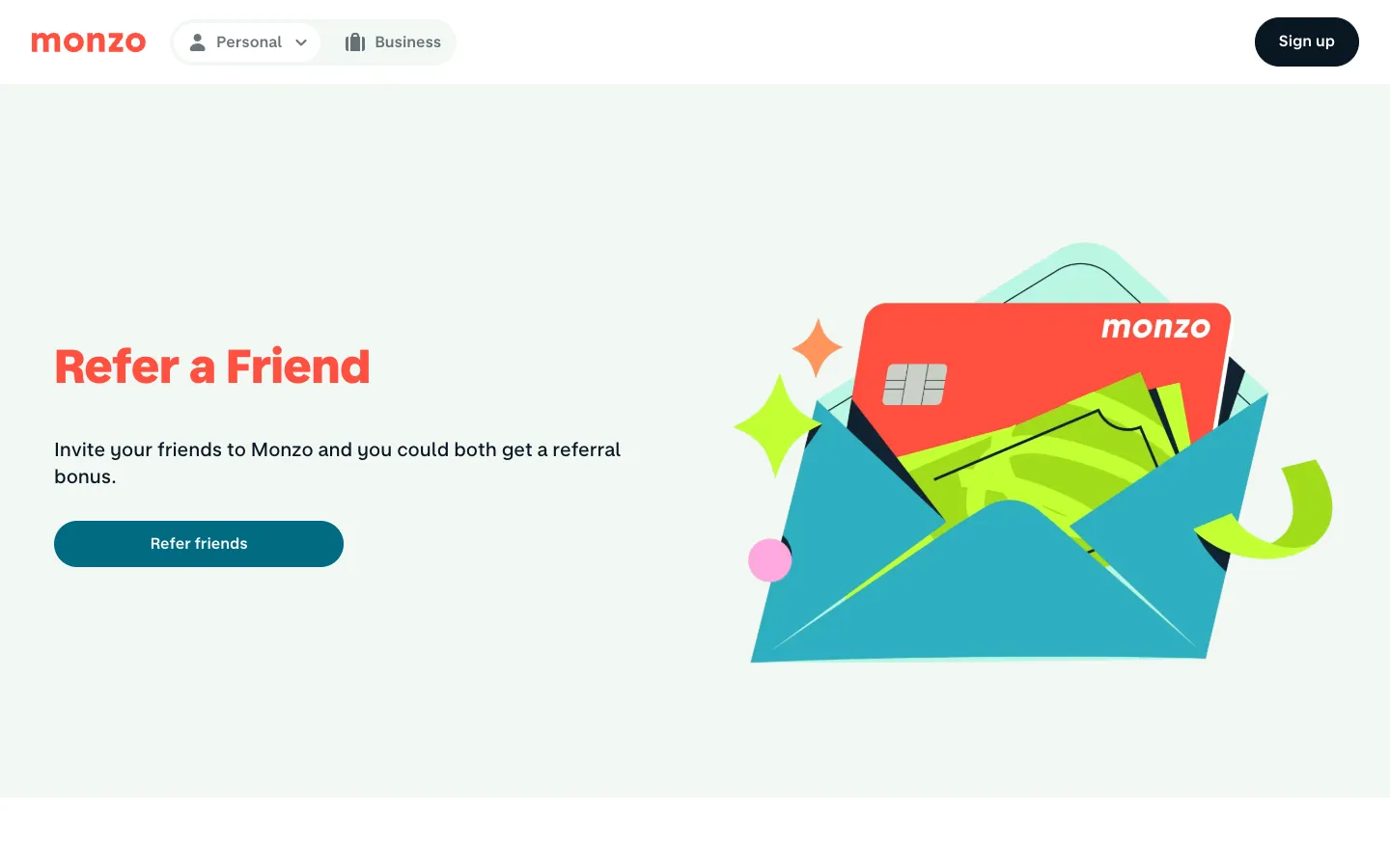
Up builds the invitation into the features: the more mates you have on Up, the easier it is to split, track and settle expenses, and the site ends with a link to hook up a mate. Monzo designed its growth like a product. It raised £1 million from 1,861 customers in 96 seconds in a crowdfunding round, fast enough to crash the platform. It opened with a waiting list and gave every user one golden ticket to pull a friend past the queue; those tickets brought about 40% of the year's sign-ups. Its referral page is an envelope with the coral card sliding out.
What to take: build the invitation into the product, make features better with friends, give the invite a physical metaphor, and pay for the friend who pays, not for the one who installs.
Decision 8: plans as a shop window
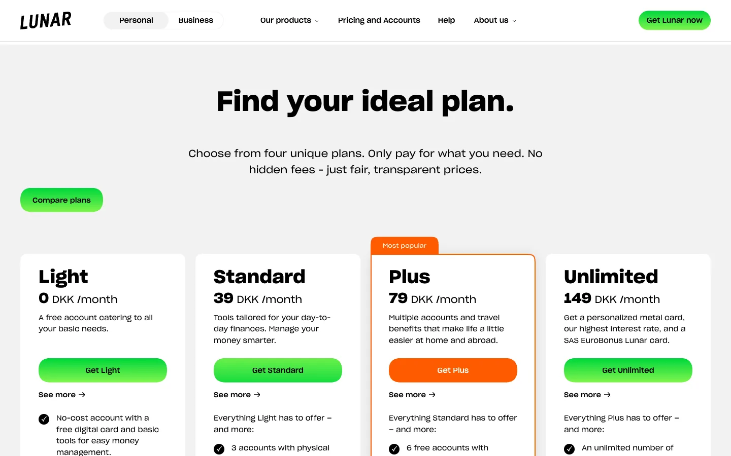
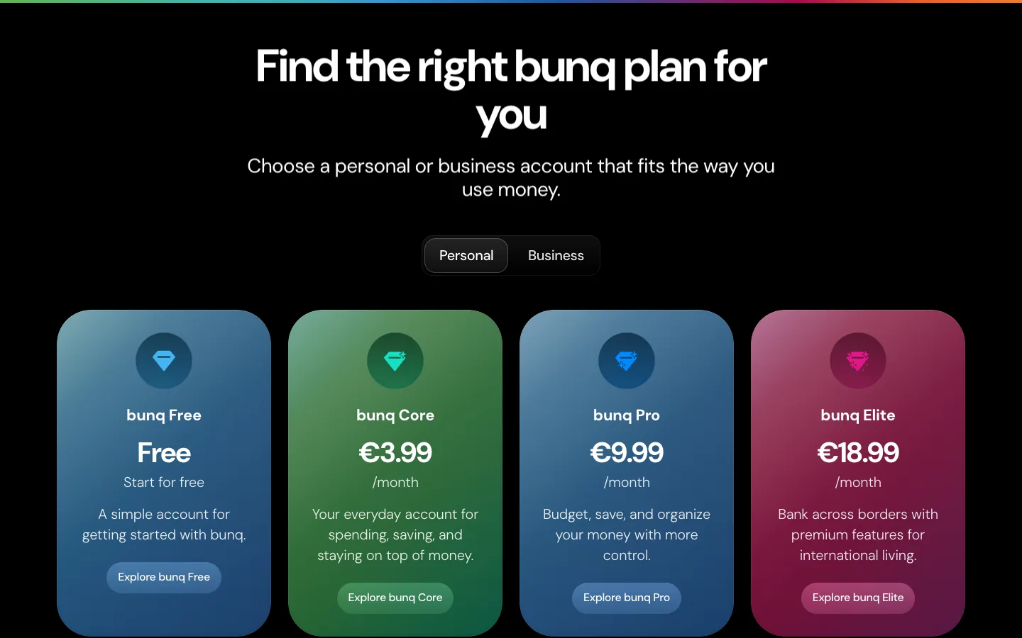
Subscriptions are the engine that needs the most design. Lunar lays out four plans on the home page: Light for free, Standard at 39 kroner, Plus at 79 and Unlimited at 149 a month. Three buttons are green; the Plus button is orange and wears a most popular tab, so the eye lands where the bank wants it. The top plan's reward is physical: a metal card with personal laser engraving, sold earlier on the page under a black block that says make a statement. bunq does the same with four gradient tiles from Free to €18.99.
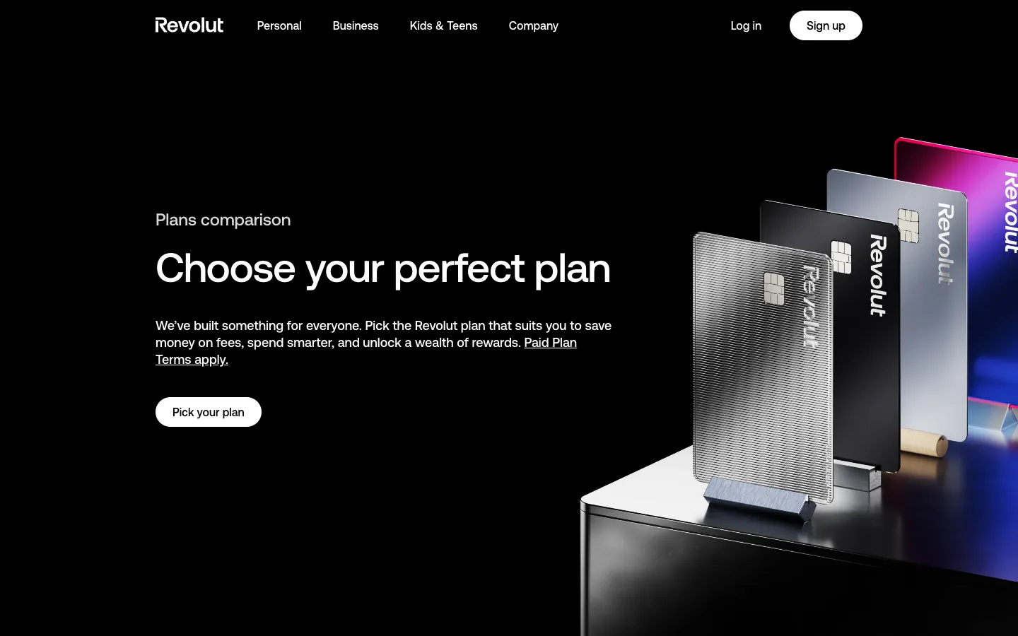
Revolut sells five plans, from free Standard through Plus at £3.99 and Premium at £7.99 to Metal at £14.99 and Ultra at £55 a month, and shows the higher plans as a value: benefits worth £1,750, £3,750, over £9,000 a year. Subscriptions brought it $936 million. Robinhood Gold sells one membership at $5 a month and makes the case with a single number: 3.6% on cash, which the page says is more than eight times the national savings average.
What to take: show the plan as the value it unlocks, in money per year or one number against the average, mark the plan you want sold, and make the top plan something you can hold.
Banking app design concepts: where the screens are going
Concepts show where the category is heading before any bank ships it. This one imagines ten AI features for a banking app and stages each as a product shot: a phone on a pastel plinth, a big number in the corner, one line of copy. Automated expense management, a checkout that pays in one tap, a family budget, a cost-of-living calculator for a city like Rome, a car connected to the bank, a credit score of 670 with the loans it opens, investment updates that explain what the news means for you. The shift is from an app that reports what happened to one that suggests what to do next.
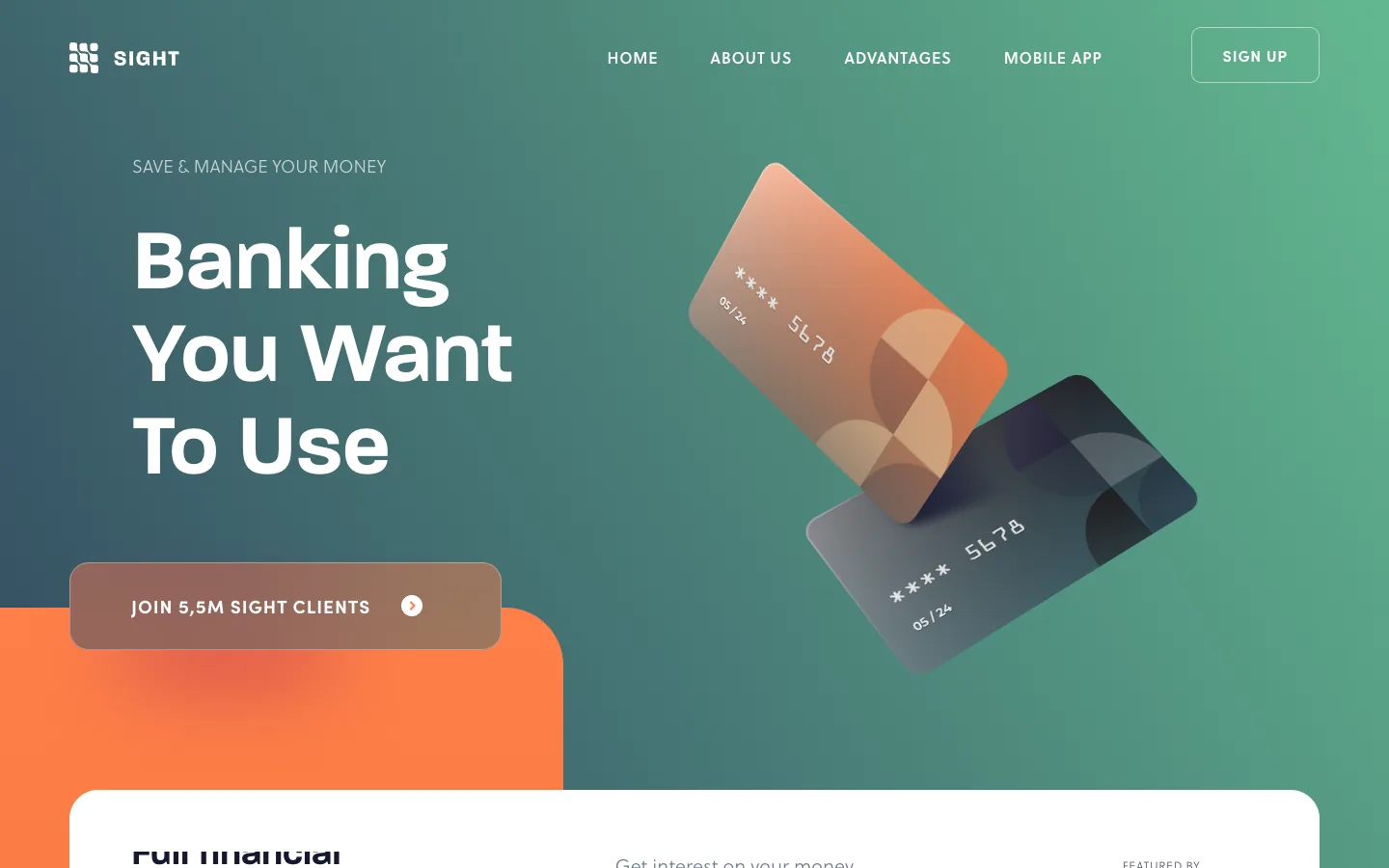
Sight is a bank that exists only as a website: a concept with a teal gradient, two cards tilted at an angle, portraits of smiling customers and a counter of five and a half million clients. It is well made, and it is the average of the category: the same gradient, the same tilted cards, the same smiles. Put it next to Lunar's melting lolly, Pinch's neon arcade or Up's sun in sunglasses, and you see why those are remembered. A concept is a good way to learn the vocabulary; the brands that grow say something the vocabulary does not.
What to take: collect concepts for ideas about the product, and check your visual direction against them. If your first screen could be swapped with a template, the card and the character have work to do.
Why others shut down: loved apps without an engine
The neobanks that closed rarely failed on design. Their customers liked them. What they missed was the engine under the screens.
- A savings rate without lending. An Australian neobank pulled customers in with a 2.25% savings account and lent almost nothing; it returned AU$252 million to 37,884 customers and closed.
- A full licence and few customers. Another Australian bank had 5,730 depositors and a loss of AU$84.3 million in a year; a planned raise fell through.
- No lending by choice. A British app with about 60,000 customers refused lending, pay-later and crypto, and said itself that such a model had less chance to survive.
- Behind the basics. A big bank's digital spin-off launched without Apple Pay, Google Pay or fingerprint login and closed with just over 11,000 customers.
- A parent that cut the engine. A loved US neobank bought by a big bank fell under a rule that capped its card fees and was shut down; its budgeting feature is what customers mourned.
What to take: before the screens, name the engine. A brief for a fintech site starts with the line of revenue each screen serves, and the design makes that line the easiest thing to do.
Entering a new country: seven design moves
One fintech launched in a new country, reached a million active credit-card users in less than two years and a valuation in the billions. We read how it did it; the moves below are the ones any team can use.
- One product, one number. A single card with one memorable promise, cashback in real money, and the full bank story saved for later.
- A person in the first mile. Staff hand-deliver the card the next day and set up the app with the customer.
- A UI kit and a voice before the full brand. The component library came within two months; UX writers were hired before brand managers.
- A local team for words and pictures. A proven playbook from elsewhere, re-tested, with copy, visuals and culture made by people from the country.
- Two looks, one brand. Light backgrounds won in feeds; the bright colour stayed for billboards and the street.
- Fast support as the first wow. Round-the-clock phone and chat, pitched as VIP for everyone.
- A city-scale moment. The bank licence announced with a free concert in the main square, then a calmer, more mature brand for the bank era.
Show the money before the sign-up
This is the principle we design fintech sites by. The winners above all let a stranger see the money before they ask for anything: Wise's fee in the calculator, Revolut's plan values in pounds a year, Lunar's four prices on the home page, Robinhood's rate against the national average. In our own fintech work the price or the saving appears before the form, because a number the visitor can check is the fastest way to trust.
BloxFi, a global API for currency conversion and settlement, has rates that depend on volume, so a fixed price table would mislead half its readers. We gave its pricing page a volume slider: drag from $100k to $10M and the rate steps from 0.90% down to 0.50%, then turns into an Enterprise plan with a dedicated account manager, and the button books a consultation.
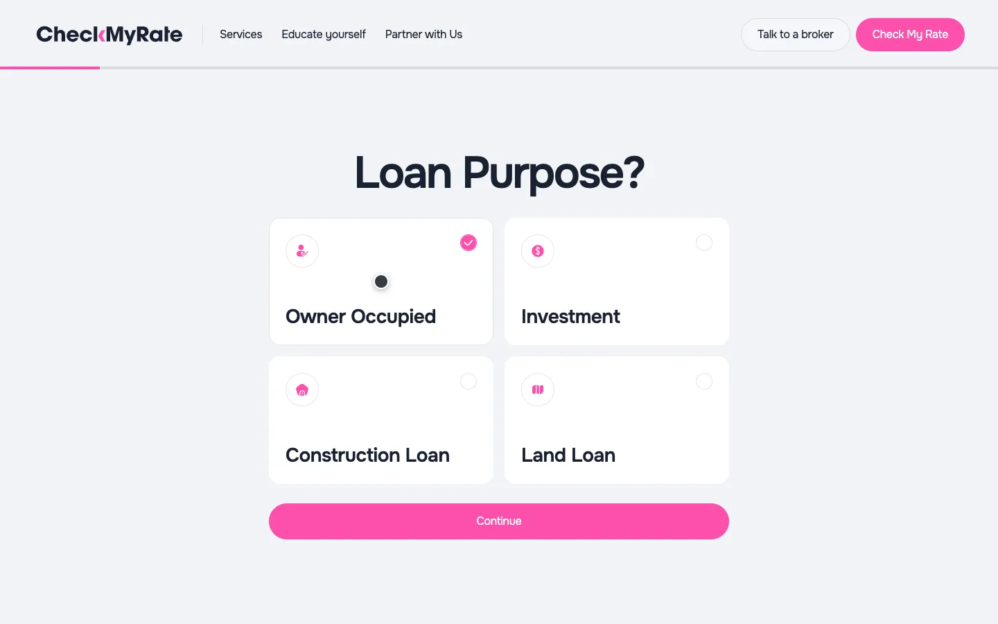
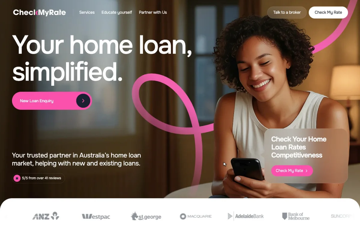
CheckMyRate, a mortgage broker in Melbourne, sells a comparison, so its first screen offers one: check your home loan rate's competitiveness, a pink button, and a questionnaire that asks one thing per screen with a thin pink progress line on top. Loan purpose, property value, loan amount, current rate, and the answer about your rate comes before any request for a phone number.
The same idea lives in the product behind a site. For FinancePay, a financing platform for businesses, we designed a dashboard that opens with available credit, the total financed, active requests and funded invoices, and puts the next invoice one button away. The full stories are in the BloxFi case and the CheckMyRate case.
Neobank examples: thirteen banks side by side
| Neobank | Card | Voice | Growth | What it earns on |
|---|---|---|---|---|
| Lunar | A pink ice lolly for travel; metal with laser engraving on top | Sunny, direct | Four plans on the home page, a QR code | Plans from 0 to 149 DKK |
| Up | On the phone: a circuit-board wallpaper | A sun in sunglasses, triangle mates | Better with mates, hook up a mate | Accounts, saving, home loans |
| Mercury | Cards for teams, 1.5% cashback | Calm, cinematic | One email field, a live demo | Business banking, cards, accounting |
| Pinch (pre-launch) | Coral and black, flying through neon | A gamers' arcade | A waitlist | Swipe fees shared with creators |
| bunq | Rainbow on the phone | Bank of the free | Five minutes, three steps | Plans from free to €18.99 |
| Robinhood Gold | Gold, 3% cash back | Serif, black and gold | One number against the average | A $5 membership |
| Wealthsimple | Matte black, shot like a watch | Editorial | A campaign on the first screen | Chequing, credit card, investing |
| Monzo | Hot coral | A public tone-of-voice guide | Crowdfunding, golden tickets, 79% word of mouth | Plans, lending |
| Nubank | Purple, a kit made for unboxing | Frank, anti-bank | 80–90% organic in 2021 | Credit card first |
| Revolut | A card per plan, up to platinum-plated | Beyond banking | Referrals tied to card use | Subscriptions, $936m |
| Wise | Green | Transparent fees | Over two-thirds word of mouth | 0.52% on volume |
| Klarna | Pink | A ginger cat, playful | Checkouts in shops | Merchant fees, memberships |
| monobank | Black, no printed number | A cat in many outfits | Jars anyone can top up | Cards and credit limits |
Neobank app and website design checklist
If you are writing a brief for a fintech site or app, go through the customer's seven moments with this list.
- Hears from a friend. An invitation built into the product, with a physical metaphor and a bonus after the friend's first payment.
- Opens an account. One promise, one action, the steps to a card counted and shown on the site.
- Holds the card. A colour or material nobody else has, a designed arrival, a card per plan if you sell plans.
- Pays for the first time. An instant notification with the amount, the place and what it earned.
- Lives with it. Money with names: jars, pots, boxes, and goals others can add to.
- Writes to support. Support in the messengers people use, around the clock, a human voice.
- Pays you. Every screen serves one named money engine; plans shown as value per year; the price before the sign-up.
We design fintech sites and products on Webflow and Next.js: APIs and payments, brokers and lenders, dashboards. If your folder of references is already open, send it with the product and the engine it earns on, and on a call we will go through which of these decisions your site needs first.
«The guys over-delivered and addressed our request changes promptly, resulting in a smooth engagement.»
 Artem KuzmychCOO · Clutch
«Every our client says that the main thing that makes them trust us and choose us is our website and its design. So, the result speaks for itself.»
 Iryna HurievaCo-Founder · Clutch
Websites and products we shipped
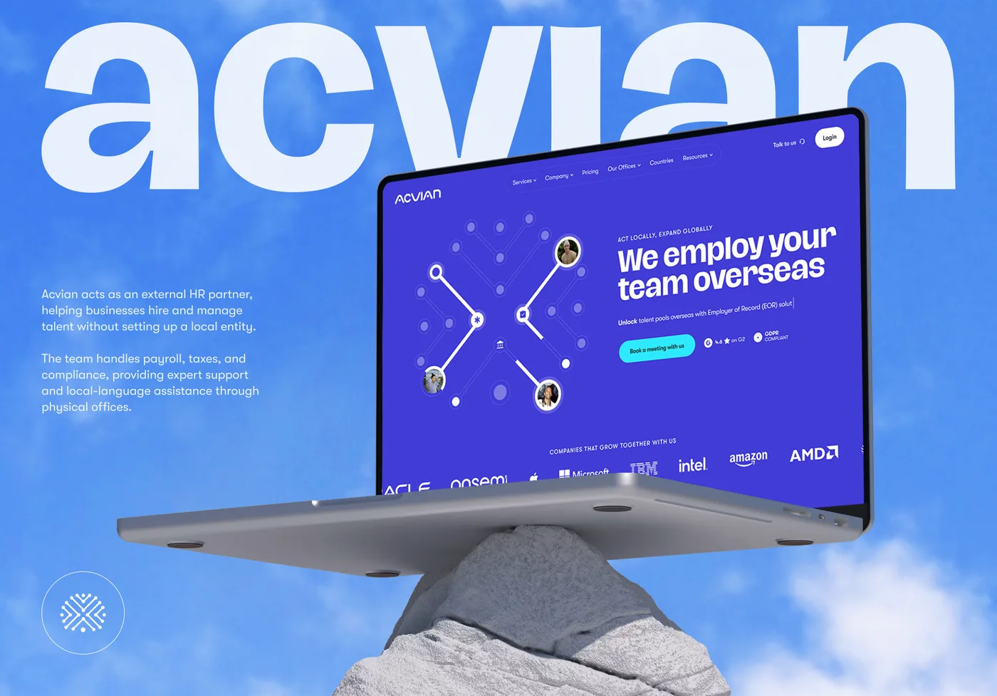 Acvian30+ pages in 60 days: a new Webflow site for a global HR partner
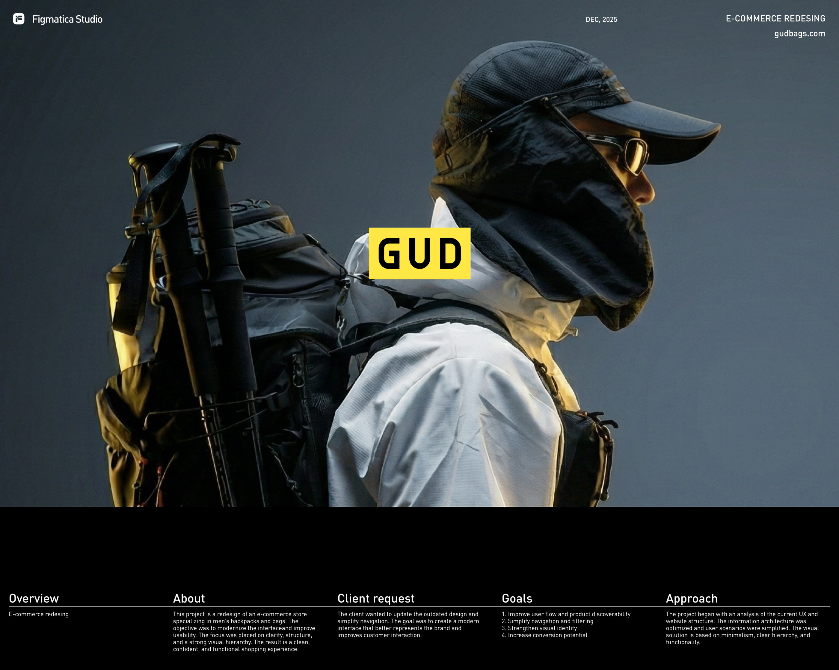 GUD5.5 weeks from research to final design: an online store redesign for a backpack brand
- BloxFi80+ country pages from one template: how a fintech API went global
Want the same for your site? 30 minutes, free.
Book a free call ↗Sources
- Nu Holdings Form F-1, SEC, 2021
- Monzo Annual Report 2026, Monzo, 2026
- Wise Annual Report and Accounts FY2024, Wise, 2024
- Wise Group plc full year 2026 results, Wise (GlobeNewswire), 2026
- Revolut Annual Report 2025, Revolut, 2025
- Chime Financial Form S-1, SEC, 2025
- Klarna Q2 2026 earnings release, SEC, 2026
- Winning the Digital Banking Battle in Asia-Pacific, BCG, 2021
- Neobanking in the United States, Simon-Kucher, 2025
- Monzo growth, Tom Blomfield
- The story behind the Monzo card, WIRED, 2018
- David Vélez and Nubank, Rest of World, 2020
- Welcome to Nubank: the story behind our welcome kit, Building Nu, 2017
- Klarna's AI and the return of humans, Fortune, 2025
- CFPB orders operator of Cash App to pay $175 million, CFPB, 2025
- Xinja Bank return of deposits completed, APRA, 2021
- Volt Bank return of deposits successfully completed, APRA, 2022
- Fintech app Dozens to close down, BusinessCloud, 2022
- Bó, the digital bank from RBS, Verdict, 2020