Contents
- The short version
- Fintech websites by Figmatica
- Fintech API website: BloxFi, by Figmatica
- Mortgage broker website: CheckMyRate, by Figmatica
- Fintech dashboard: FinancePay, by Figmatica
- Premium card website: Moto
- Card app website: Tuyo
- Digital bank website: Xapo Bank
- Lending website: Possible Finance
- Cash advance app website: Credit Genie
- Payments platform website: Run Payments
- Payment gateway website: MatrixPay
- Mortgage platform website: Europace
- Personal finance app website: Mojek
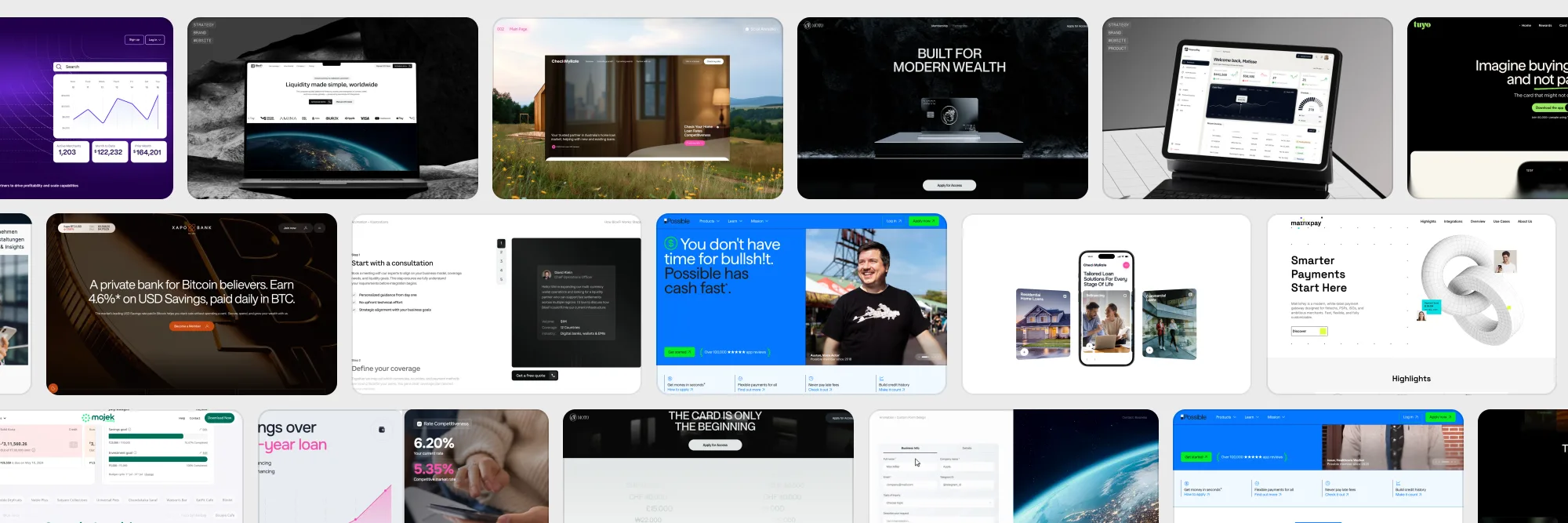
- Eleven fintech websites side by side
- Fintech website design: what the strongest share
- Frequently asked questions
A currency API with 80+ country pages, a mortgage broker in Melbourne, a metal card for modern wealth, a bank for Bitcoin believers and a payments OS. Our fintech work first, then nine sites that design competitions singled out: where each one puts the number, the proof of safety and the button.
A fintech site has a harder job than most. The visitor is about to hand over money, a bank login or a company's payment flow, and they give the page a few seconds to prove it deserves that. A beautiful gradient buys attention. It takes something else to buy trust: a number that means something, a sentence about where the money sits, a product that is visible before the sign-up.
We start with three fintech projects of our own, with the clips from their cases, because that is where we can show the whole process rather than the surface. Then nine fintech sites that web design competitions singled out: cards, a bank, lenders, payment infrastructure, a mortgage platform and a money app. For each, what it does well and what to take into your own brief.
The short version
- A calculator sells better than a price table. BloxFi's price depends on the currency pair and the volume, so the site computes it instead of listing it.
- One number carries the first screen. Xapo Bank: 4.6% on USD savings, paid daily in BTC. Credit Genie: up to $150 in minutes.
- Safety is answered next to the button. Tuyo, Credit Genie and Mojek explain custody, encryption and bank linking in plain words on the home page.
- B2B payments open a door per audience. Run Payments splits partners, merchants and developers; Europace splits lenders, brokers and disruptors.
- Real people beat stock photos. Possible Finance puts a customer with a name and a job on its first screen, and CheckMyRate puts the founder's words on its home page.
Fintech websites by Figmatica
A global currency API that needed to look like infrastructure you can trust with money in 120+ currencies, and a mortgage broker whose mission is to make the market more transparent. Both went from brief to a live Webflow site with our team doing design, development and motion. Each card plays the site; below, how we built them.
Fintech API website: BloxFi, by Figmatica
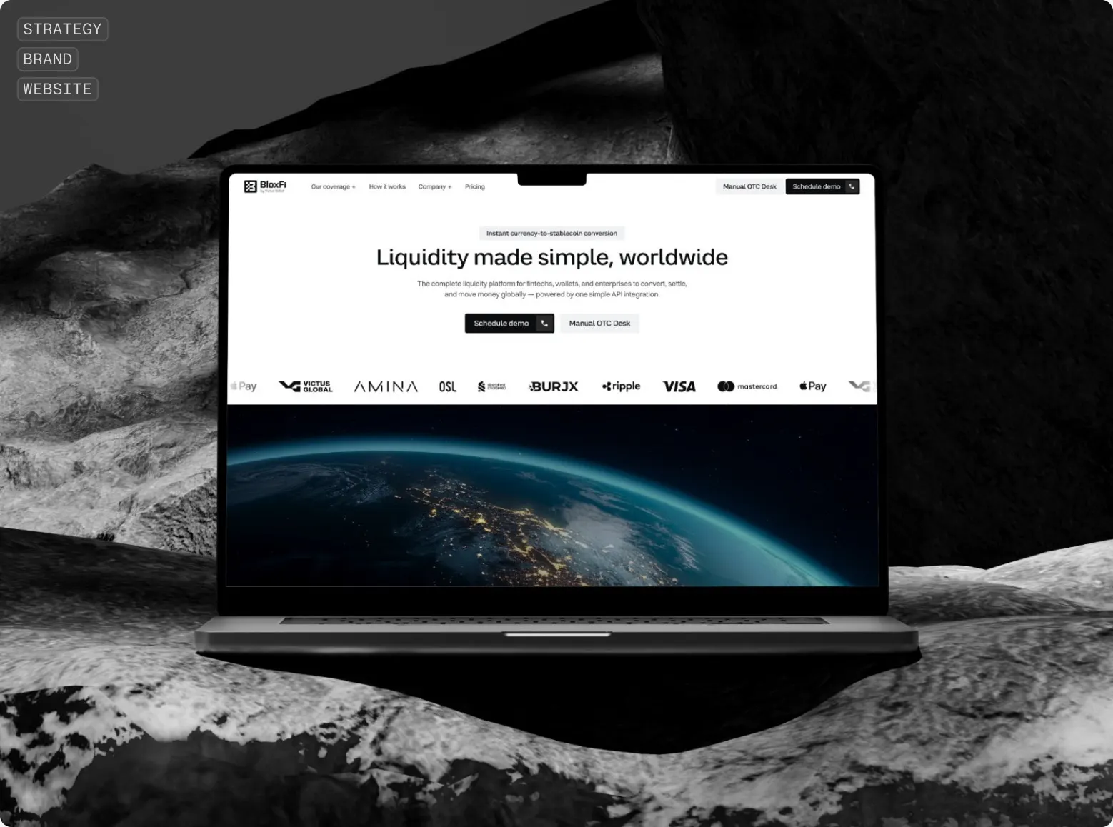
BloxFi converts and settles money across borders through one API, for fintechs, digital wallets and large businesses. The product was ready. What it lacked was a face: the site had to present the company as infrastructure, the kind of thing a finance director signs off without a second meeting.
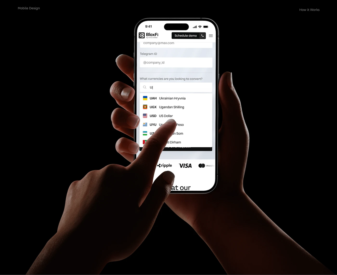
We started from the price. BloxFi's rates depend on the currency pair and the volume, so any fixed table would mislead half its readers. In its place we put a calculator: pick the pair, type the amount, and in a second the page shows a concrete figure and leads to a business request.
Then the map. Every country where BloxFi works needed its own page with its currency, coverage and questions, and there are more than eighty of them. We built one template in Webflow and let the CMS generate the rest: adding a market is one new record in the base. How that template is put together is a separate article, 80+ country pages from one Webflow template.
And the motion. The mark starts as one solid block and breaks into connected parts, the way BloxFi gathers scattered payment rails into one API. The How it works block walks through the integration step by step, one animation per stage of the money's path, so a client understands the product before the sales call. The full story, with the brand and the mobile screens, is in the BloxFi case.
Mortgage broker website: CheckMyRate, by Figmatica
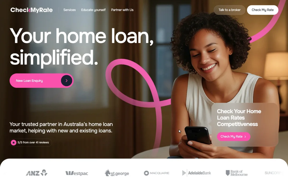
CheckMyRate is a Melbourne service that helps homeowners check whether their mortgage rate is still competitive and find a better one. Its founder wanted a site that explains first and sells second, because the whole point of the company is a more transparent market.
The first screen assembles itself in front of you: the headline, the button, a pink line and a photo. As you scroll, the header folds into a pill, the loan types sit in a carousel, the reasons to trust the broker stack up like cards, and the FAQ opens its answers in place.
On the phone the eight loan types become a carousel of photo cards: one fully visible, the next peeking from the edge, so it is obvious there is more to swipe. Every type answers a stage of life, and every card leads to a broker.
The rate check sits next to what it is worth: the savings over a 30-year loan. Seven sections and two templates carry the rest: home, leadership, an educational blog, partnership, the application, seminars and contacts. The project took two months in five stages, from research to testing and support after launch; the whole board is in the CheckMyRate case.
Figmatica team quickly understood our vision and delivered a website that feels clear, trustworthy, and on-brand. It looks really great and helps us reach and convert more users across Australia.
Fintech dashboard: FinancePay, by Figmatica
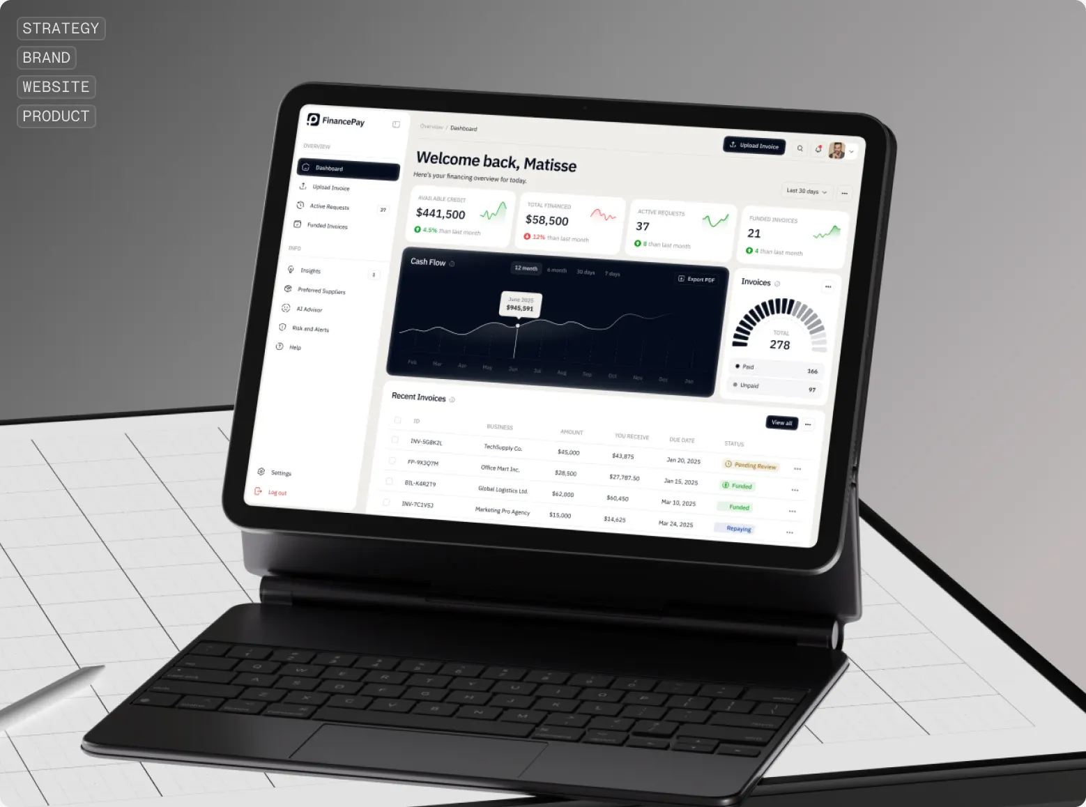
Fintech is also the product behind the site. For FinancePay we designed the brand, the website and the product: a financing dashboard for businesses. It opens with a greeting and four tiles, available credit, total financed, active requests, funded invoices, then a cash flow chart, a gauge of paid and unpaid invoices and a table of recent invoices where each row carries its status: pending review, funded, repaying. The main button uploads the next invoice.
Premium card website: Moto
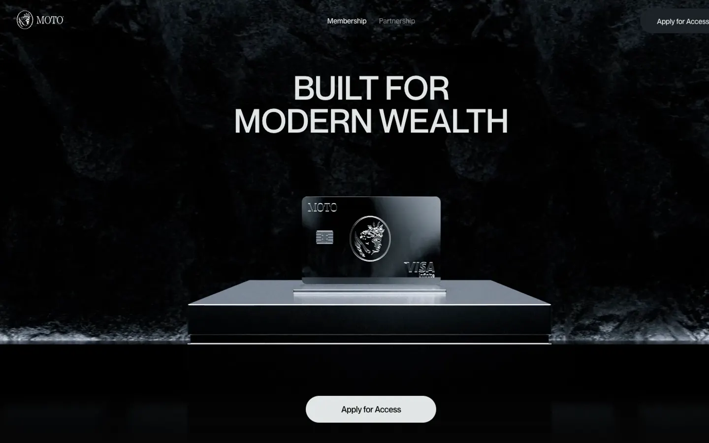
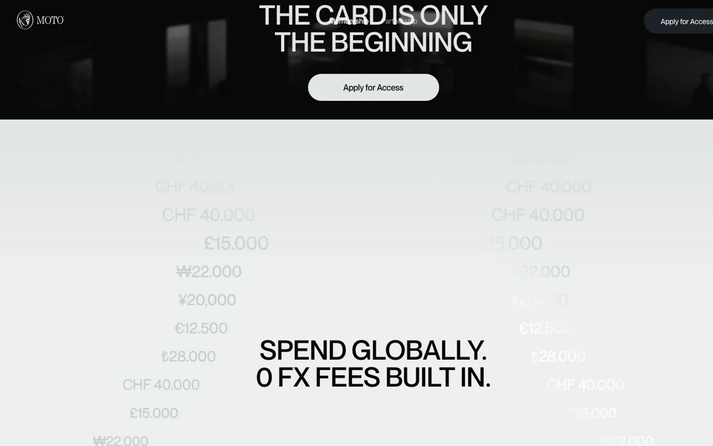
Moto opens in darkness: a black metal card on a stone plinth, lit like jewellery, and three words above it, Built for modern wealth. There is one action on the page and it repeats all the way down: Apply for Access. Not sign up, not open an account. Access, the way a private club says it.
Further down the card becomes a life: notifications slide in, a hotel booked, a jet booked. Then Spend globally, 0 FX fees built in, with amounts falling across the screen in yen, francs, pounds, won, euros and lira.
What to take: a word for the relationship. Access, membership, members: the vocabulary sets the price level before any number appears.
Card app website: Tuyo
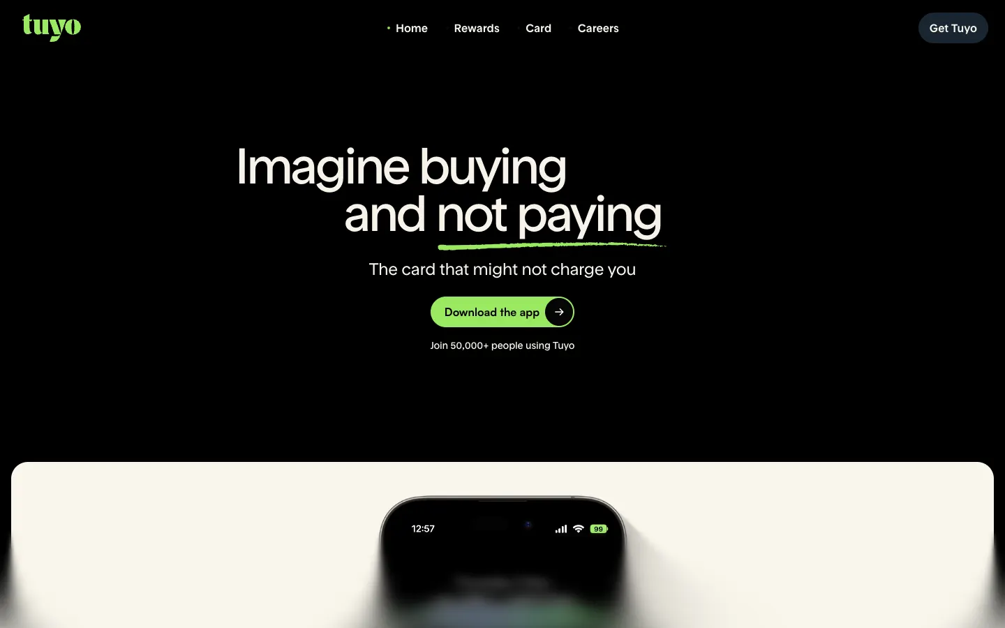
Imagine buying a bagel and not paying. The word in the middle changes as you watch, coffee, paella, a smoothie, each with its emoji, and the line underneath explains the trick: the card that might not charge you. Under the headline, one button, Download the app, and a count, 50,000+ people using Tuyo.
The mechanic has a name, Buy Now, Pay Maybe, and around it four short cards: pay in 175M+ places with Apple Pay and Google Pay, free global transfers in several currencies, yields on USDC, EURC and BTC, 15,000+ tokens across five networks. The FAQ opens with the question every reader has: how secure is my money. The answer says self-custodial, regulated partners, licensed card issuers, and an FX spread usually under 1%.
What to take: one playful mechanic in the headline and the safety question first in the FAQ.
Digital bank website: Xapo Bank
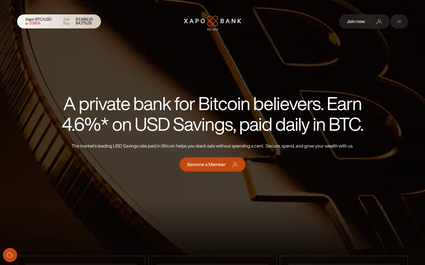
Before the page opens, a legal notice: a regulated bank in Gibraltar, passported into the United Kingdom, and a button to enter. Then the first screen: in the top corner a live BTC/USD ticker with sell and buy prices ticking, in the centre one line, Bitcoin-first since 2013, and the number that sells it, 4.6% on USD savings, paid daily in BTC.
Further down the bank gives its street address, One Grand Casemates Square in Gibraltar, and says members are always welcome to walk through the door and meet the people behind their bank.
What to take: a live number at the top and a door you can walk through. For a digital bank, a street address is proof.
Lending website: Possible Finance
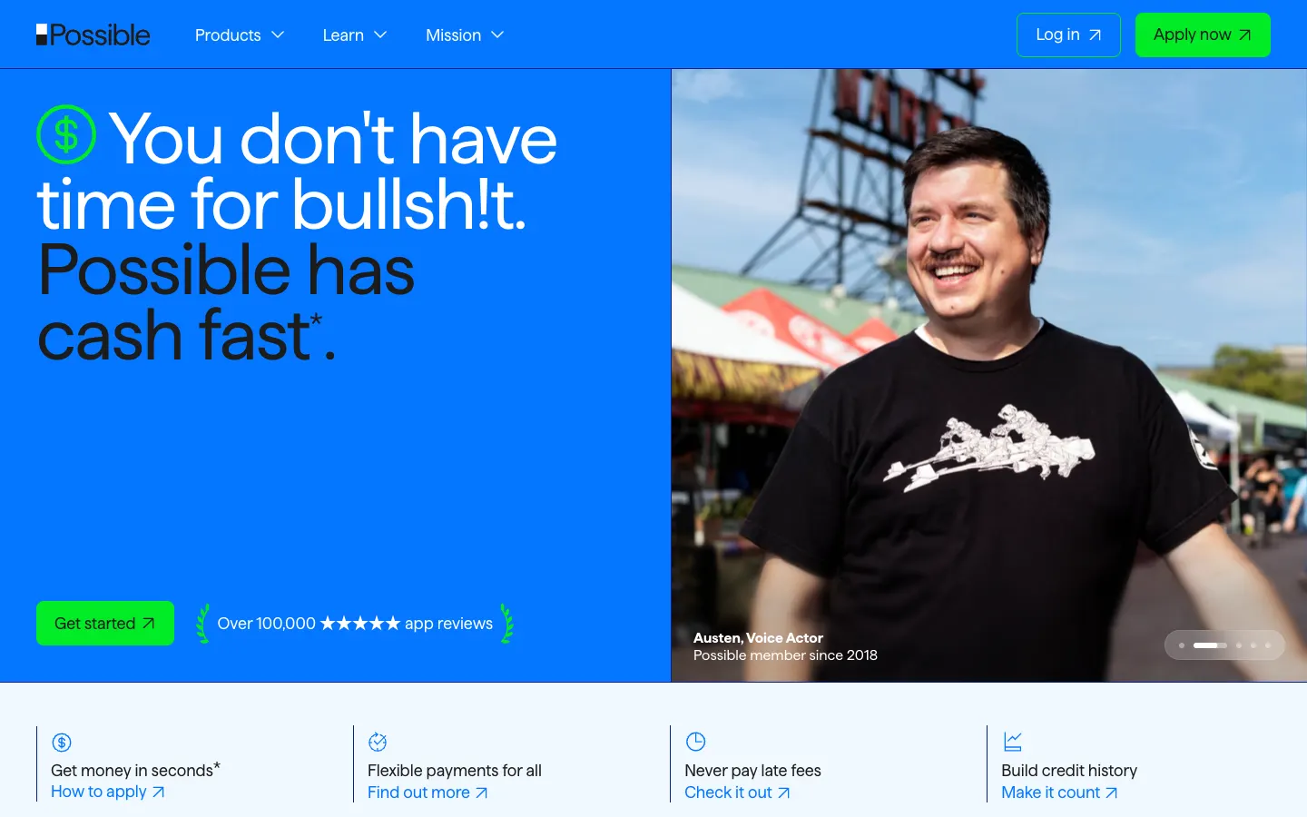
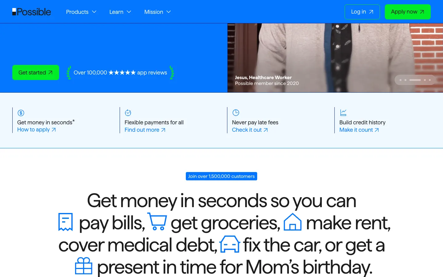
Bright blue, a green button, and a headline no bank would print: You don't have time for bullsh!t. Possible has cash fast. Next to it, a customer photo with a first name and a job, a voice actor, a healthcare worker, a sales representative, switching like a slideshow. Under it, Over 100,000 five-star app reviews and a row of four promises: money in seconds, flexible payments, no late fees, credit history.
Then one long sentence with icons set into it: get money in seconds so you can pay bills, get groceries, make rent, cover medical debt, fix the car, or get a present in time for Mom's birthday. Over it, a count, over 1,500,000 customers. The company calls itself a Public Benefit Corporation and gives a Financial Relief Plan its own page.
What to take: the reasons in the reader's words. Nobody borrows $500 for liquidity; they borrow it to fix the car.
Cash advance app website: Credit Genie
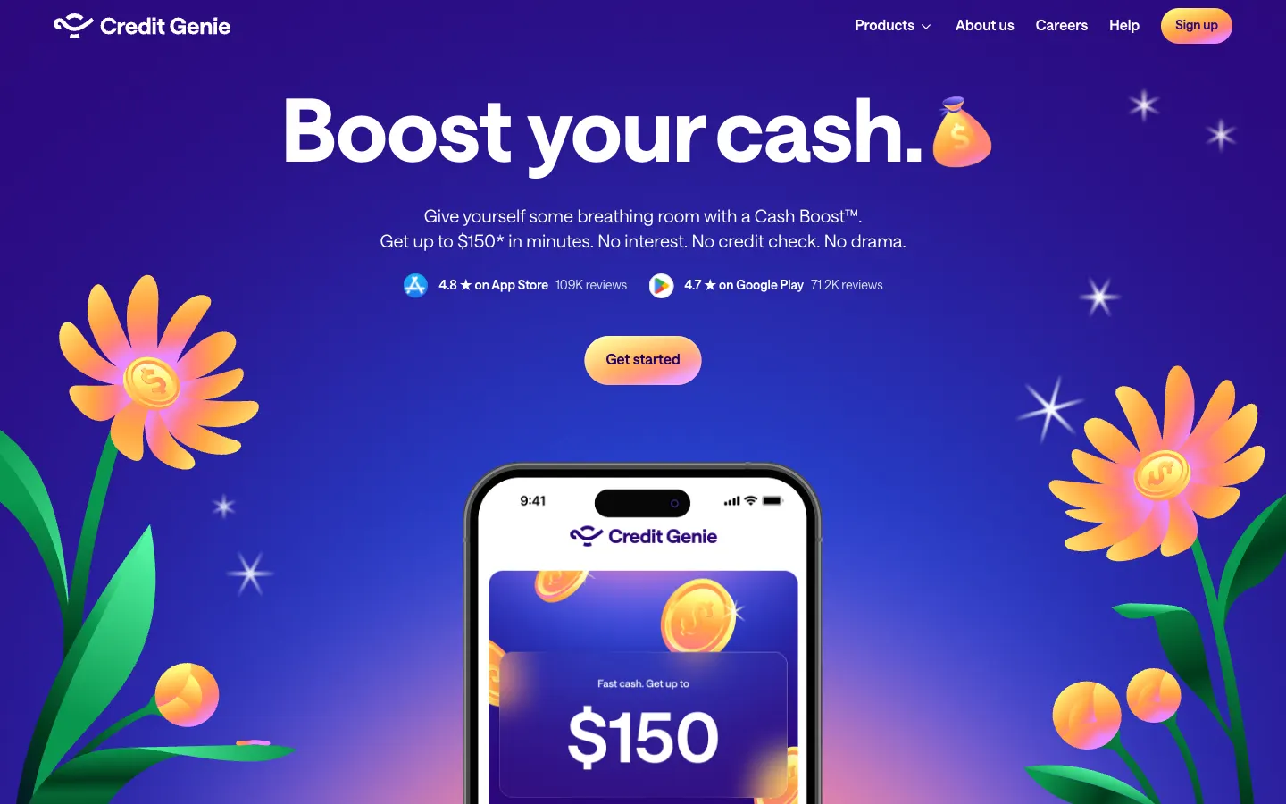
Purple, illustrated flowers, a phone with $150 on the screen. Boost your cash, and the last word keeps changing: money, account. Then the offer in four short sentences: up to $150 in minutes. No interest. No credit check. No drama. Right under it the ratings, 4.8 on the App Store with 109K reviews and 4.7 on Google Play with 71.2K.
The how-it-works block has three steps and a joke in each: sign up in two minutes, maybe less if you're a genie; link your bank; score an advance. The safety block keeps the same voice and still names the facts: bank-grade encryption, 256-bit bank linking, no bank login stored, no data sold.
What to take: say what is absent. No interest, no credit check, no drama answers three fears in six words.
Payments platform website: Run Payments
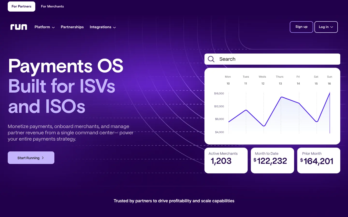
Payments OS, built for ISVs and ISOs, and next to the headline the product itself: a dashboard with a search bar, a volume chart and three tiles, 1,203 active merchants, $122,232 month to date, $164,201 prior month. The reader sees the screen they will work in before reading a word about it.
The top bar splits the audience before anything else: For Partners, For Merchants. The menu adds a third door for developers with the API. The button says Start Running.
What to take: the dashboard as the hero image. For a B2B tool, the interface is the most honest picture.
Payment gateway website: MatrixPay
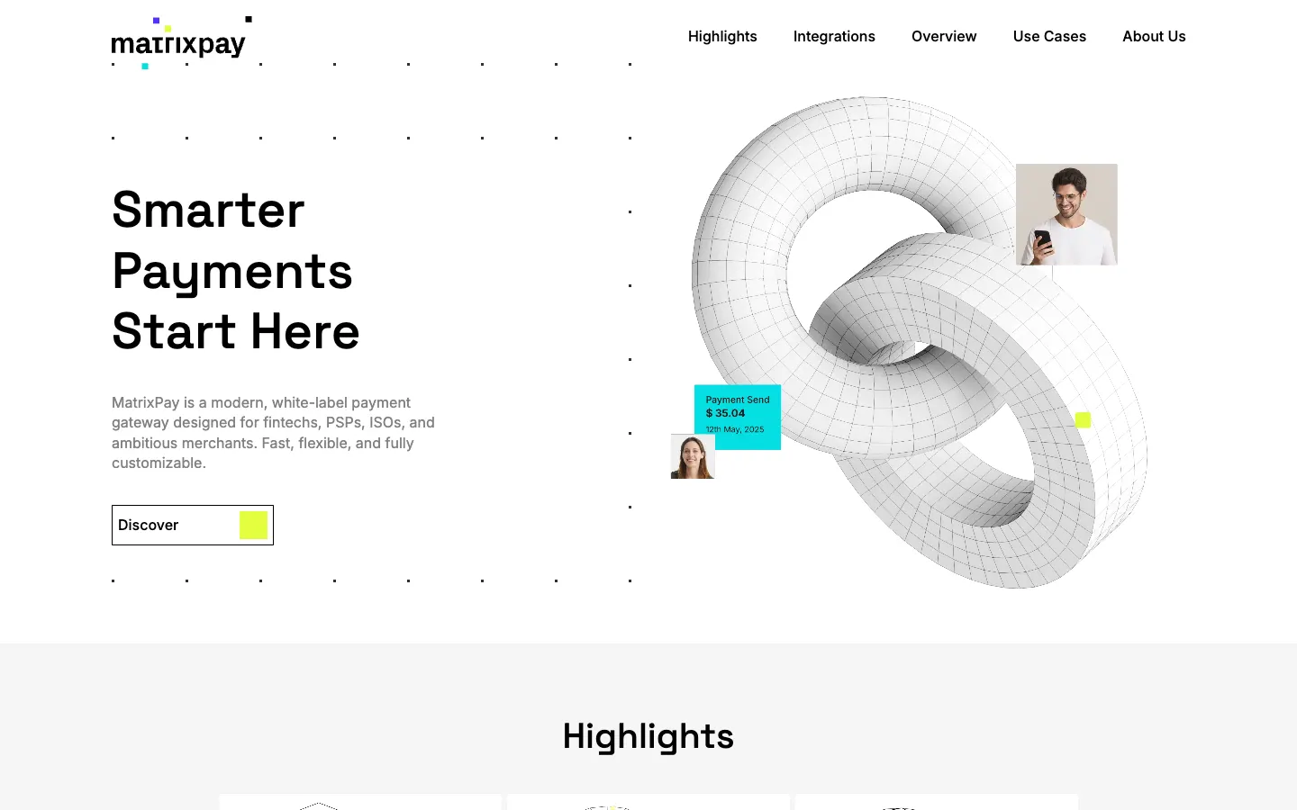
Smarter Payments Start Here, and a white 3D chain link turning slowly beside it. The first paragraph names the buyer precisely: a white-label payment gateway for fintechs, PSPs, ISOs and ambitious merchants. The highlights read like a procurement checklist: multi-acquirer support, smart routing, cascading and tokenization, local methods such as Pix, Blik, SEPA and Open Banking, PCI DSS, GDPR and DORA readiness, cloud or on-premise.
What to take: the acronyms up front. The person who signs a payment gateway reads for compliance first, and this page lets them tick boxes in the first scroll.
Mortgage platform website: Europace
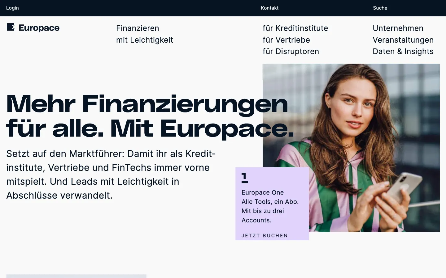
The German mortgage marketplace speaks to three audiences and names them in the menu: für Kreditinstitute, für Vertriebe, für Disruptoren, lenders, brokers and newcomers. The headline, Mehr Finanzierungen für alle, More financing for everyone, sits beside a person with a phone and a small card offering Europace One, all tools in one subscription with up to three accounts.
Then one number for scale, 7 billion euros in transaction volume a month, and one for breadth, over 800 product providers on the platform.
What to take: one number per claim. Scale gets a figure, breadth gets a figure, and neither needs an adjective.
Personal finance app website: Mojek
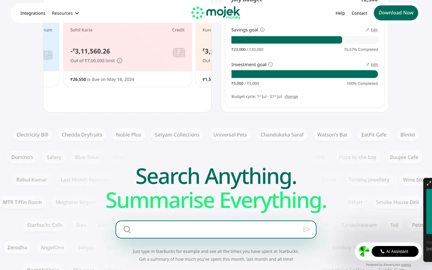
Save Thousands Every Single Month, in green, over a phone with a budget screen. The second paragraph answers the fear before it forms: Mojek connects to accounts through the government-regulated Account Aggregator framework, and connecting a bank needs a one-time password.
The block that sells is a search field surrounded by the names of shops and cafés: Search Anything. Summarise Everything. Just type Starbucks and see every time you spent there, this month, last month, all time.
What to take: show one query the reader would type. A concrete example explains an AI feature faster than the words AI-powered.
Eleven fintech websites side by side
| Site | Type | Main action | What to take |
|---|---|---|---|
| BloxFi (Figmatica) | Currency API | Schedule a demo | A calculator instead of a price table |
| CheckMyRate (Figmatica) | Mortgage broker | Check my rate | The check next to what it is worth |
| Moto | Premium card | Apply for Access | A word for the relationship |
| Tuyo | Card and app | Download the app | One mechanic in the headline |
| Xapo Bank | Digital bank | Become a Member | A live number and a street address |
| Possible Finance | Lending | Get started | Reasons in the reader's words |
| Credit Genie | Cash advance app | Get started | Say what is absent |
| Run Payments | Payments platform | Start Running | The dashboard as the hero |
| MatrixPay | Payment gateway | Discover | Compliance acronyms up front |
| Europace | Mortgage platform | Book Europace One | One number per claim |
| Mojek | Personal finance app | Download now | One query the reader would type |
We design and build fintech websites on Webflow and Next.js: APIs and payment infrastructure, brokers and lenders, dashboards for the product behind them. If your folder of references is already open, send it with the product, and on a call we will go through which of these pieces your site needs first.
«Every our client says that the main thing that makes them trust us and choose us is our website and its design. So, the result speaks for itself.»
 Iryna HurievaCo-Founder · Clutch
«The guys over-delivered and addressed our request changes promptly, resulting in a smooth engagement.»
 Artem KuzmychCOO · Clutch
Websites and products we shipped
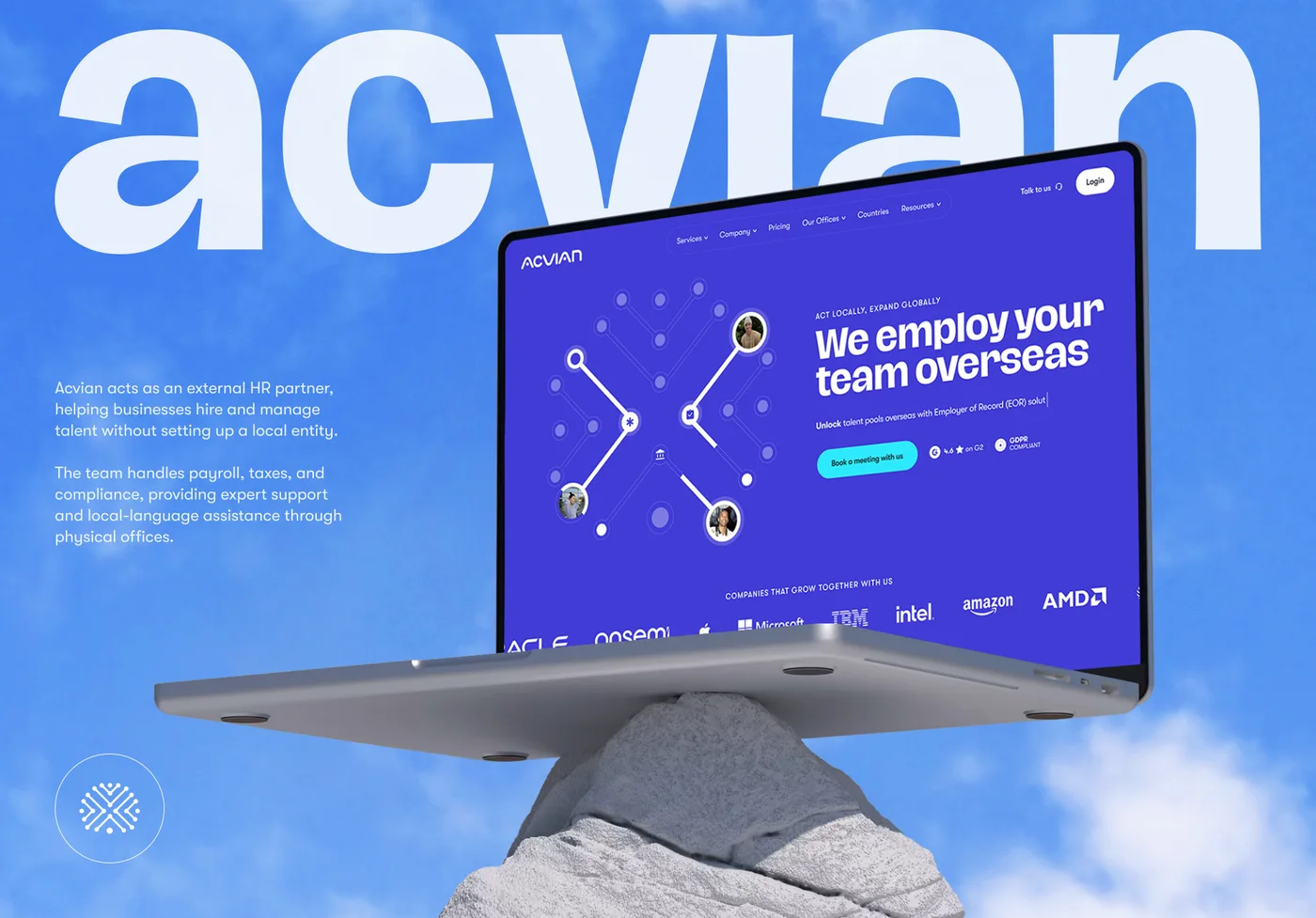 Acvian30+ pages in 60 days: a new Webflow site for a global HR partner
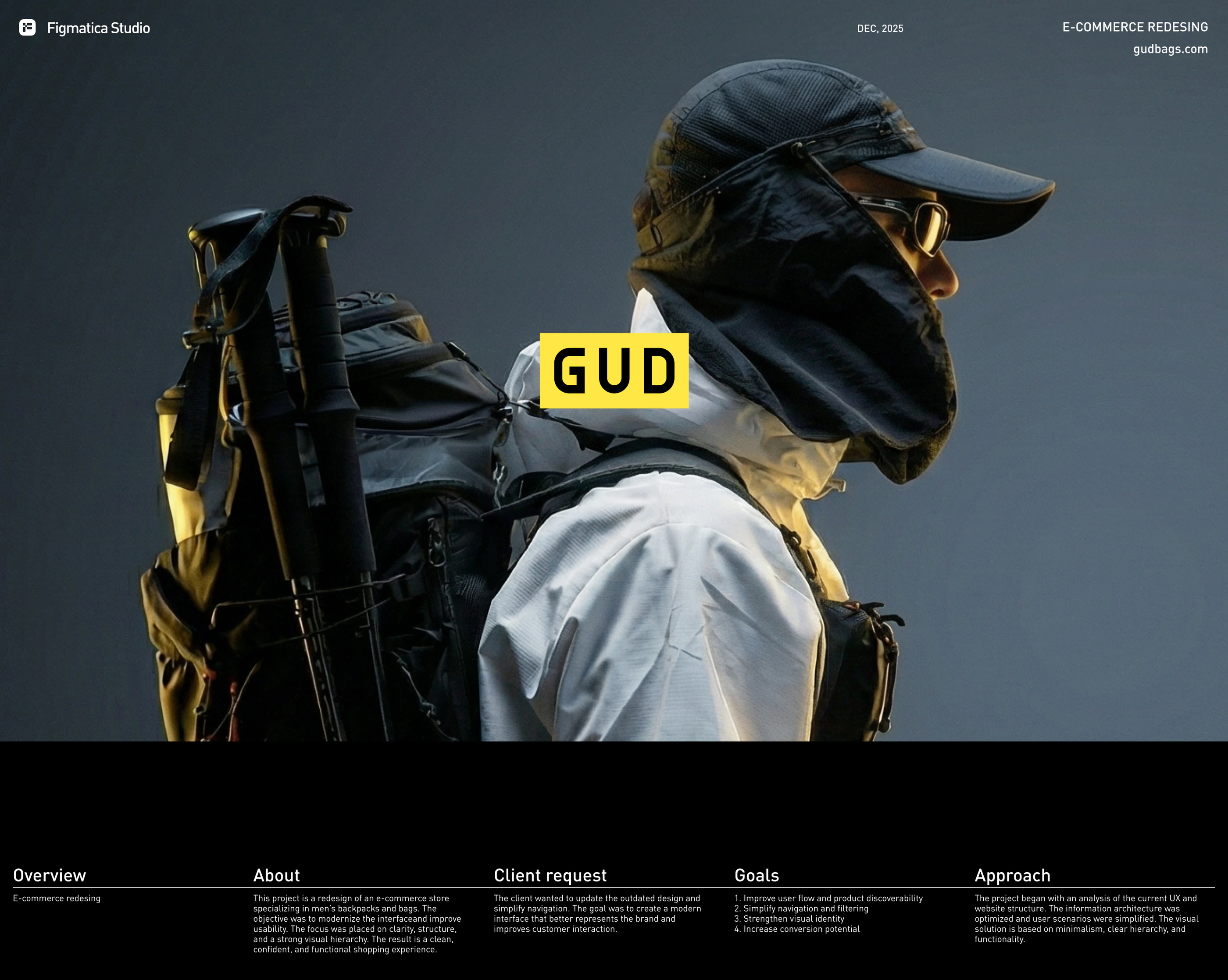 GUD5.5 weeks from research to final design: an online store redesign for a backpack brand
 BloxFi80+ country pages from one template: how a fintech API went global
Want the same for your site? 30 minutes, free.
Book a free call ↗