Contents
- What is depth scrolling?
- Why did KFC need a promo site built for a QR code?
- How does Apple-style parallax scrolling work?
- How we built the KFC depth-scrolling site
- How do you design a QR code promo landing page?
- How do you keep parallax fast and accessible on mobile?
- When does parallax help, and when does it hurt?
- What came out of the KFC project
- Checklist before you launch a parallax promo page
- Frequently asked questions
Depth scrolling is a parallax technique: layers of a page move at different speeds as you scroll, so the screen feels three-dimensional. We used it on a mobile KFC promo site that customers open from a QR code on in-store kiosks, and the case went viral.
We built a promo website for KFC that tells a short story through Apple-style depth scrolling, and people open it on their phones from a QR code on the self-service kiosk. Every UX designer is chasing the same thing: a digital experience people actually enjoy. When we took on this project, we knew an ordinary landing page would not do it.
This post covers what we built, how parallax works under the hood, how to keep it fast and accessible on a phone, and when you should not use it at all.
- Motion serves the story. Parallax works when the page tells a short, linear story. It gets in the way when people came to find something fast.
- Content first, motion second. Every screen must read well with the animation switched off, for people who ask for reduced motion and for search engines.
- Phones set the budget. Animate only transform and opacity, keep layer images light and check Core Web Vitals on a mid-range phone.
- A QR visit needs one action. Someone standing at a kiosk wants the offer. Show it fast and make getting the promo code the only goal of the page.
Key takeawayThe result: a design that went viral, built around Apple-inspired depth scrolling.
What is depth scrolling?
Depth scrolling is a form of parallax scrolling in which the foreground, the midground and the background of a page move at different speeds as you scroll, which creates an illusion of depth on a flat screen.
The idea comes from how we see the real world. When you look out of a train window, the fence next to the track flies past while the hills on the horizon barely move. Your brain reads that difference in speed as distance. A web page can fake the same cue: the layer that moves slowest feels furthest away.
Apple uses variations of this on its product pages, where scrolling drives the animation of a device, a headline or a background. That is why people search for it as "Apple style scroll animation". In practice it is a mix of parallax, pinned sections and scroll-linked animation.
Why did KFC need a promo site built for a QR code?
KFC needed a mobile page that would catch a customer in the restaurant, at the moment they hesitate before ordering, and give them a reason to act: a promo code.
KFC is a global fast-food brand that people love, and it knows it has to stay ahead of the competition online. Mobile browsing keeps growing and expectations keep rising. KFC wanted a website that would show off its iconic brand and give visitors an immersive, enjoyable experience.
The entry point shaped every design decision. Nobody finds this page through a search box. People scan a code on the self-service kiosk, so the site opens on a phone, often on mobile data, while the person is standing in a queue. That context rules out long pages, heavy downloads and anything that needs a login.
How does Apple-style parallax scrolling work?
Apple-style parallax works by tying the position of each layer to the scroll position and multiplying it by a different speed factor, so layers slide past each other as the page moves.
Our team brainstormed with the marketers from Idealers on how to win over KFC's audience in a way nobody else had. Apple's product pages were the reference we kept coming back to.
We drew inspiration from Apple's parallax scrolling, which creates an illusion of depth by moving several layers at different speeds.
Under the hood, a depth-scrolling section is built from a few parts:
- Layers. Each depth plane is its own element: a background image, a mid layer with objects, a foreground with the product or the text. Three layers are usually enough to read as depth. More layers mean more images to download and more work for the phone.
- Speed factors. The background moves at a fraction of the scroll distance, the foreground moves at full speed or slightly faster. Small differences look natural. Large ones look like the page is breaking apart.
- A scroll timeline. Something has to connect scroll to movement. Modern browsers can do it in CSS with scroll-driven animations, and website builders offer scroll-based interactions. Check current browser support and keep a fallback for browsers that do not have it.
- Pinned scenes. For the Apple feel, a section often stays pinned on screen while the scroll drives what happens inside it, then releases and the page continues.
How we built the KFC depth-scrolling site
We designed a multi-layered storytelling website where each scroll step moves the story forward, from the product close-up to where the ingredients come from.
We treated the page like a storyboard before we treated it like a layout. Each screen had one idea and one image, and we decided which layer carries that idea before any motion was added. Motion came last, as a way to link the scenes.
As users scroll, the foreground and background move at different speeds, which keeps the page lively. The landing page opens with a close-up of KFC's signature fried chicken, and it makes you hungry right away. Further down, the background shows the ingredients travelling from farm to table. The visuals and the subtle parallax together create an immersive experience that people connect with emotionally.
How do you design a QR code promo landing page?
A QR code promo landing page should load fast on mobile data, show the offer on the first screen and lead to one action, such as getting a promo code, without a login.
On the KFC site the flow is short: the customer hesitates at the kiosk, scans the code, explores the site, learns about the benefits and gets a promo code. The rules below come from that project and from the NN/g QR code usability guidelines.
- Say what the code gives. Put a short line next to the QR code, like "scan to get a promo code". People scan when they know what they will get.
- Link straight to the campaign page. Never send a QR scan to a homepage. The page it opens should continue the message printed on the kiosk.
- Make the first screen light. The first screen should render from one optimised image and real text. Load the heavier parallax layers for later scenes after that.
- One goal, no login. Every scene should lead to the promo code. Extra forms, sign-ups and menus lose people who are about to order.
- Make the code easy to use. Show the promo code in large text, add a copy button and tell people where to enter it. They will switch back to the kiosk or an app with it.
- Tag the link. Add campaign parameters to the QR URL so scans show up as their own traffic source in analytics. Plan how you will measure the campaign before launch, not after.
- Plan the end of the campaign. Printed codes stay on kiosks longer than promotions last. When the offer ends, the URL should still open something useful.
How do you keep parallax fast and accessible on mobile?
Keep parallax fast by animating only transform and opacity with light images, and keep it accessible by turning the motion off for people who set their device to reduce motion.
A depth effect that stutters on a phone does more harm than a static page. These are the rules we check before a scroll-heavy page ships:
- Animate transform and opacity only. The browser can move these on the GPU without recalculating the layout. Animating top, margin, width or background-position makes the page reflow or repaint on every frame.
- Do not read layout in scroll handlers. If you use JavaScript, update positions inside requestAnimationFrame and pause layers that are off screen. Prefer CSS scroll timelines where the browser supports them.
- Watch Core Web Vitals. Google's Core Web Vitals count as "good" a Largest Contentful Paint within 2.5 seconds, an Interaction to Next Paint of 200 milliseconds or less and a Cumulative Layout Shift of 0.1 or less. Big hero layers hit LCP first. Layers without fixed dimensions cause layout shift.
- Budget the images. Export layers in modern formats, crop them to what the phone actually shows and lazy-load everything below the first screen. Do not lazy-load the first image.
- Respect reduced motion. Use the prefers-reduced-motion media query to show static layers to people who turned on reduced motion. Scroll-linked motion can trigger dizziness and nausea in people with vestibular disorders. WCAG names parallax in Success Criterion 2.3.3, Animation from Interactions.
- Keep text as real text. Headlines and the offer should be HTML text, not part of a layer image. Screen readers, search engines and AI assistants can then read the page. This is the base of our SEO and AEO approach.
- Test on a real mid-range phone. A design laptop hides the problems. Open the page on an average Android phone over mobile data and scroll fast.
When does parallax help, and when does it hurt?
Parallax helps on short, visual pages that tell one story in order, such as a promo or a product launch, and it hurts on pages where people need to find, compare or read information quickly.
Nielsen Norman Group tested parallax with users and found real costs: content that loads slowly, text that scrolls past before people can read it and effects that users simply miss. Their article on parallax is worth reading before you commit. Our rule of thumb:
- Use it for promo pages, product launches and brand stories where the visit is short, the sequence matters and there is one action at the end.
- Skip it for menus, prices, checkout, documentation, dashboards and long articles. People scan these pages, and motion slows them down.
- Keep it to one scene on pages that must rank in search or convert on a cold visit. A depth effect in the hero is enough. The rest of the page should be plain and quick to scan.
The mistakes we see most often: motion on every section, so nothing stands out; text baked into images; a slow first screen because every layer loads at once; and no fallback, so the page breaks when motion is off. If a page needs to rank or scale across many markets, a clean template usually beats a heavy effect. We wrote about that in our story of 80 country pages on one Webflow template.
What came out of the KFC project
The KFC promo site went viral: people shared the scrolling effect on social media, and our partnership with KFC continues.
Once the site went live, it quickly got people talking online. Both regular users and design enthusiasts picked up on the Apple-inspired depth scrolling. You can see the live website at kfc-promocode.webflow.io.
This case shows what a thoughtful, immersive experience can do for a brand campaign when the motion has a job to do. If you are planning a campaign that needs people to act, not just look, our demand generation work starts from the same question: what is the one action, and what gets in its way?
Our partnership with KFC continues. A taste of innovation is what captivates users and changes how a brand feels online.
Two more sites where motion explains the product: a 3D eye for an eye-care startup and the hero screen of a play-and-earn game. Below, a client's review on Clutch.
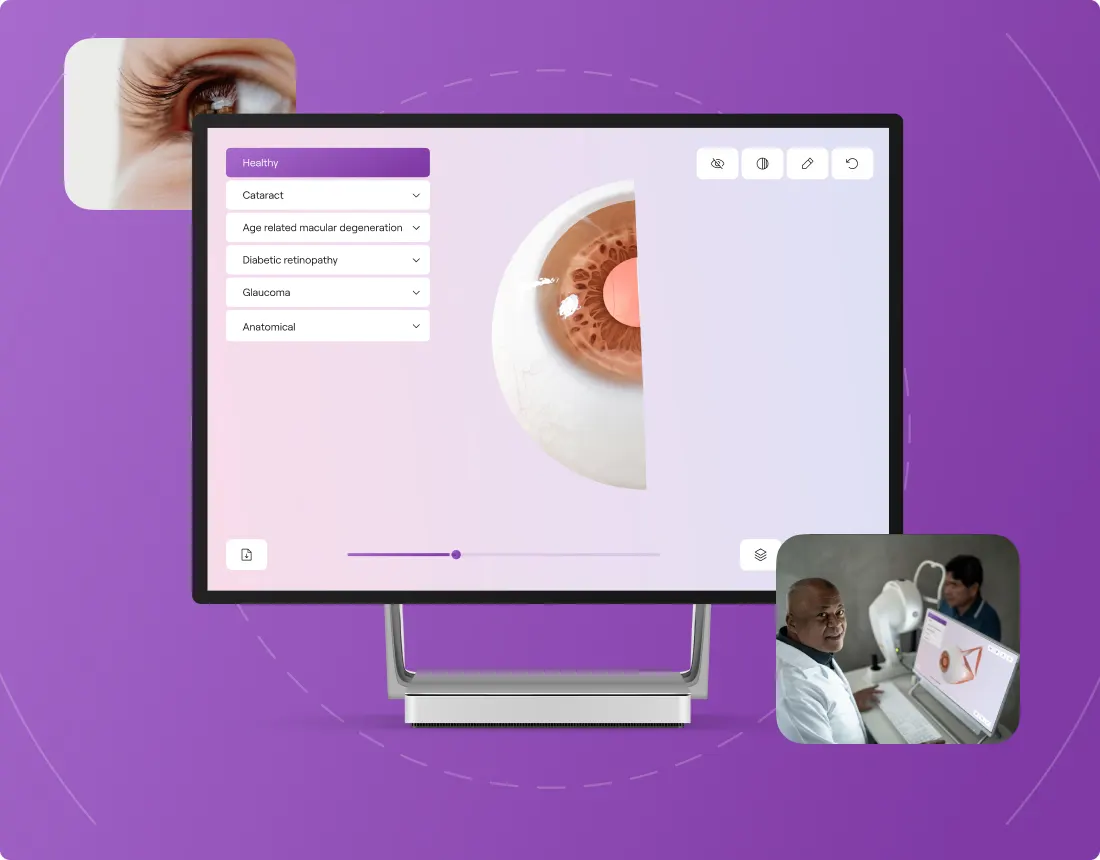 One Right EyeEye-care startup from Austria. Brand and a Webflow website from scratch, with a 3D eye that explains the product.
 Nyan HeroesPlay-and-earn game on Solana. A dedicated design team for the brand and website.
«Even our CEO was incredibly impressed with them as a team.»
 Roman ZotovMarketing Director · Clutch
Checklist before you launch a parallax promo page
Before launch, check that the page reads without motion, loads fast on a phone and leads to one clear action.
- Story. Each screen has one idea, and the sequence ends in the action you want.
- Fallback. With reduced motion on, every scene is still visible and in order.
- Speed. The first screen is light, and Core Web Vitals pass on a mid-range phone.
- Readable content. The headline and the offer are real text with proper headings, so search engines and AI assistants can read them.
- Entry and exit. The QR code says what it gives, the URL is tagged, and there is a plan for the page after the campaign ends.
Websites and products we shipped
 BloxFi80+ country pages from one template: how a fintech API went global
 GUD5.5 weeks from research to final design: an online store redesign for a backpack brand
 CheckMyRate2 months from research to launch: a Webflow site for an Australian mortgage broker
Want the same for your site? 30 minutes, free.
Book a free call ↗