Contents
- Key takeaways
- What was Acvian's site like when the company came to us?
- How did we win the closed tender?
- When is a redesign enough, and when do you need a new site?
- Seven concepts at the first showing
- How do illustrations explain an HR service?
- A site that marketing runs on its own
- By which rules did we move Acvian's addresses?
- What happened to Acvian's 120 addresses?
- How long does a move take, and what should you prepare?
- What does the client say?
- The steps we took from the Acvian move
- Find out what will happen to your site's addresses
- Frequently asked questions
Almost two years after Acvian moved from WordPress to Webflow, we opened all 120 old addresses of its site: 104 work, and we missed eight ourselves. Here is how Acvian chose between a redesign and a new site, what keeps rankings in Google, and how to move step by step.
Verdict
Choose a redesign when the structure of the site still matches the company and the team works in it with ease. Choose a new site when the company has outgrown the old structure or the marketing team waits on a developer for every change. In both cases the same thing keeps your rankings: every old address leads to its new page.
Redesign
Best for
A company whose offer, markets and page set have stayed the same, whose platform suits the people who edit the site, and which wants the site to look like the company it is today.
Not for
The company has new services, countries or audiences that need their own pages, or the marketing team waits on a developer to publish.
New website
Best for
A company that has grown into new markets, services or a group of companies; a team that wants marketing to publish on its own; a site whose structure was built for an earlier stage of the business.
Not for
The launch date is close and leaves time only for new visuals.
Acvian came to us on a recommendation. On the very first call its team warned us that a closed tender would decide it all: we had to show our portfolio and process and offer a competitive price. The other bidders were leading Ukrainian design studios whose names every designer knows. Thirty days after we first met, Acvian's first payment reached our account.
The tender was run by a company that helps employers hire people in any country of the world. Acvian takes on the contracts, the payroll and the paperwork that protect both the employer and the employee. In a few years it grew from one subsidiary in Ukraine into a group of almost ten companies. The group has offices in the United States, Poland, the Czech Republic, Slovakia, Austria, Romania and Ukraine. Meanwhile the website was more than three years old.
Hence the question in Acvian's brief. Sooner or later every growing company asks it: refresh the old site or build a new one. We looked for the answer together with Acvian, from the tender to the launch. Almost two years after the move we did what studios rarely do: we opened all 120 old addresses of their site to see how many still bring people to the right page.
Key takeaways
- More than 30 pages in 60 days. Acvian's new Webflow site went live in the autumn of 2024: service pages with animated illustrations, country pages, a payroll cost estimator and a resources section that marketing runs itself.
- Rankings belong to page addresses. When every old address leads to its new page, Google moves the rankings and links onto it. This works the same for a redesign and for a new site.
- Content and people decide between a redesign and a new site. A redesign is enough while the structure still matches the business and the team works in the site with ease. A new site is due when the company has outgrown the structure or marketing waits on a developer every day.
- 104 of Acvian's 120 old addresses work almost two years on. They open a page with the same or closely related content. We missed eight, although the new site has an obvious page for each; the list is below.
What was Acvian's site like when the company came to us?
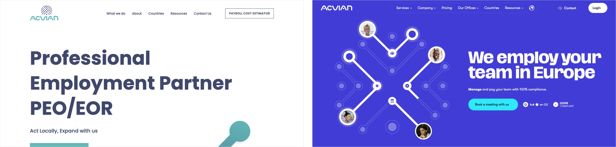
The old site looked old-school. The first screen carried a large headline, “Professional Employment Partner PEO/EOR”, the line “Act Locally, Expand with us” and one turquoise button asking for a proposal. A company with offices in seven countries and years of successful cases presented itself on the first screen with a single headline and a button.
The look was only the surface. The site lacked what a buyer of HR services looks for first: client logos, case studies, marks of trust and a clear structure. Behind it sat a second problem. The WordPress admin panel was set up so that every new article cost the marketers extra time. The company kept growing, while the site stayed as it had been built more than three years before.
How did we win the closed tender?
With this site Acvian went looking for a studio. A recommendation led it to us: the team read our blog and booked a call with Acvian's business manager and business developer. After the call the brief arrived as a Notion document, and a document this complete comes along rarely. In it Acvian described itself and its goals, and added design examples the team likes, technical requirements, and links to page prototypes and texts. With a brief like this a project can be priced precisely, and its risks show in advance.
The core of the brief fitted in two sentences. The WordPress site looks weaker than the company, and the marketers find it hard to run the blog in it. Two roads lay ahead: refresh the design on the same WordPress, or move to Webflow, a platform where a marketer builds pages and publishes articles on their own.
We priced both roads in one spreadsheet. In it you switch the scenarios on and off, and the estimate recalculates itself. Every stage is written out: what we do, who works on it, how long it takes, with a link to examples of that stage in Figma. We sent the spreadsheet with a pitch deck and a Loom video explaining it. Acvian replied with thanks for the quality of the presentation and the timeline, and invited us to a second meeting, this time with the CEO.
The conversation with the CEO lasted forty minutes. We spoke about how the site should grow and how we would build it for those goals. People took more of the time than the figures in the spreadsheet: who would work on the site and whether we understood each other. After the call a letter arrived: “We have decided to move forward with you and are ready to entrust our project to the Figmatica team.”
Then came the contract. A contract usually takes two or three hours, but Acvian builds its business on contracts, and its lawyers returned ours with comments down to the smallest clause. For us it was a mildly stressful moment and, at the same time, a free consultation from lawyers whose hours cost a lot. Of the two roads Acvian chose the move to Webflow: its brief framed the question exactly this way, around marketers who write and publish on their own. The whole project is in our video on YouTube. In the video we call it a redesign; by the measure of this article it was a new site, with a new structure, a new platform and new addresses.
When is a redesign enough, and when do you need a new site?
The measure is simple. A redesign changes how the site looks and keeps its base: the platform the site is built on, the structure of its sections and the page addresses. A new site builds the base again. Between the two lie many in-between options, and often the look and the structure change together while the platform stays. So it is safer to compare six things one at a time.
| What changes | Redesign | New website |
|---|---|---|
| Look | New | New |
| Structure and page set | Mostly the same | Built for the company as it is today |
| Platform and admin panel | The same | Free to choose |
| Who edits every day | The same people, the same way | Can be handed to marketing |
| Page addresses | Mostly stay | Change; a redirect map is needed, the list that pairs each old address with its new one |
| Time | Shorter | Longer; Acvian took 60 days of work |
Two of the six rows decide the choice. The first: does the structure of the site match what the company is today. Acvian had a sitemap for the new site, a plan of all its pages, before we arrived, and that page set sat badly in the old structure. The second row: who will work with the site every day. When it is marketing, the platform has to let the marketers edit the site themselves. At Acvian both rows pointed to a new site.
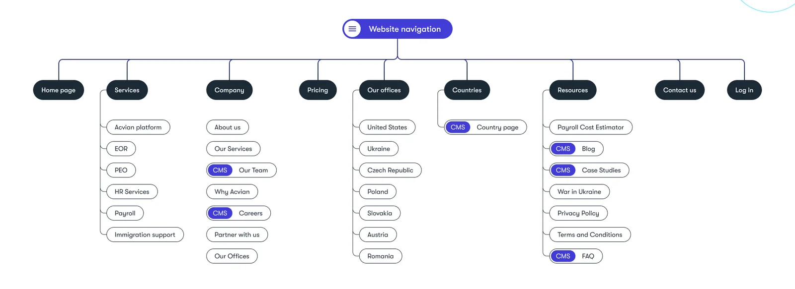
On the site this structure opens from the header: each dropdown shows the section's pages with a short line about each and a photo that sets the tone.
Seven concepts at the first showing
Acvian brought almost everything a design usually starts with: a sitemap of the new site, texts for every page in Google Docs, page prototypes from an earlier designer, a profile of the ideal client and a brand book. The research stages we normally do ourselves were already done. We added one of our own, an analysis of Acvian's competitors and of what the market expects from an HR partner's site, and with it went on to design concepts, the first versions of how the site could look. For the first showing we prepared seven: at this stage a studio sells the client an idea, and we wanted to show it from every side.
The first concept grew out of Acvian's logo, a small tree of dots and lines. On the first screen the tree unfolded into an illustration: circles and strips became everything Acvian does, from the search for a person to the banking, legal and medical services a worker passes through on the way to a new company. The illustration was meant to move from the start.
The third concept put a person on the first screen, because a face draws the eye first. Around it lay pieces of Acvian's own platform: a salary card, a country, an employee's signature. Its colour was a fresh turquoise, and its arrows repeated the shape of the letter A from the logo. The remaining five went in other directions. The second took its cue from Intercom: watercolour illustrations generated with AI and a serif typeface paired with a modern sans. The fourth gathered everything into the centre and drew a person's road towards a large business. The fifth went dark, with a three-dimensional planet; the seventh went digital and futuristic, with lines joining corners of the world. The sixth came from a designer on one of his first projects with us: textured illustrations in the spirit of Wise.
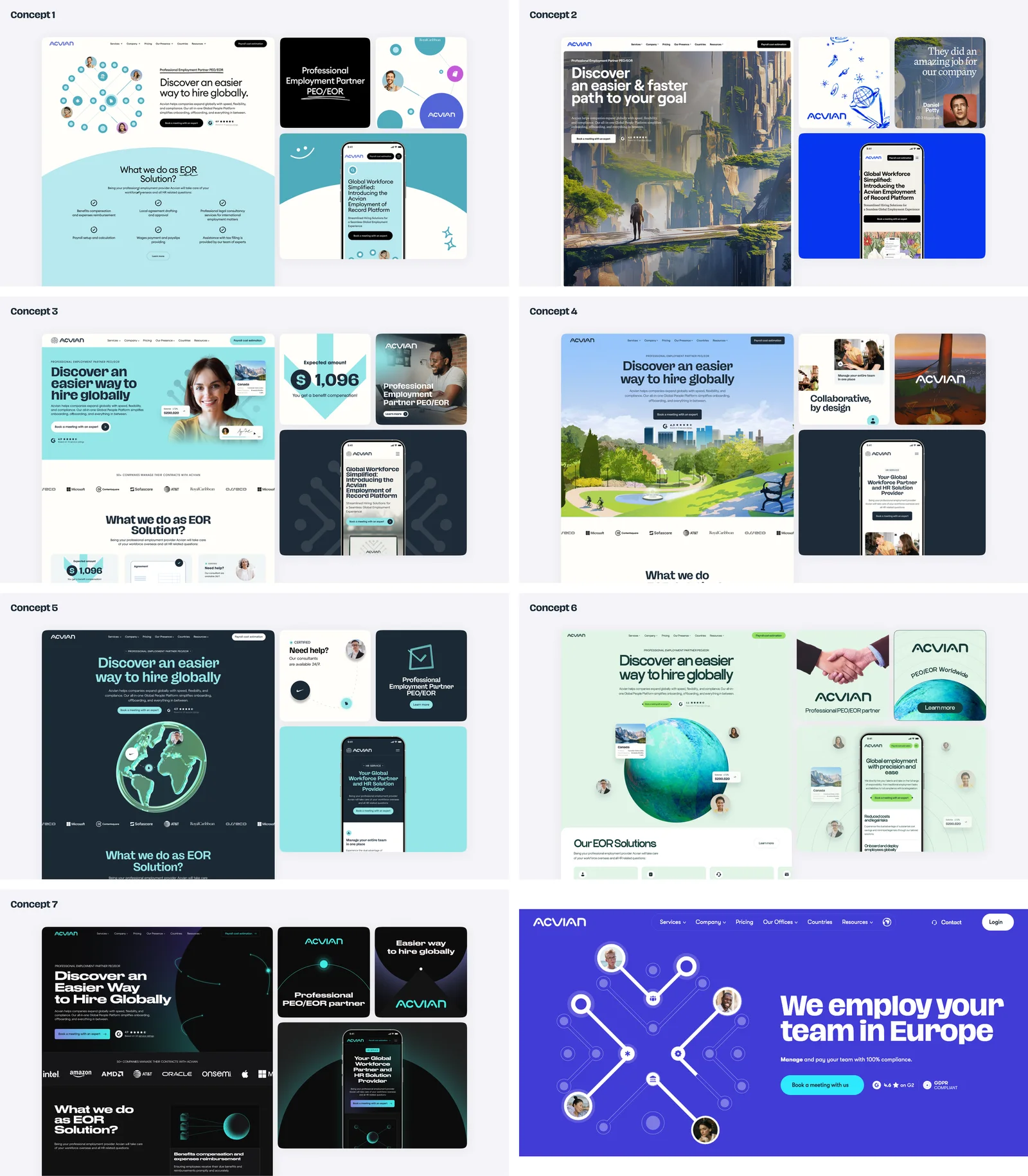
Different concepts got different typefaces. Roboto, the typeface from the brand book, we set aside at once, because the site had to stay current for years. Hagrid, which we proposed in a later round, was eventually bought for the site: it sets the headlines, and GT Walsheim Pro carries the text. The palette settled on a deep blue, a bright electric blue, white and a dark graphite. We showed the concepts on a desktop screen and a phone screen side by side, so the client could see each one living on both.
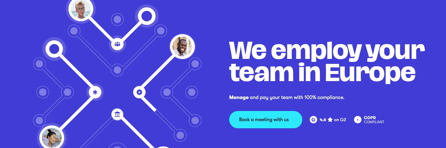
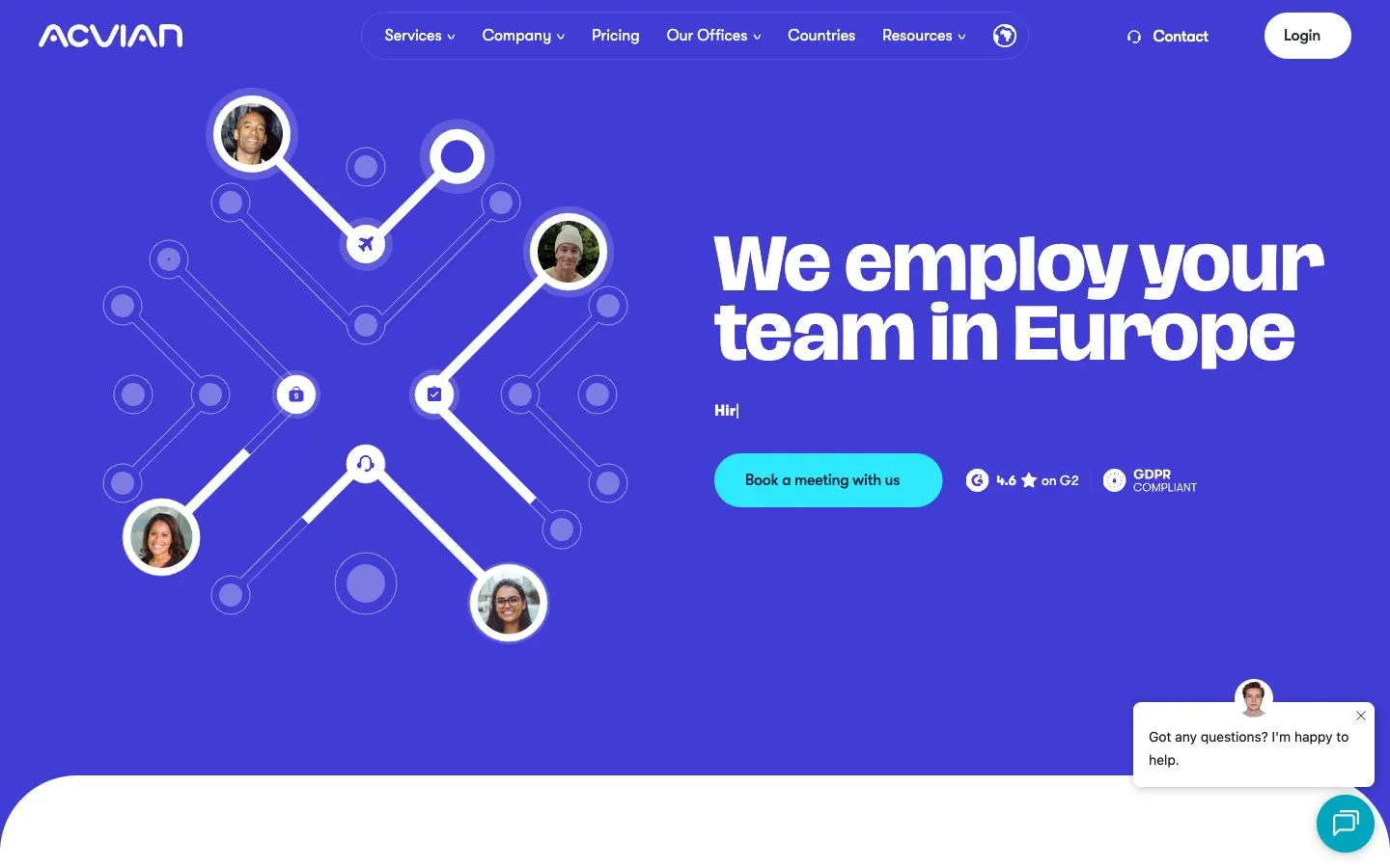
Of the seven, Acvian picked two: the first, with the tree, and the third, with the person. We joined the colours of the third with the illustration of the first and cut the text on the first screen to three short points: unlock talent, hire within 24 hours, manage and pay your team. Two more rounds followed: one on colour, because the client wanted more of the brand's blue, and one on the second block and the buttons. Later, on the homepage design, the three points began to type out and erase one after another: “Unlock talent pools overseas”, “Hire within 24 hours”, “Manage and pay your team with 100% compliance”. The illustration turned white. Only the button stayed turquoise, and the eye goes straight to it.
Seven concepts at the first showing turned out to be too many. The client said so itself when we asked for feedback: three options with a little more time on each would have been easier to choose from. Since then we show three concepts at most. The three rounds of edits at every stage stayed as they were: we gave them before Acvian too, and we agree on them at the start.
How do illustrations explain an HR service?
The moving illustration from the first screen became a device for the whole site. It mattered most on the service pages, because Acvian's services are hard to picture: employer of record, payroll, relocation. For these pages we drew animated illustrations in Figma that tell each service as a short scene.
On the immigration page a circle slowly fills with white while a small plane flies round it and lights up the steps one by one: talk to us, get support, choose the best solution, relocate the talent. The payroll page shows a dollar splitting apart and cheques falling to employees in different countries. On the HR page specialists of different professions pass through Acvian, and the PEO and EOR pages, two similar services, share one illustration: a planet, with specialists from around the world going from the first talk to their first day at work.
Acvian's own story got a scene too, on the company page. As the visitor scrolls, a small flag from 2020 grows into the Acvian logo and then into a solid shape: the start-up becoming a group of companies. Next to it are real photographs of Acvian's team.
In development we animated the first-screen illustration and turned it into Lottie, a light format for vector animation, so it loads fast. On phones some scroll animations became swipes, and the growing flag stayed on the desktop version, where it works best.
A site that marketing runs on its own
The illustrations answered the first half of the brief, the site that looked weaker than the company. The second half concerned the people who would work with the site every day. Already on the homepage design we turned repeating blocks into components. A component is a block that repeats across pages, and one change reaches every page in a click or two. Every state of every element went into a UI kit, the library of buttons, forms and other interface parts. So the developer knew exactly what happens to a button on hover and on click.
The article became a separate little construction set. A marketer opens an article in the Webflow editor, presses the plus and picks a block: a heading of the right level, a slider, a gallery of photos or videos, a list, a table in one of three styles, a banner with a button, a client's testimonial. The spacing between blocks is already set in the design.
Around the blog grew a full resources section: search, a featured article, categories, a newsletter sign-up, a case-study template; in careers, vacancy pages with a table of contents and share buttons. Country pages show where Acvian has offices and what taxes and fees to expect. The payroll cost estimator is connected to a live calculation, and a meeting with the team can be booked straight from the site.
That is how the site changed platform, structure and addresses all at once. And a change of addresses touches what worries every company on a move most: the Google rankings the site has built over the years.
By which rules did we move Acvian's addresses?
The Acvian move changed the addresses of most pages, so the redirect map became the main job of the launch. Google knows a site as a set of addresses. Each address has its own history: a place in the results, links from other sites, a client's bookmark. When a page moves to a new address, the old one has to lead the visitor and the search engine to the new one by itself. Such a hand-over is called a permanent redirect, or a 301.
Google's guide to moving a site boils it down to four rules:
- permanent server-side redirects from each old address to its new one, 301 or 308;
- each old address to a page with the same content; many old addresses sent to the homepage may be treated as an error, a soft 404;
- redirects kept as long as possible, generally at least a year;
- pages the company removes answer with a 404 or 410.
Even with these rules, rankings move around for a while after a move. For a medium-sized site, the same guide says, it takes Google a few weeks or more to show the new addresses in place of the old ones, and then the rankings settle. This happens after a redesign whose addresses have changed and after a new site alike. So a move is best judged later, once the rankings have settled. Almost two years have passed since Acvian's.
What happened to Acvian's 120 addresses?
We set up Acvian's redirects ourselves, so we checked them the way we would check anyone else's work. Up to the end of September 2024 the Wayback Machine web archive saw 120 addresses on the old site. We opened each of them on the live site on 24 September 2026. The raw data is in a CSV spreadsheet that opens in Excel or Google Sheets.
| What the old address gives today | Addresses |
|---|---|
| The same page (differs only by www or a slash at the end) | 35 |
| A redirect to a new page with the same or closely related content | 69 |
| A redirect to the homepage | 1 |
| Error 404, with an obvious new page today | 8 |
| Error 404, other old pages and posts | 7 |
104 of the 120 addresses lead to a page with the same or closely related content. The old Austria page opens the new country page; the old post about the payroll cost estimator opens the estimator itself. Twelve old country pages and posts whose countries the new site describes on the general service page lead there. Two redirects we would point better today: the old Turkey and India pages lead to blog posts, while the new site has a page for each country.
We missed eight addresses. For each the new site has an obvious page:
- the Armenia, India, Turkey, Estonia and Lithuania pages and posts: the new country pages;
- a post on hiring tech people in Ukraine: the Ukraine country page;
- two relocation pages: the new page on the war in Ukraine.
The other seven addresses with a 404 once held a test post, an author page, a news item from 2021 and a few old articles. For most of them a 404 is the right answer; one old article has a close relative on the new site and could lead there. The check points to two steps. First, compare the redirect map against the full archive of the old site. Second, a month after the launch, walk again through every old address from the archive and from Search Console, Google's free dashboard for site owners. Eight missing redirects take ten minutes to add.
How long does a move take, and what should you prepare?
Acvian's project itself took 60 days and produced more than 30 pages; in the autumn of 2024 the new site went live. The work ran in this order: competitor analysis, concepts, the design of every page for a desktop screen and then for a phone, the UI kit, and the build in Webflow. The timeline was short because the client arrived with its homework done:
- a sitemap of the new structure;
- texts for every page in Google Docs;
- page prototypes from an earlier designer;
- a profile of the ideal client;
- a brand book with the fonts.
The sitemap, texts and prototypes we usually make ourselves, and they take their own time at the start of a project. If your company plans a move, gather these five things before the tender, and the project gets shorter by that time.
What does the client say?
At the end of every project we ask the client when they felt the work was heading the right way. Mykyta Semenov, Acvian's chief operating officer (COO), answered like this; his words are shortened below the video.
«That moment came at the very start, when we got the first design drafts. We asked you for several visions of our new site, because we needed a view from outside and a designer's approach. We got several options, compared them, you listened to our edits and offered your own ideas. Thanks to that, it all turned out very well.»
Acvian also told the story of our work together on its LinkedIn page.
The steps we took from the Acvian move
- Collect every old address. The sitemap.xml file that lists pages for search engines, the Pages report in Search Console, and the Wayback Machine archive of the last few years. Each source catches pages the others miss.
- Match each address to a page with the same content. Mark the pages you remove on purpose separately.
- Set up permanent 301 redirects from each old address. In Webflow this is a list in the site settings; on WordPress it takes a plugin, an add-on to the site, or a change to the server configuration.
- On launch day, open every old address. Check where each one leads: the page with the same content, or a 404 for a removed page.
- Submit the new sitemap in Search Console. Google then finds the new addresses sooner.
- A month later, walk the old addresses again. Look through the 404 report in Search Console; this is where our eight addresses would have surfaced.
- Keep the redirects for at least a year. Better for good: they are free and keep old links from other sites working.
Find out what will happen to your site's addresses
If you are planning a redesign or a new site, start with the list of old addresses. We build the redirect map and check it before the launch and a month after it; this is part of our site move that keeps your traffic. And you can see how AI assistants read your site in a minute with our free check.
Websites and products we shipped
 BloxFi80+ country pages from one template: how a fintech API went global
 CheckMyRate2 months from research to launch: a Webflow site for an Australian mortgage broker
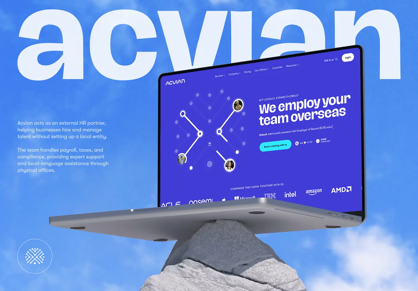 Acvian30+ pages in 60 days: a new Webflow site for a global HR partner
Want the same for your site? 30 minutes, free.
Book a free call ↗