Contents
- What a real estate developer website must have
- The short version
- Real estate developer websites by Figmatica
- Luxury residential website: ERA Residence, Estepona
- Luxury real estate collection website: Sobha Privy Collection, Dubai
- Branded residences website: Mr. C Residences, Boca Raton
- New development website with prices: Quinta D. Amália, Porto
- Hotel condo website for investors: DUOS, Miami
- Residential complex website with 3D: Belgrade Arbor
- Residential complex website: Kankrit, Kyiv, by Figmatica
- Office leasing website: 360 Lexington Avenue, New York
- Commercial real estate website: The Red, Chicago
- Real estate search website: Resider, British Columbia
- Ten real estate websites side by side
- How the strongest developer websites deliver it
- Frequently asked questions
Website examples for real estate developers: nine sites of new developments, residences and office buildings singled out at web design competitions, from a boutique community in Estepona to an office tower in Chicago, and a residential complex in Kyiv built by Figmatica. We opened each one past the first screen and wrote down where it puts the price, the floor plan, the map and the button that starts a conversation.
Before a developer writes to a studio, a folder of references usually already exists. Twenty tabs of real estate website design inspiration from design galleries, a few competitors, one tower that someone on the board liked. Screenshots of first screens: a render at sunset, a thin serif headline, a lot of air.
The first screen sets the mood. The sale happens two or three clicks further: the price, the plan of the flat, the minutes to the station, the form that reaches a person. So we picked nine real estate sites that web design competitions singled out and went past the first screen on each. The tenth is ours. Below is what each one does well, with screenshots, and what a developer can take from it into their own brief.
What a real estate developer website must have
This page is about websites for developers: new developments, residential complexes, branded residences and office buildings. A developer's site sells one project, or a few, to buyers and tenants who compare it with every other building in town. Six things decide whether it does:
- A picker of units. Filters by type, rooms, area and floor, and a card with a plan for each unit.
- A price or a price from. Per unit, per square metre, or a starting price on the home page.
- The location in minutes. Metro, school, shops and the airport, on foot and by car, or landmarks the buyer knows.
- Documents and progress. The building permit, construction progress, a fact sheet to download.
- One action on every screen. Select an apartment, book a call, inquire, with a form that asks the size and who is calling.
- The developer behind it. About the investor, other projects, named people to talk to.
The short version
- An apartment picker sells better than a gallery. ERA Residence filters its 25 homes by type, bedrooms and area; Belgrade Arbor filters 208 units in a 3D model of the building.
- Three numbers answer the first call. Quinta D. Amália shows 160 apartments available and a starting price of 535k.
- An investor product speaks the investor's language. DUOS in Miami sells 49 hotel condos for short-term rental, with the purchaser's guide in English and Spanish.
- An office building lists suites like a catalogue. 360 Lexington gives each suite its size, floor, condition and plan, and names the brokers.
- A residential complex can say the price on the first screen. Kankrit, built by Figmatica, shows the address, the completion date and the price per square metre before the first scroll.
Real estate developer websites by Figmatica
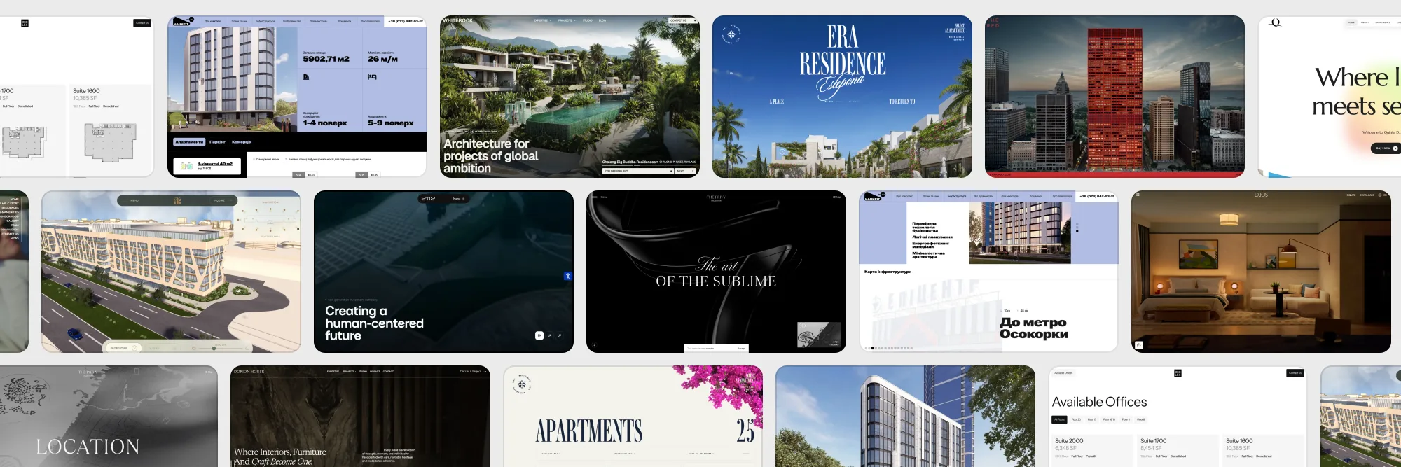
We start with our own work, because you are reading a studio's page and should see its hand first. A residential complex for developer RIEL, an investment holding with its own development projects, an architecture studio designing in the UAE, Thailand, the US and Spain, and an interior studio with its own furniture production. Each card plays the live site.
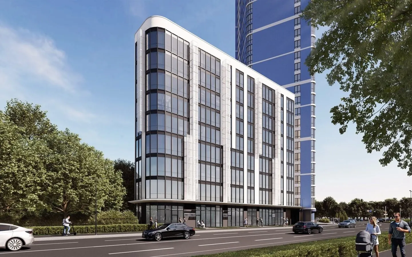 KankritResidential complex by developer RIEL, Kyiv. Prices, plans and a map of the area on the site.
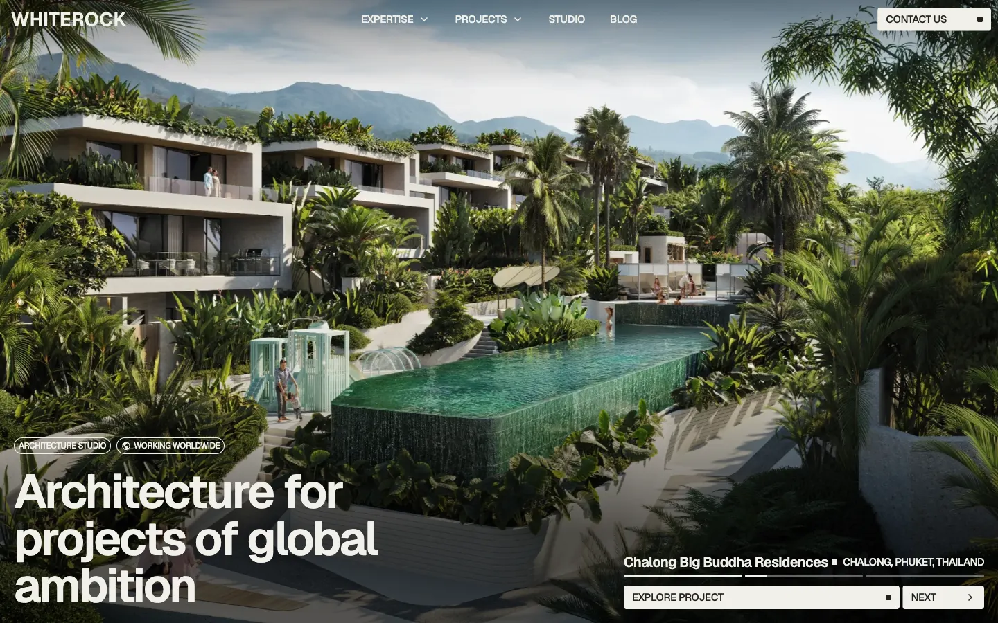 WhiteRockArchitecture studio with projects in the UAE, Thailand, the US and Spain.
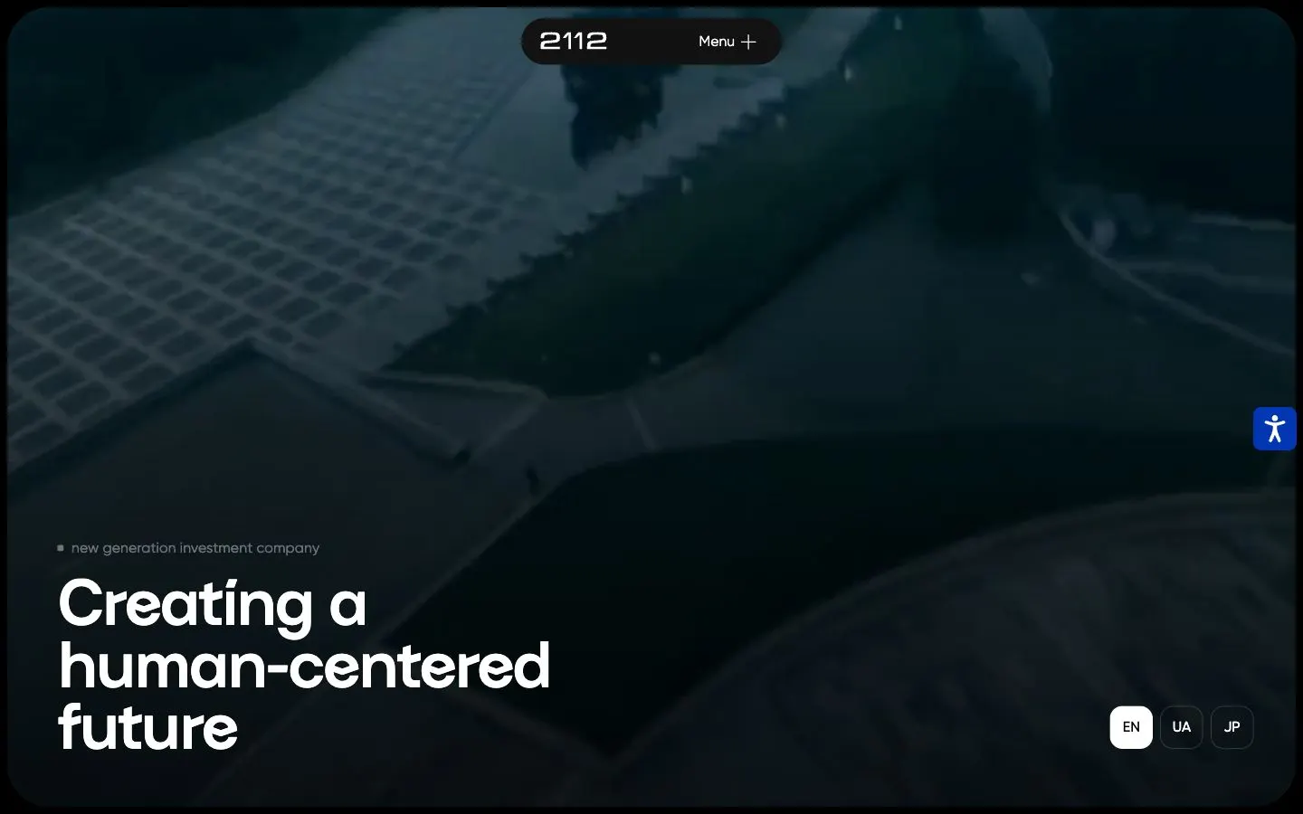 2112 HoldingInvestment holding with residential and retail development, in three languages.
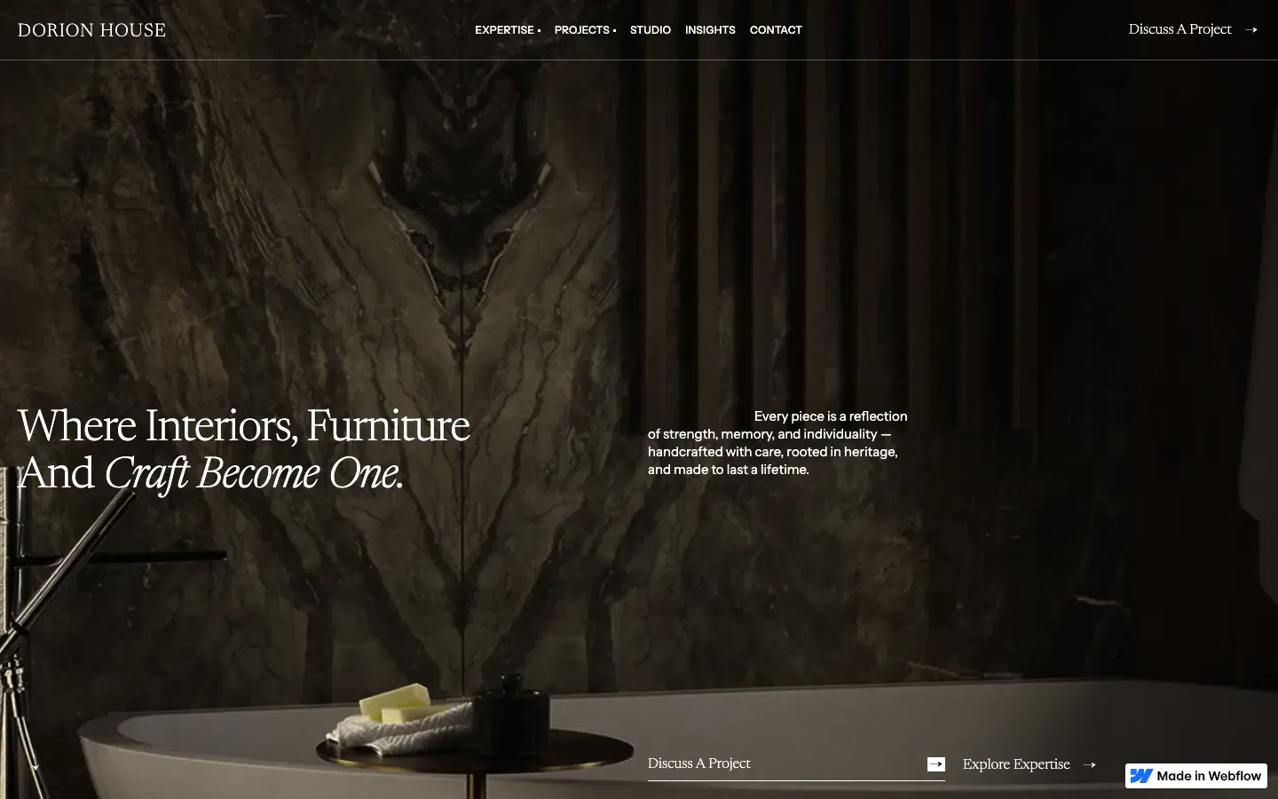 Dorion HouseInterior studio with its own bespoke furniture production.
Luxury residential website: ERA Residence, Estepona
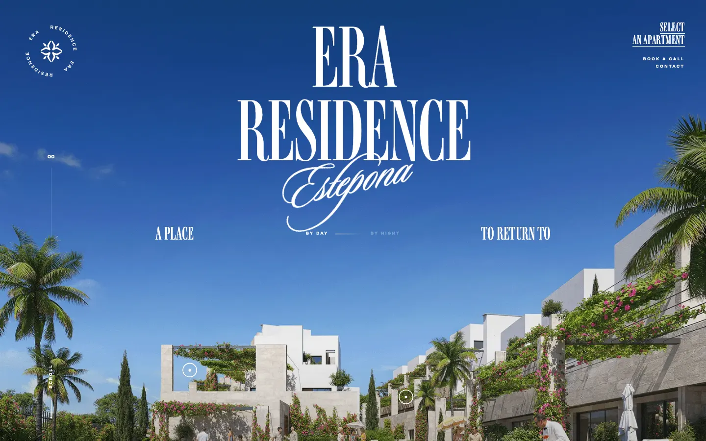
ERA Residence opens like a travel poster: the name in tall condensed letters, Estepona in a handwritten script, white villas and palms under a blue sky, and a line split across the screen, a place to return to. In the top corner, three actions and nothing else: select an apartment, book a call, contact.
Further down the page tells the place before the product: a boutique gated community of only 25 residences on the New Golden Mile between Marbella and Estepona, with walking paths between the homes instead of corridors. A map of the coast shows the distances to Marbella, Puerto Banús and Gibraltar.
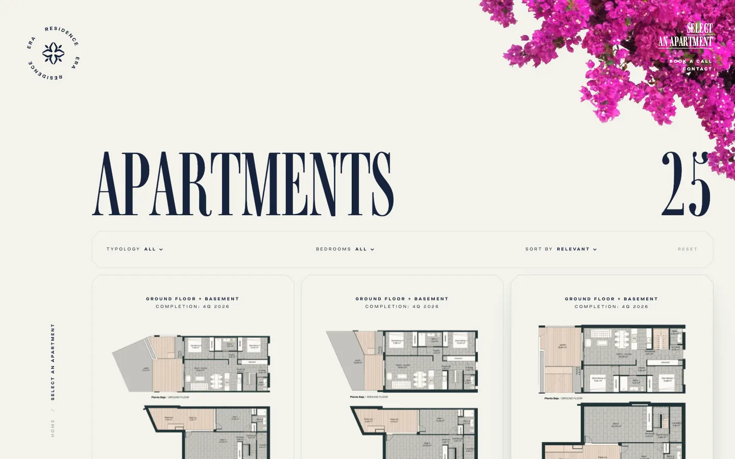
Select an apartment leads to a page titled with a number, Apartments 25. Filters by typology (ground floor with basement, ground floor, penthouse duplex) and by bedrooms, a sort by area, and a card for each home with its plan: №011, block B1, ground floor, 3 bedrooms, 132 m² plus a 29 m² terrace, and its completion date.
What to take: every home has its own card and its own number. A buyer from abroad shortlists three cards and books a call about them.
Luxury real estate collection website: Sobha Privy Collection, Dubai
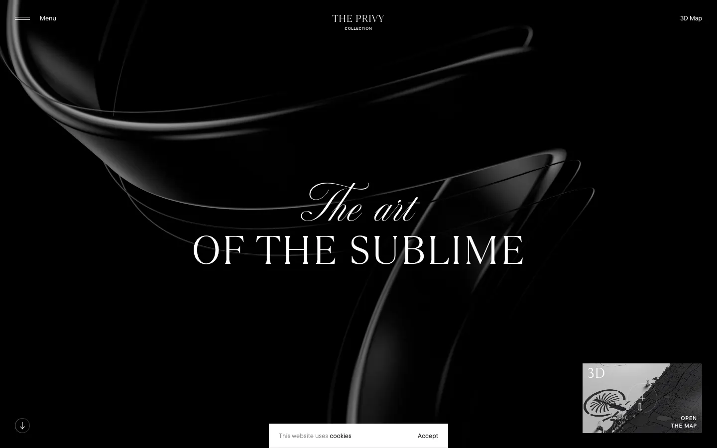
Sobha Privy Collection sells a selection rather than a building: exclusive homes in Dubai's most iconic addresses. The first screen is black gloss and one line, The art of the sublime. Then the rules of the collection, the Privy Collection Tenets, each a reason a home made it in: expansive spaces first.
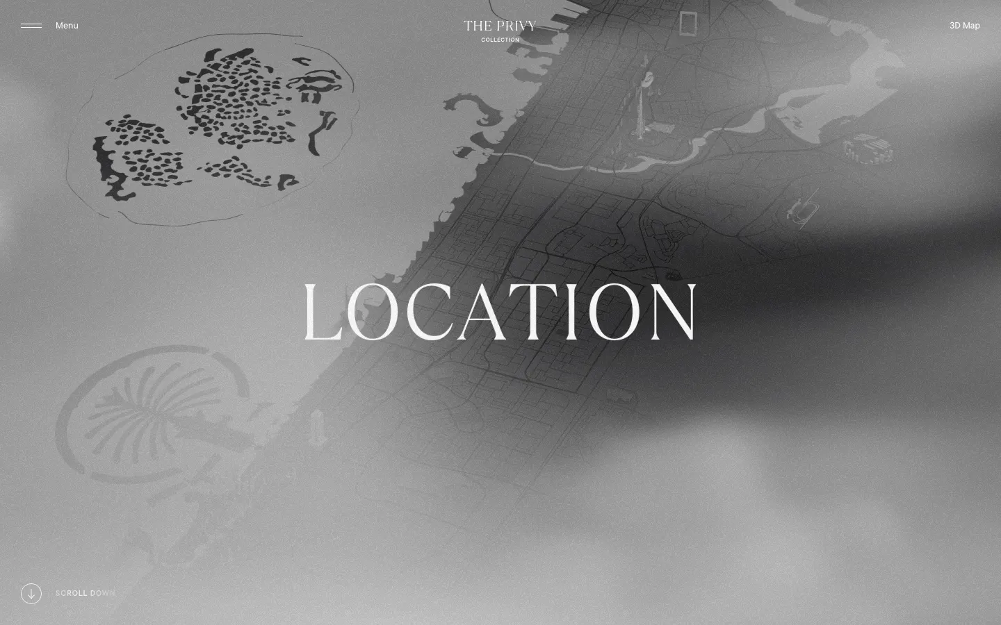
The menu keeps a 3D Map next to the burger. The location page is a monochrome city with the landmarks a buyer already knows marked on it: Palm Jumeirah, Burj Khalifa, the Museum of the Future, Burj Al Arab, Dubai Mall, and among them the collection's own addresses.
What to take: locate the home by landmarks the buyer already has in mind. A foreign buyer knows the Burj Khalifa long before they know a street name.
Branded residences website: Mr. C Residences, Boca Raton
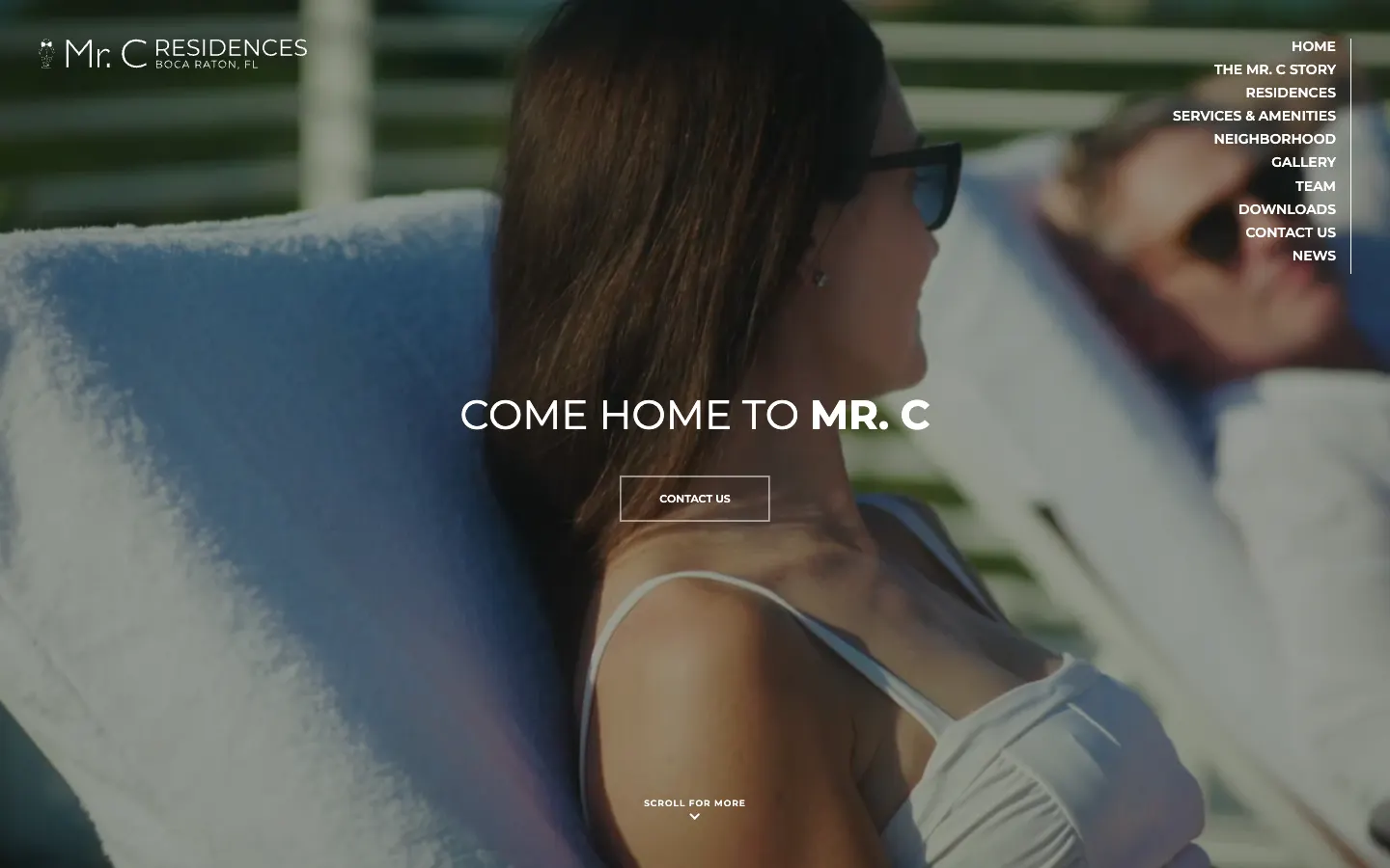
Mr. C Residences opens with a video by the pool and four words, Come home to Mr. C. The story comes from a hospitality family: four generations of the Ciprianis, 133 private residences in Boca Raton, the Bellini restaurant in the building. The menu goes the way a buyer thinks: the Mr. C story, residences, services and amenities, neighborhood, gallery, team, downloads, contact, news.
The residences page lists what is inside down to the appliances, Wolf and Sub-Zero, with a fact sheet to download; every render is signed as an artist's conceptual rendering. The contact form asks the desired residence size, from two bedrooms to three bedrooms plus den, and whether you are an agent.
What to take: a form that sorts the lead. Sales know the size and whether an agent is on the line before they call back.
Next to property sits the loan. A buyer checks the price and the mortgage before calling anyone, and the site that answers both questions gets the call. Our case from that side of the deal: a Melbourne mortgage broker with a rate check on the first screen.

New development website with prices: Quinta D. Amália, Porto
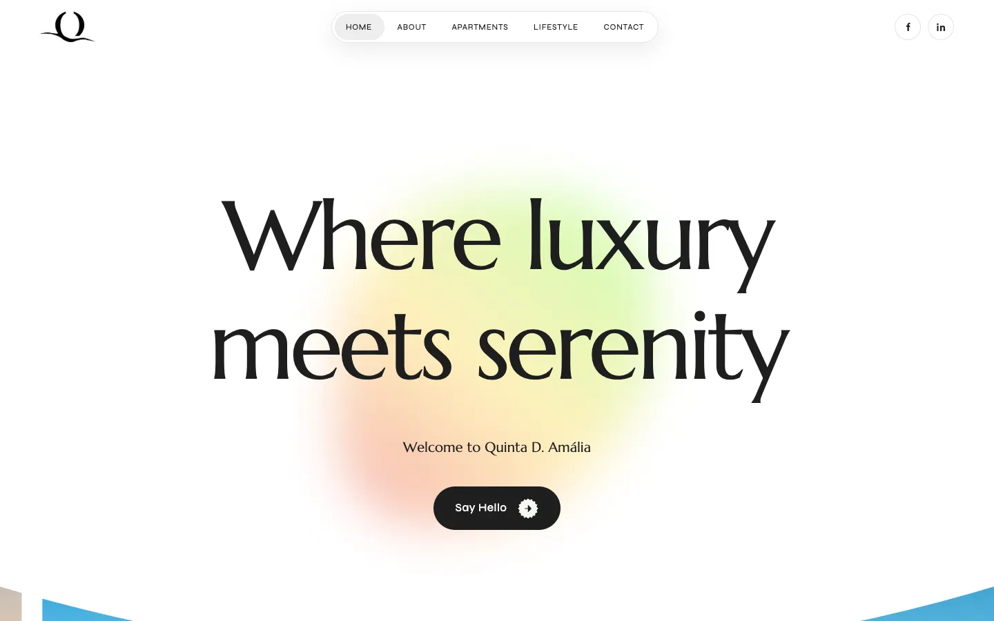
Quinta D. Amália starts on white: Where luxury meets serenity, a soft coloured glow, one button, Say Hello. The first paragraph already carries the facts: Vila Nova de Gaia, minutes from Porto, a low-rise development of T1, T2 and T3 apartments from 70 m², and the quarter construction starts.
Then three cards, one-, two- and three-bedroom, each with Order yours, and three counters: 20+ years of experience, 160 apartments available, 535k starting price.
What to take: the starting price and the stock on the home page. Two numbers filter out the wrong calls and warm up the right ones.
Hotel condo website for investors: DUOS, Miami
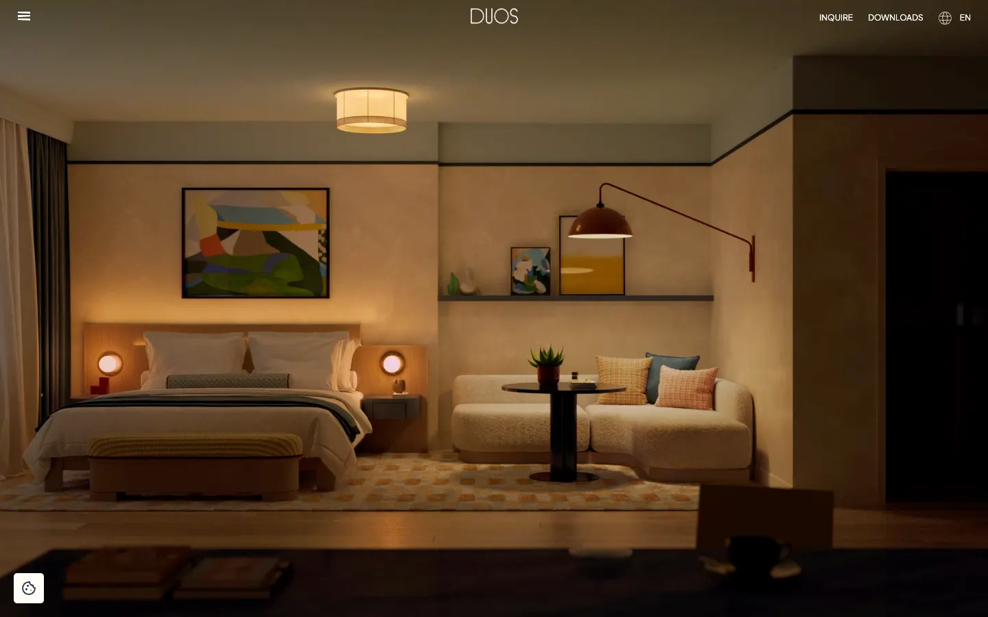
DUOS in Wynwood sells 49 hotel condominiums built for short-term rentals, and every page speaks to an owner who buys to rent out: fully furnished, hotel-grade services, check in and check out. The suites go from a studio of 400 sq ft (39 m²) to two bedrooms, each with its size in both units and a sample floor plan.
Downloads sit in the header: a purchaser's guide in English and in Spanish, the floor plans, a brochure in both languages. The site itself switches between English, Spanish, Portuguese and Italian.
What to take: documents in the buyer's language. A buyer who reads Spanish gets the purchaser's guide in Spanish and forwards it to their lawyer as it is.
Residential complex website with 3D: Belgrade Arbor
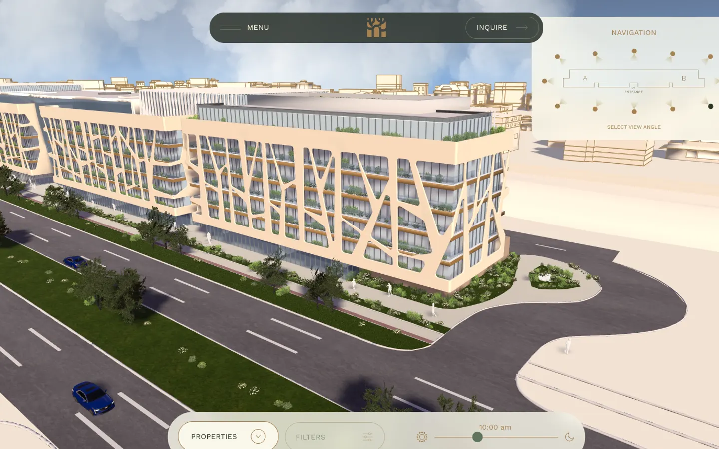
Belgrade Arbor is a residential and business complex in New Belgrade with a facade drawn from a tree canopy. The 3D experience puts the whole building on screen: pick a view angle, move the sun with a time-of-day slider, then filter units by rooms from one to four, by area from 28 to 162 m², by floor, by garden or balcony, by wing. On the day we looked the filter returned 208 results.
Each unit has a code, an area and a floor: A 1.01, 36.06 m², one room, first floor. The location block counts minutes, railway station 1 and 3. The menu splits residences, business and retail spaces, and keeps a page about the investor; the building permit is a PDF linked from the site.
What to take: the permit next to the render. The buyer of an off-plan flat checks the documents before the view.
Residential complex website: Kankrit, Kyiv, by Figmatica
The same idea at a Kyiv price. The first screen of Kankrit gives three facts before any scroll: the address in the Darnytskyi district with a link to the map, the completion date, and a price from $1,520 per square metre. Under them, one button: get a consultation.
Then the building in numbers: 5,902.71 m² in total, 26 parking spaces, commercial units on floors 1 to 4, apartments on floors 5 to 9. Tabs switch between apartments, parking and commercial units, and every layout has its area and its price per square metre: a one-room flat of 40 m² from $1,580, a two-room of 79 m² from $1,520. The menu reads like a buyer's checklist: plans and prices, infrastructure, construction progress, for investors, documents, about the developer.
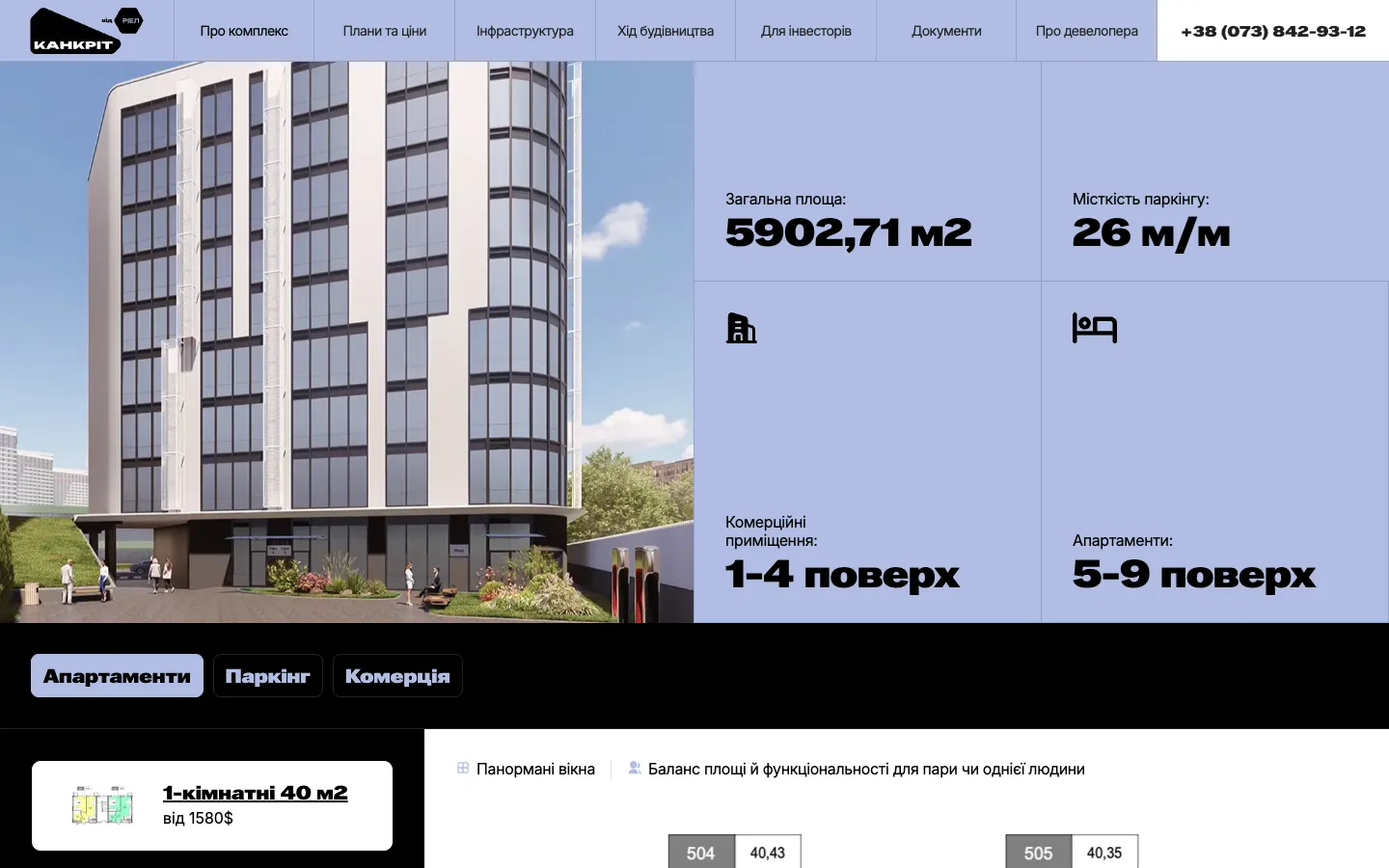
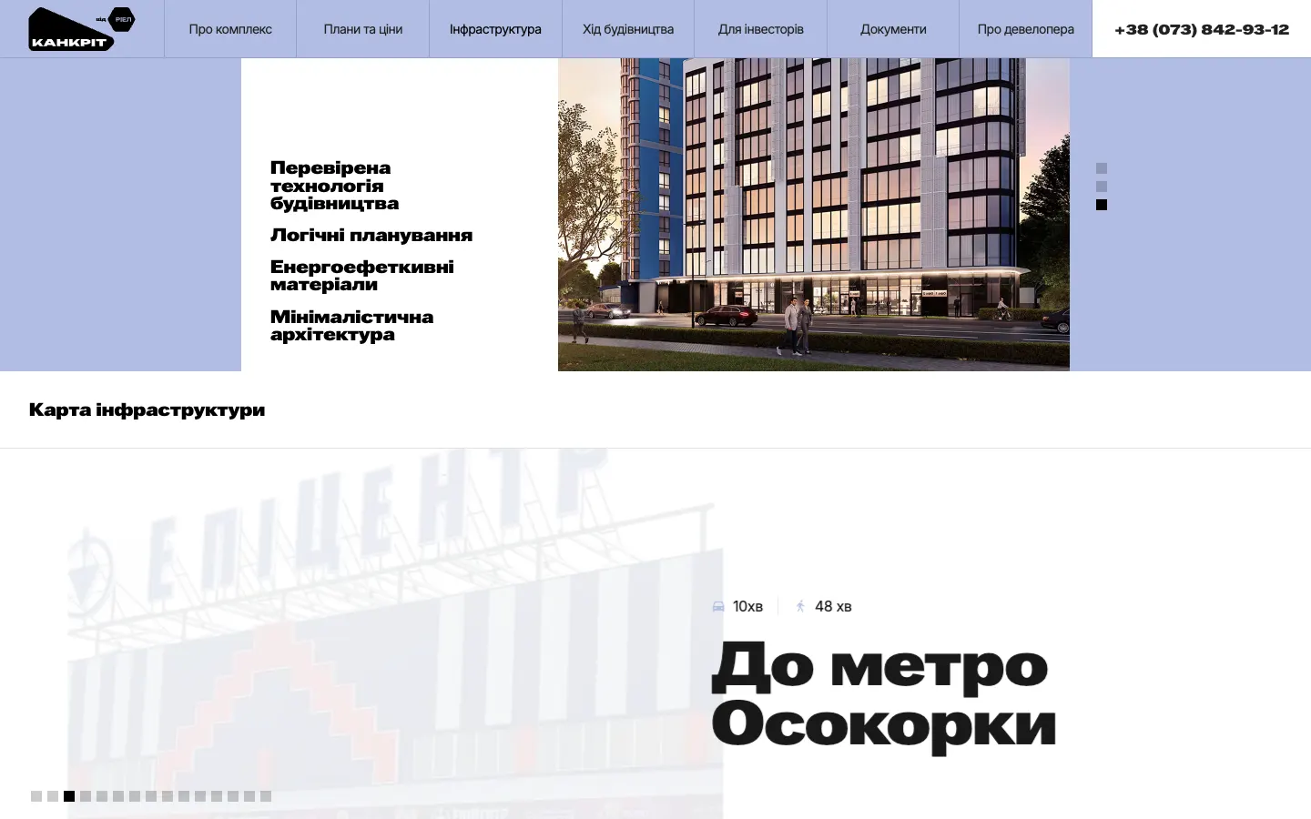
The neighbourhood is told in minutes, by car and on foot: River Mall 7 and 20, Epicentr 5 and 15, Osokorky metro 10 and 48, the bus stop 3 to 5, school No. 314 9 and 45. A buyer thinks of a flat in these units, so the site answers in them.
Office leasing website: 360 Lexington Avenue, New York
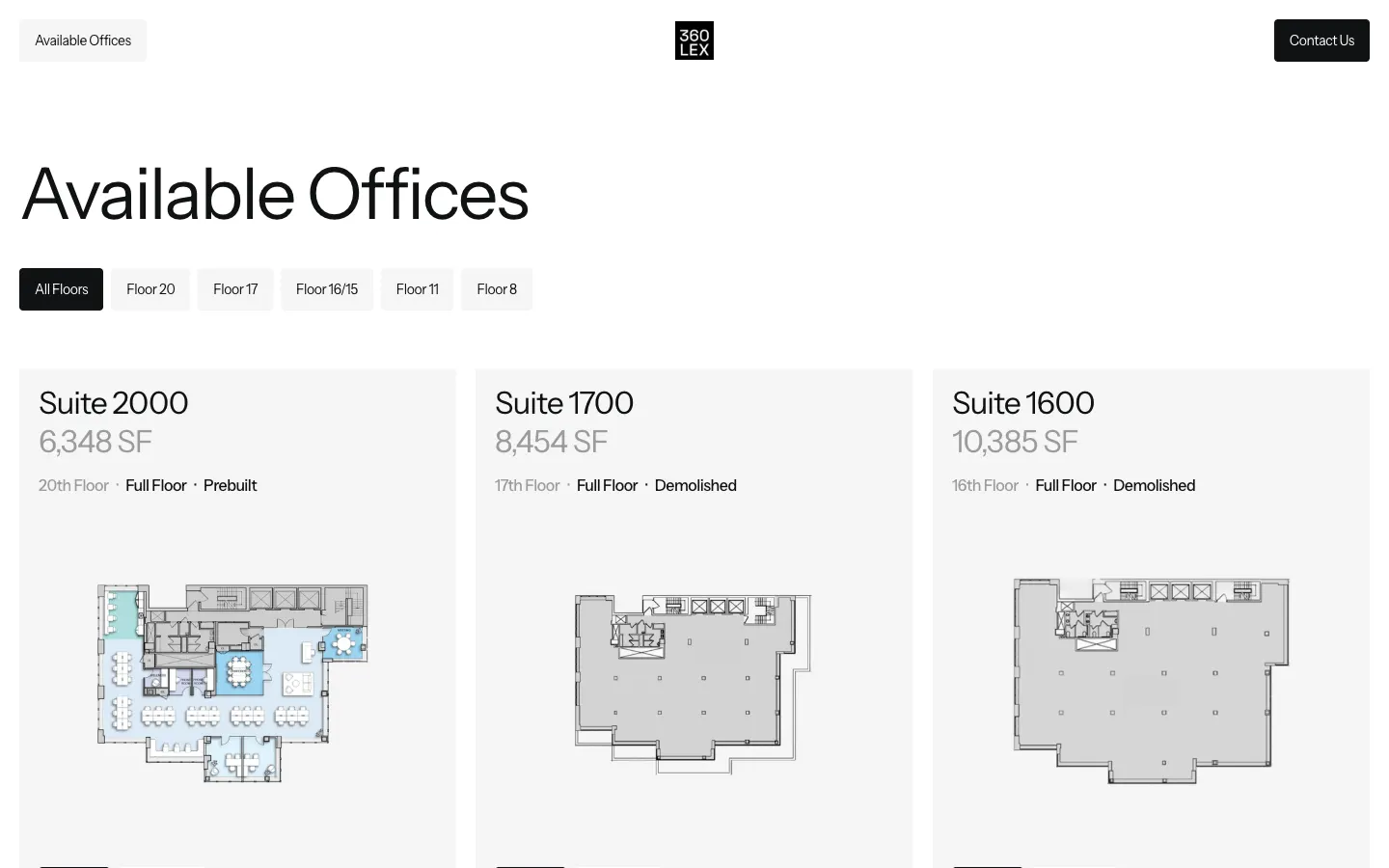
360 Lexington writes its location into the first screen: 40th Street and Lexington Avenue, a two-minute walk from Grand Central. The menu is two buttons, Available Offices and Contact Us.
Available Offices is a catalogue with tabs by floor. Each card: suite, size, floor, full or partial, condition, and two buttons, Inquire and View Plan. Suite 2000, 6,348 SF, 20th floor, full floor, prebuilt. Suite 1600, 10,385 SF, 16th floor, demolished to the shell. Under the catalogue, a form to schedule a tour and three brokers by name with a direct phone each.
What to take: the condition of each space. A tenant choosing between moving in next month and building out their own office sees the difference on the card.
Commercial real estate website: The Red, Chicago
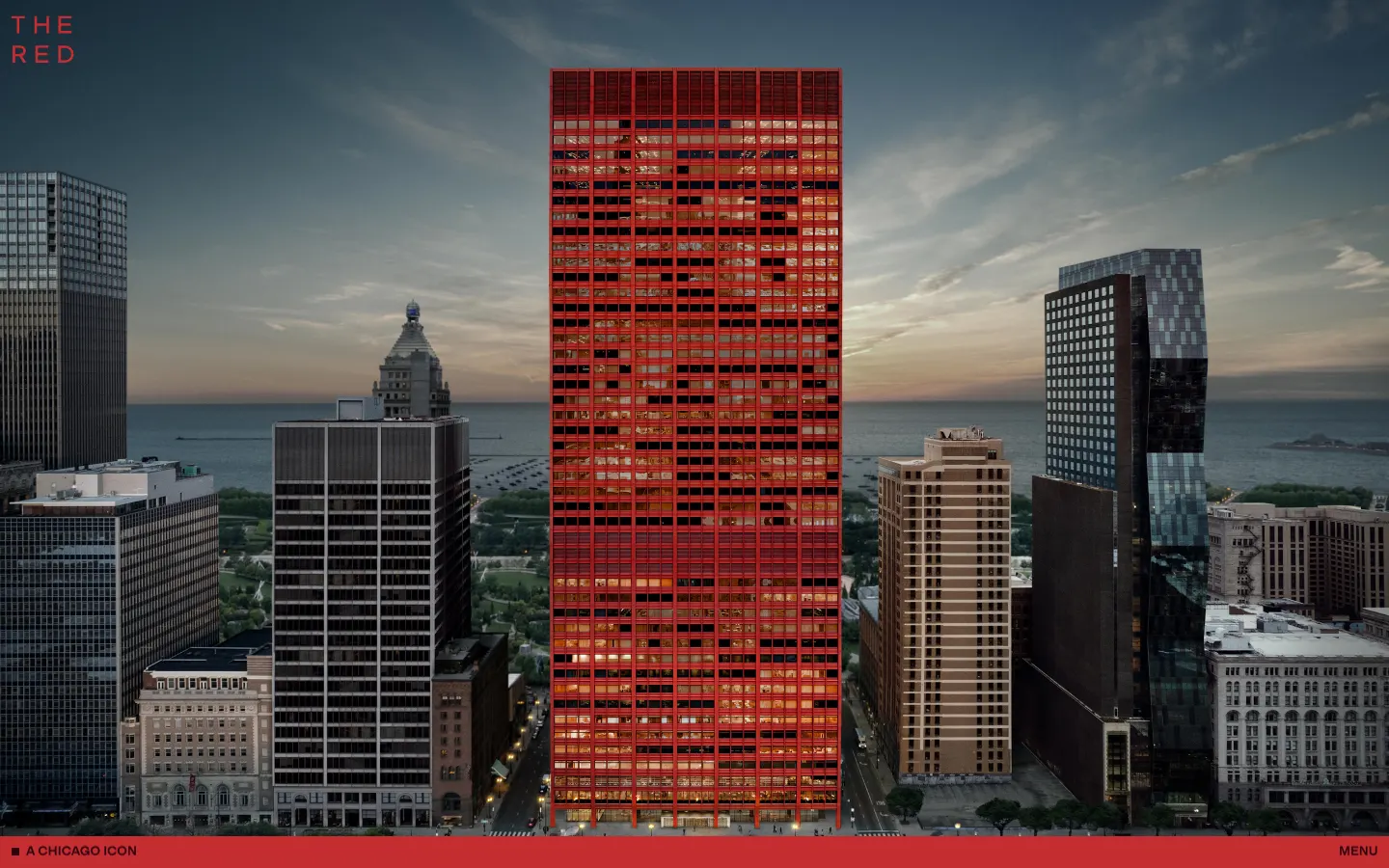
The Red is 333 South Wabash, a red tower that has stood on Chicago's skyline for half a century, and the site is built around the colour: the building glows red among grey neighbours, and the inquiry block fills the screen in the same red. The text is one long paragraph: over a million square feet across 44 floors, a fitness and wellness centre, an auditorium, childcare, and Hayden Hall, the East Loop's dining hall.
Inquire lists three leasing agents by name, each with a direct phone and email, next to the form.
What to take: a landmark sells by its one recognisable feature. For The Red it is the colour, and the site repeats it on every screen.
Real estate search website: Resider, British Columbia
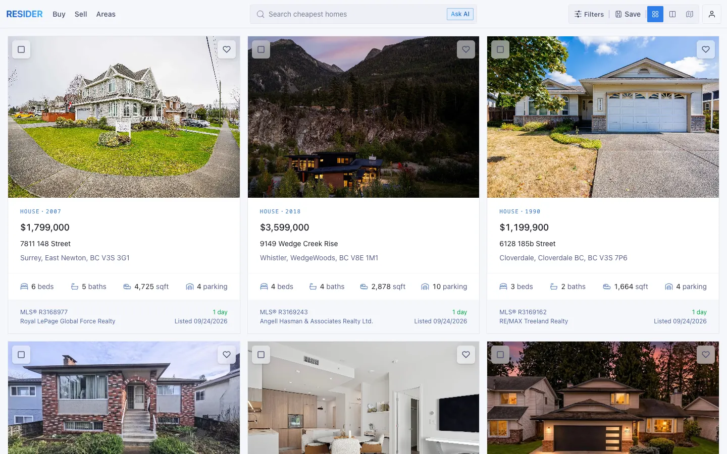
Resider skips the hero entirely: the first screen is the search. Buy, Sell, Areas, a search field, an Ask AI button, filters, and three views, List, Hybrid and Map. Each card is dense: $1,799,000, a house in Surrey, 6 beds, 5 baths, 4,725 sq ft, 4 parking, the MLS number, the brokerage, listed one day ago.
What to take: a hybrid of list and map, and a question box next to the filters. A buyer who has no words for filters yet types a sentence.
Ten real estate websites side by side
| Site | Type | Main action | What to take |
|---|---|---|---|
| ERA Residence, Estepona | Boutique residences | Select an apartment | A card and a number for every home |
| Sobha Privy Collection, Dubai | Luxury collection | 3D map | Location by landmarks |
| Mr. C Residences, Boca Raton | Branded residences | Contact us | A form that sorts the lead |
| Quinta D. Amália, Porto | New development | Order yours | Starting price and stock on the home page |
| DUOS, Miami | Hotel condos | Inquire, Downloads | Documents in the buyer's language |
| Belgrade Arbor, Belgrade | Residential complex | Explore in 3D | The permit next to the render |
| Kankrit, Kyiv (Figmatica) | Residential complex | Get a consultation | Price per m² on the first screen, the area in minutes |
| 360 Lexington, New York | Office leasing | Available offices | The condition of each space |
| The Red, Chicago | Office tower | Inquire | One recognisable feature on every screen |
| Resider, British Columbia | Listings search | Search, Ask AI | A list-and-map hybrid |
How the strongest developer websites deliver it
Put the ten next to each other and the style differs completely, from ERA's travel poster to The Red's wall of colour. The pieces under the style repeat. If you are writing a brief for a property developer website, this is the features list to bring along with the references.
- A picker of units, with filters. Type, bedrooms, area, floor; a card with a number, a plan and a completion date for each unit.
- A price or a price from. Quinta D. Amália gives a starting price on the home page, Kankrit gives the price per square metre on the first screen.
- The location in minutes or in landmarks. Belgrade Arbor and Kankrit count minutes, Sobha marks the Burj Khalifa, 360 Lexington names Grand Central.
- Documents to download. A fact sheet, floor plans, a purchaser's guide, a building permit, in the languages of the people who buy.
- One action, present on every screen. Select an apartment, Inquire, a consultation. A form that asks the size and who is calling.
- Named people. The Red and 360 Lexington list their brokers with direct phones; a name answers faster than an inbox.
We build real estate websites on Webflow and Next.js: residential complexes, developers, architecture and interior studios. If your folder of references is already open, send it along with the building, and on a call we will go through which of these pieces your site needs first.
«Every our client says that the main thing that makes them trust us and choose us is our website and its design. So, the result speaks for itself.»
 Iryna HurievaCo-Founder · Clutch
«The guys over-delivered and addressed our request changes promptly, resulting in a smooth engagement.»
 Artem KuzmychCOO · Clutch
Planning a site for a development or a residential complex?
In 30 minutes we look at your project and name what the site should show first: prices, plans, the area or the investor's numbers. Free, with the people who would design it.
Book a free call ↗Websites and products we shipped
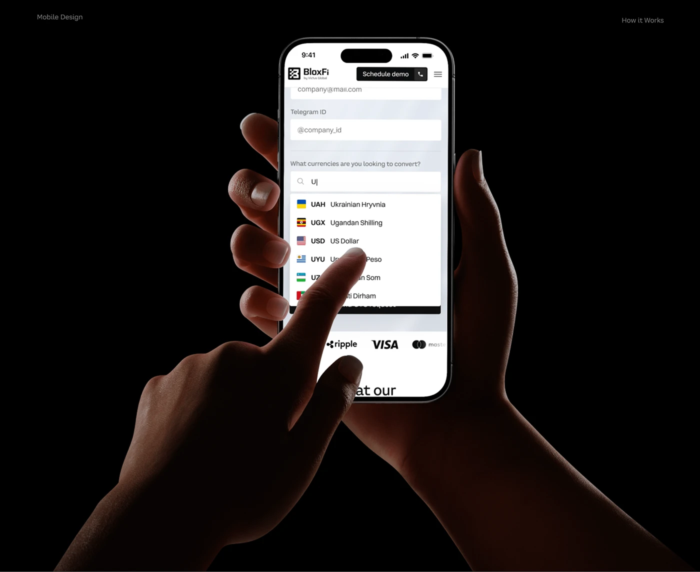 BloxFi80+ country pages from one template: how a fintech API went global
 Acvian30+ pages in 60 days: a new Webflow site for a global HR partner
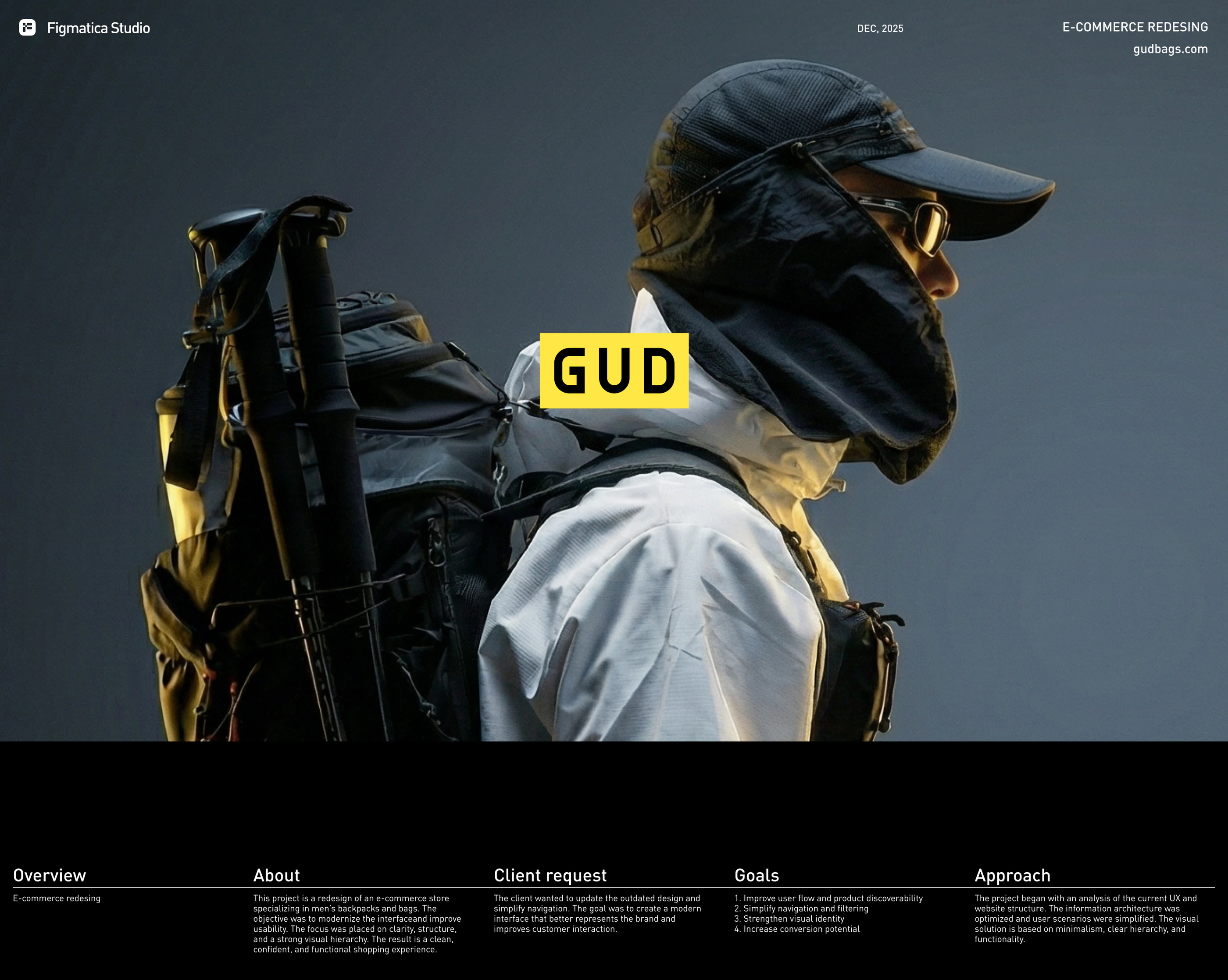 GUD5.5 weeks from research to final design: an online store redesign for a backpack brand
Want the same for your site? 30 minutes, free.
Book a free call ↗