Contents
- The short version
- What TOF, MOF and BOF mean in e-commerce
- Wow, solution, or both: how the product changes the funnel
- One product, a niche, or a brand: three kinds of store
- AG1's funnel, from the feed to the checkout
- Oura: one ring, one membership
- Skims and Quince: brand stores at the top of the funnel
- Olipop and The Farmer's Dog: solutions that come back
- E-commerce by Figmatica
- Every extra click costs conversion
- Focused and contextual vision: one store, different eyes
- Seven DTC brands side by side
- E-commerce website checklist, floor by floor
- Frequently asked questions
What each stage of an online store's funnel tracks, from CTR at the top to repeat orders and LTV at the bottom, how wow products, solutions and wow + solution change it, and how one-product stores, niche stores and brand stores use it. Shown on AG1's funnel walked to checkout, on Oura, Skims, Quince, Olipop, Liquid Death and The Farmer's Dog, and on Figmatica's own stores.
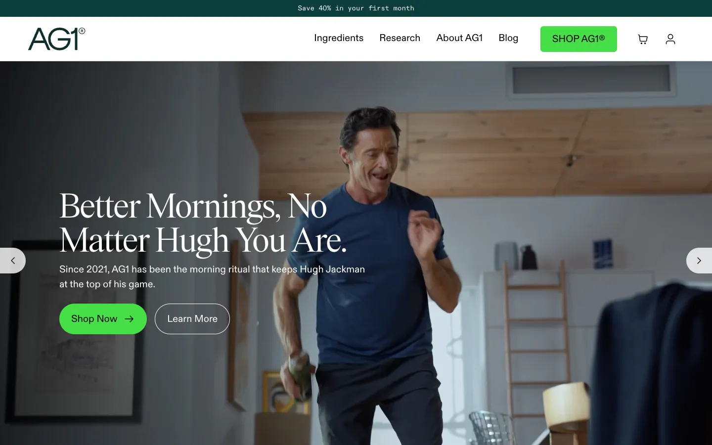
A man scrolls his feed before bed and stops on a video: Hugh Jackman, a glass of green drink, one scoop in water first thing in the morning. He taps. The page says save 40% in your first month. Two screens later he is looking at a pouch, a shaker, a canister and five travel packs, a price of €87 crossed from €107, and a line saying 93% of customers choose the subscription. He has not decided to buy anything yet. The store has already decided what he will see next.
That path has a name, the funnel, and three floors: TOF, MOF and BOF, the top, middle and bottom of the funnel. Every serious online store measures each floor with its own numbers. Below, what each floor is, what it tracks, how the type of product and the type of store change it, and how AG1, valued at $1.2B, and other DTC brands worth a billion or more build theirs. Then our own stores, and a checklist for yours.
The short version
- TOF is measured by CTR. The top of the funnel answers one question: did the promise make a stranger click.
- MOF is add to cart, checkout, purchase. The middle is where the store page does the selling, and every step has its own drop-off.
- BOF is repeat orders and LTV. The bottom decides whether the first order paid for the ad or only started to.
- The product type chooses the strong floor. Wow products win at the top, solutions win at the bottom, wow + solution can win both.
- Every extra click costs conversion. In our stores Add to cart is on every screen, even inside the photo gallery, as on GUD's product page.
- AG1 builds all three on one product. A bundle and a subscription on the product page, bumps at checkout, and a 30-day journey that keeps the subscriber past the first month.
What TOF, MOF and BOF mean in e-commerce
TOF, top of funnel, is the moment a stranger meets the product: an ad in the feed, a video, a search result, a creator's review. Here the store does not sell yet. It earns a click. The main number is CTR, click-through rate: clicks divided by impressions. Next to it sit the cost of those impressions and clicks, CPM and CPC, and the number of sessions that actually reach the site.
MOF, middle of funnel, is the store itself: the landing page, the product page, the cart and the checkout. It is tracked as a chain of rates. Add to cart: carts over sessions. Checkout started: checkouts over carts. Purchase: orders over checkouts, and conversion rate, orders over sessions. Beside them, AOV, the average order value, which bundles and upsells push up.
BOF, bottom of funnel, begins after the first order. Repeat purchase rate: the share of customers who order again. For subscriptions, retention and churn by month. And LTV, lifetime value: how much a customer brings over the whole relationship. LTV set against CAC, the cost of acquiring that customer, tells whether the whole funnel makes money.
| Stage | Question | What is tracked | Where it lives on the site |
|---|---|---|---|
| TOF | Did the promise earn a click? | CTR, CPM, CPC, sessions | Ads, the first screen of the landing page |
| MOF | Did the page turn a visit into an order? | Add to cart, checkout started, purchase, conversion rate, AOV | Product page, offer, cart, checkout |
| BOF | Did the first order become a relationship? | Repeat orders, retention, churn, LTV, LTV:CAC | Subscription, account, email and SMS, referrals |
Wow, solution, or both: how the product changes the funnel
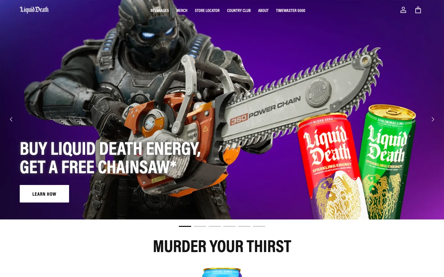
A wow product sells on the first look. It stops the thumb in the feed, so it wins at the top: high CTR, cheap clicks. The risk sits at the bottom: the second purchase needs a reason beyond surprise. Liquid Death is the clearest wow in the category: water in a tallboy can, flavours called Mango Chainsaw and Severed Lime, a first screen that offers a free chainsaw with the energy drink. A valuation of $1.4B says the brand keeps giving that reason.
A solution product sells on a problem the buyer already has: energy, digestion, a dog's diet, a cheaper cashmere sweater. The top of the funnel is harder, because a problem is less clickable than a spectacle. The middle needs proof: ingredients, research, reviews, a guarantee. The reward is at the bottom: a problem that returns every morning makes a subscription natural, and LTV grows with it. AG1 and The Farmer's Dog are solutions.
Wow + solution is the rare product that does both. Oura is a ring that looks like jewellery and tracks 50+ health metrics; the first property wins the click, the second keeps the membership. Skims calls itself a solutions-oriented brand and sells shapewear people post about. These products can win every floor, which is why they carry some of the largest valuations: Oura $11B, Skims $5B.
One product, a niche, or a brand: three kinds of store
A one-product store sells one hero and builds everything else around it: bundles, subscriptions, accessories, add-ons. The whole site pushes toward one button, so the middle of the funnel is short and AOV comes from upsells. AG1 sells one powder; Oura sells one ring, $399, and a membership at $5.99 a month on top of it.
A niche store serves one audience deeply: dog owners, cyclists, climbers, new parents. It wins on relevance, since every page speaks to the same person, and on the bottom of the funnel, since that person keeps coming back. The Farmer's Dog, a subscription for fresh dog food with plans built around each dog's breed, age and weight, passed $1B in annualised revenue and was valued at $1.46B in its last disclosed round.
A brand store sells a world rather than an item: many products held together by a name, a style and a promise. Its funnel starts at the top with content and community, and it earns repeat orders through new drops. Skims opens with a campaign photo and a new collection; Quince, valued at $10.1B, promises high-quality essentials at radical prices and puts $50 cashmere in the menu.
| Store type | Strong floor | How AOV and LTV grow | Examples |
|---|---|---|---|
| One product + upsells | MOF | Bundles, order bumps, subscription or membership | AG1, Oura |
| Niche store | BOF | Personalised plans, refills, one audience coming back | The Farmer's Dog |
| Brand store | TOF | New drops, collections, community | Skims, Quince, Liquid Death |
AG1's funnel, from the feed to the checkout
AG1 is a one-product store for a solution product, and it treats the top of the funnel as a job for faces. The first screen is a campaign with Hugh Jackman; further down, quotes from Lewis Hamilton, athletes and entrepreneurs, each with a name and a title. The benefits are six short blocks: energy, immunity, digestion, stress, performance, skin. And the offer sits in the top bar of every page: save 40% in your first month. Whatever ad brought the visitor, the same promise meets them on arrival, so the click and the page agree.
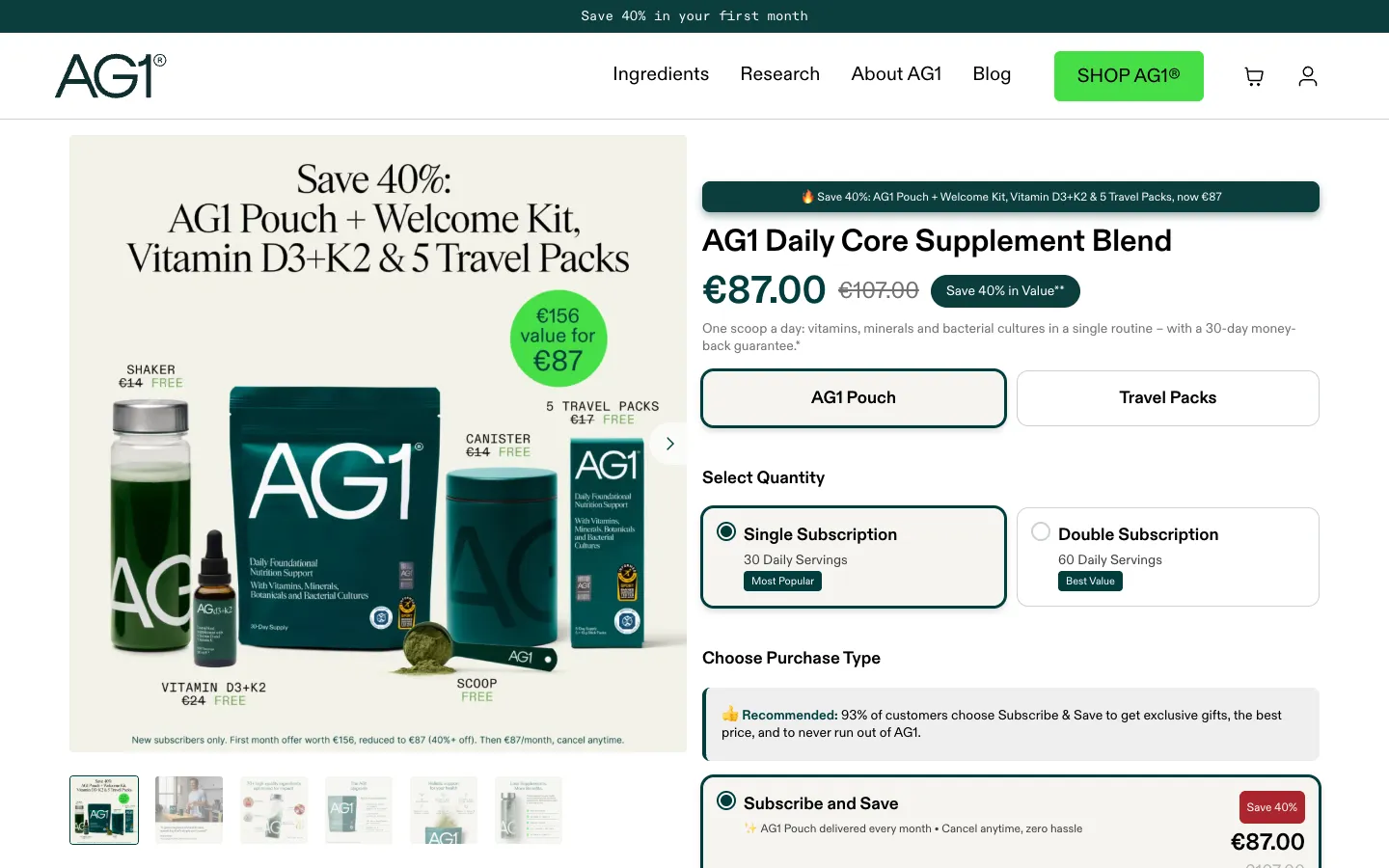
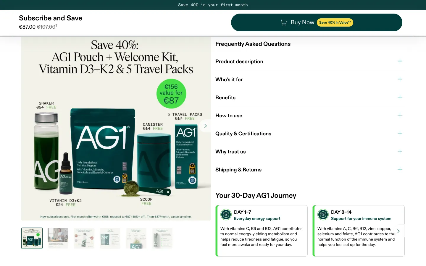
The middle of the funnel is one product page doing three jobs. The offer is a bundle, not a pouch: AG1 plus a welcome kit, Vitamin D3+K2 and five travel packs, €87 instead of €107, and the photo shows every piece with its value. The choice is reduced to two: single subscription, 30 servings, marked most popular; double, 60 servings, marked best value. The purchase type is pre-selected on Subscribe and Save, with a line of social proof above it: 93% of customers choose it. One-time purchase is there, at €107, right below.
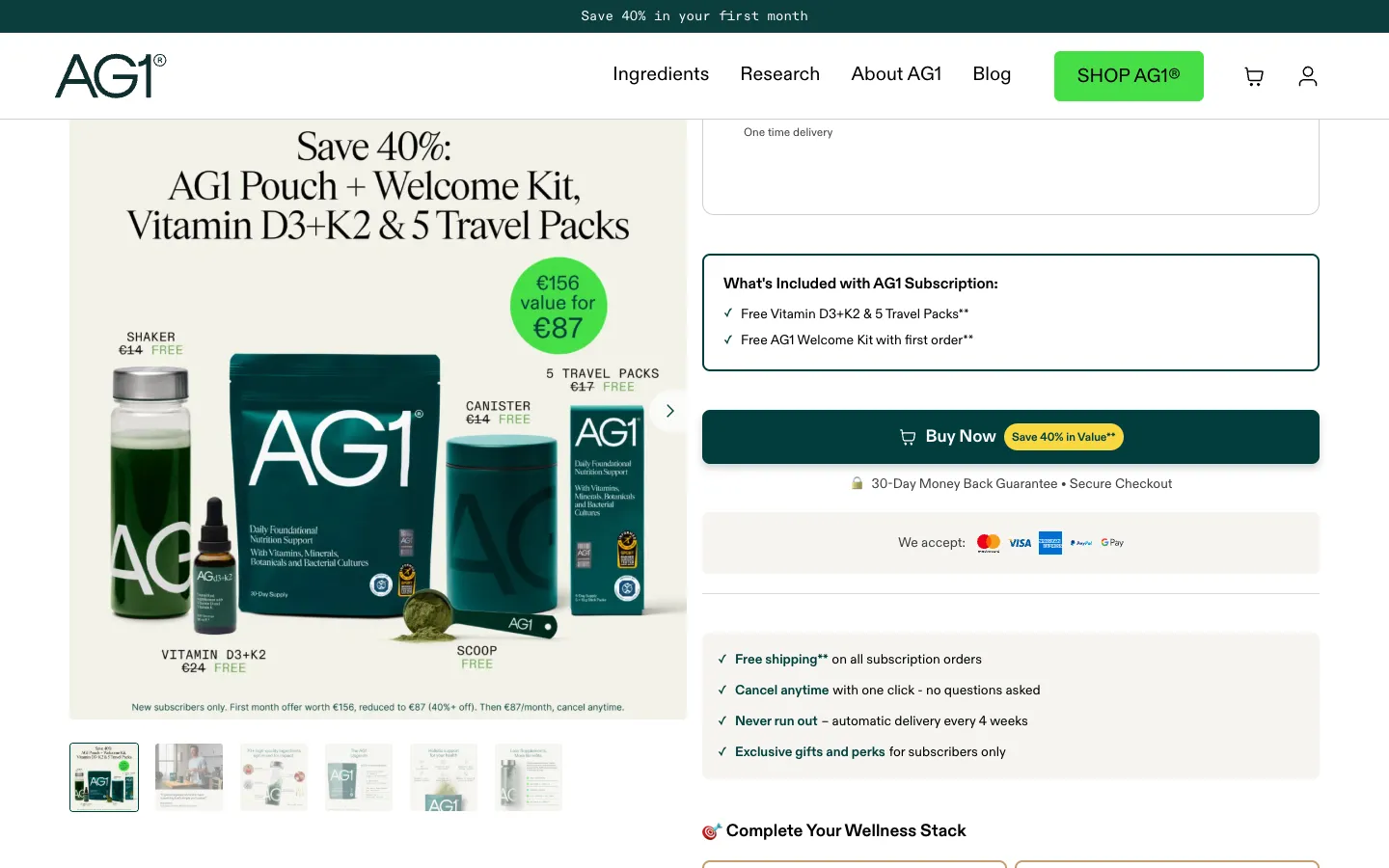
The objections are answered next to the button: a 30-day money-back guarantee, secure checkout, free shipping on subscriptions, cancel anytime with one click, delivery every four weeks.
Under the button sits the first upsell, an order bump called Complete Your Wellness Stack: Omega-3 fish oil for +€22, Vitamin D3+K2 for +€24, each one tap away. This is where AOV grows without a second decision.
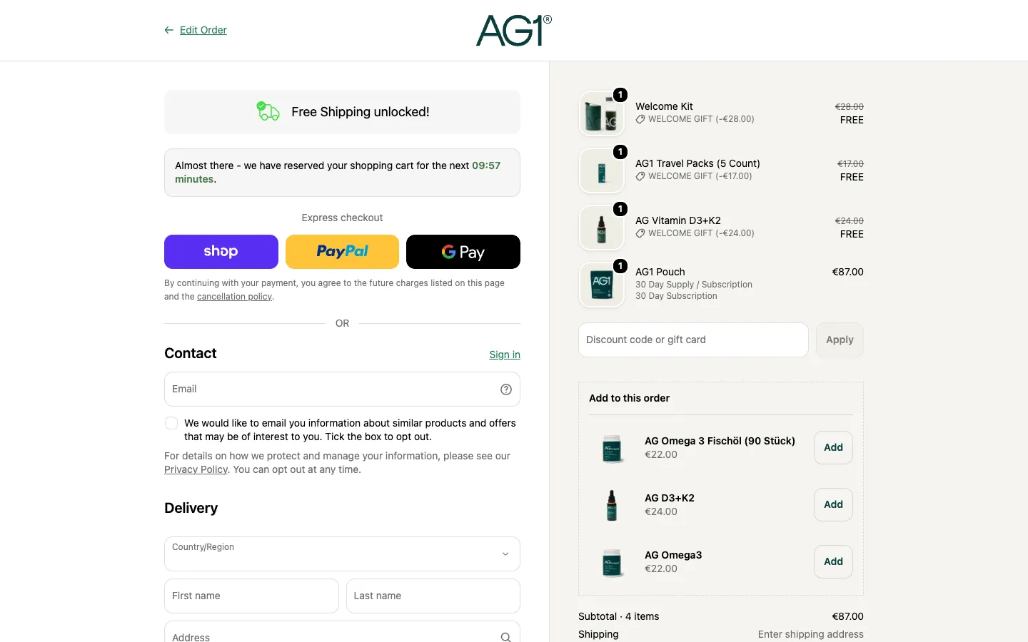
Buy Now skips the cart and opens the checkout. Three things wait there. A green line, free shipping unlocked. A timer: we have reserved your shopping cart for the next ten minutes. And in the order summary, a block called Add to this order, with more supplements and an Add button beside each. Express payment sits above the form, and the email field says it is used for the order confirmation and for cart reminders: the store already plans how to bring back a visitor who leaves here.
The bottom of the funnel starts before the first order. The product page carries a block called Your 30-Day AG1 Journey: days 1 to 7, everyday energy; days 8 to 14, immune support; days 15 to 30, digestion. A subscriber who knows when to expect a result stays long enough to feel it, and the second delivery arrives in week four, just as the journey ends. Around it, the rest of BOF: a members area, a refer-a-friend campaign, email and WhatsApp for offers.
What to take from AG1: one promise from the ad to the top bar, one bundle instead of a catalogue, the subscription pre-selected with proof above it, bumps under the button and at checkout, and a map of the first month that keeps the second order coming.
Oura: one ring, one membership
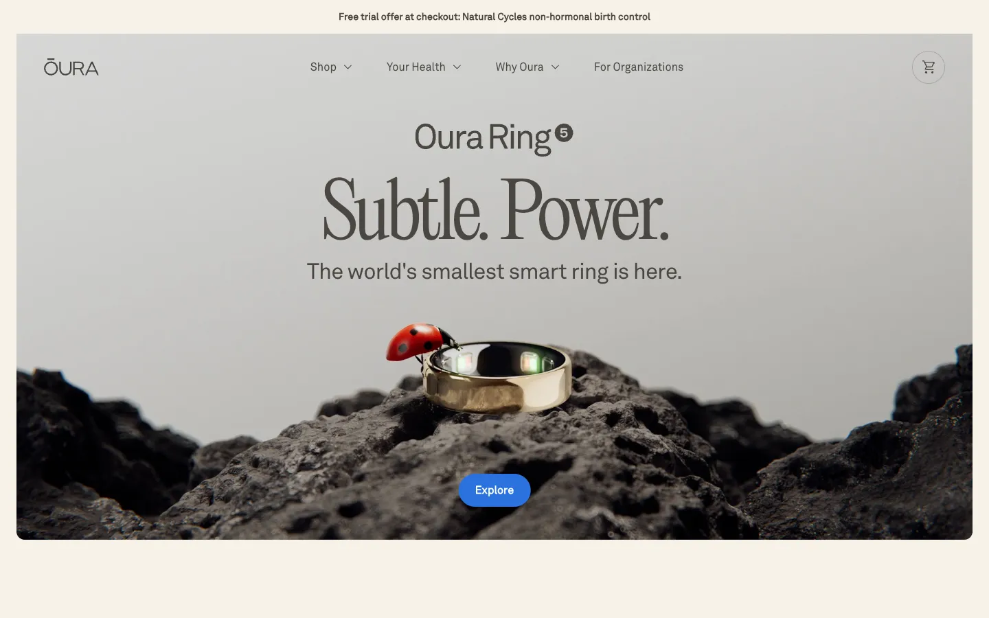
Oura, valued at $11B, sells a wow + solution product in a one-product store. The top of the funnel is pure wow: Subtle. Power. The world's smallest smart ring is here, over a silver ring on black stone with a ladybird walking across it. The solution comes one scroll later: understand your body, 50+ health metrics, 86% of members see their health improve, and stories from members with a name and a condition.
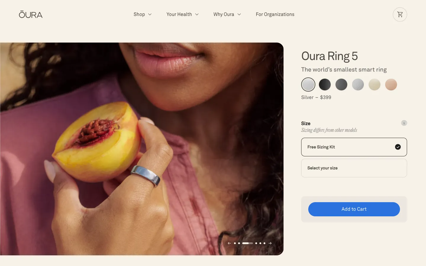
The product page removes the one friction a ring has: size. Choose the finish, then a free sizing kit before the purchase. The bottom of the funnel is built into the product: a membership at $5.99 a month, the first month free, which unlocks the insights and an AI health companion. The ring is the first order; the membership is the LTV.
Skims and Quince: brand stores at the top of the funnel
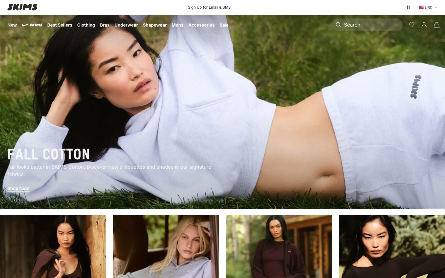
Skims, valued at $5B, runs its store like a magazine: a campaign photo, a season's name, Shop Now, then drops one after another, a new sleep line, bras everyone is switching to, a collaboration edit. The bottom of the funnel is a text message away: text SKIMS to a short number to never miss a drop, and the fine print says those messages include cart reminders. For a brand store, the next drop is the repeat order.
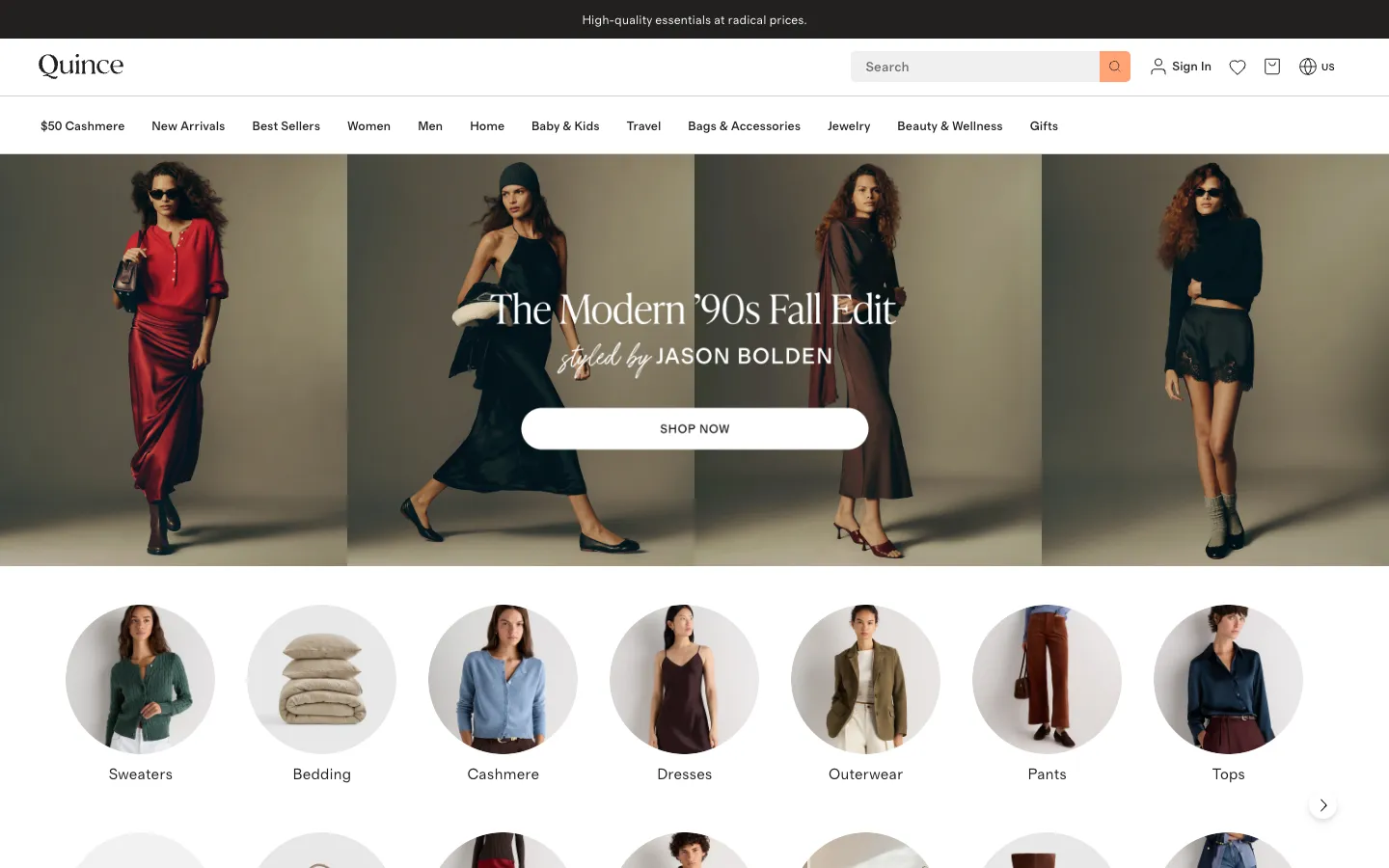
Quince, valued at $10.1B, sells a solution through a brand: luxury materials at a price that reads like a mistake. The top bar says it in five words, high-quality essentials at radical prices, and the first item in the menu is a price, $50 Cashmere. Free shipping and returns for 365 days answer the objection of buying clothes online. Every product card carries a price and a star rating, so the middle of the funnel happens on the home page.
Olipop and The Farmer's Dog: solutions that come back
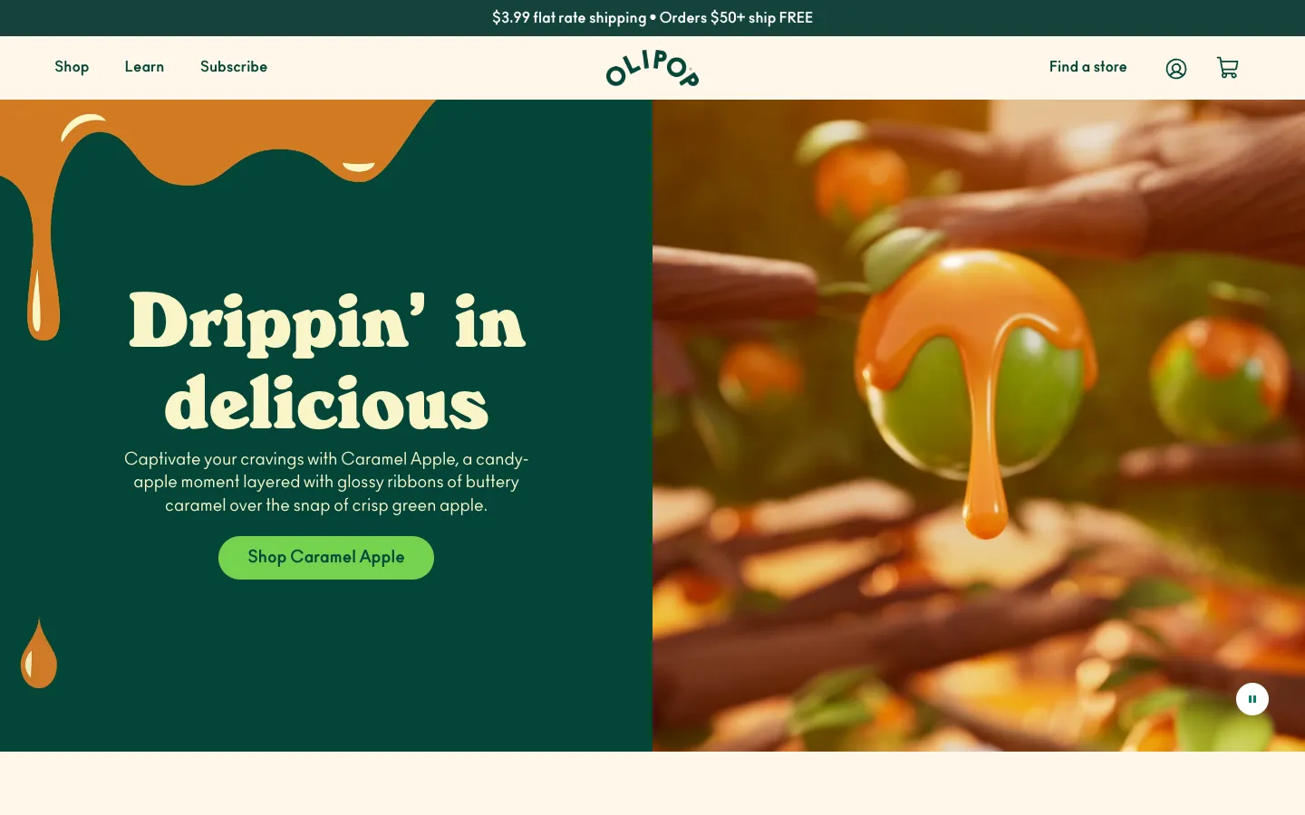
Olipop, valued at $1.85B, sells a better soda, and dresses the solution as a wow: caramel dripping over a green apple, Drippin' in delicious. The fibre that makes it a solution is on every card, 9g, next to a star rating counted in hundreds of reviews. The middle of the funnel has two levers: a 12-pack as the unit of sale, and a free shipping threshold at $50, which the cart repeats: spend $50 or subscribe to unlock free shipping. Both push AOV and the second one pushes BOF.
The Farmer's Dog is the niche store at scale: fresh dog food on a subscription, a plan built around each dog's breed, age, weight and health goals, delivered in pre-portioned refrigerated packs. It passed $1B in annualised revenue and was valued at $1.46B in its last disclosed round. For a niche store the personalisation is the funnel: the plan is built before the price is shown, and the same dog needs the same food next month.
E-commerce by Figmatica
Our own stores sit across the same map. GUD, a Ukrainian brand of backpacks and bags, is a brand store; Poelle sells leather bags; Everscape turns 2D photos into 3D glass prints, a wow product; Ministry of Desserts is a Shopify store for Kyiv dessert boutiques, with SEO feeding the top of its funnel; Smash. is a tennis brand; and for KFC Ukraine we built a promo site with depth scrolling, pure top of funnel.
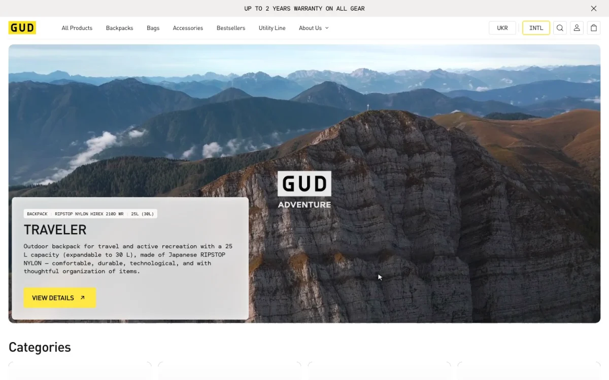 GUDUkrainian backpack and bag brand. Store redesign, three steps from the home page to the cart.
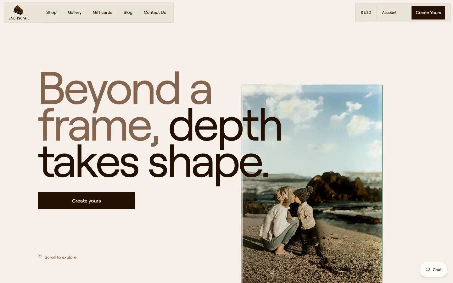 Everscape3D glass prints from 2D photos. Website for a wow product.
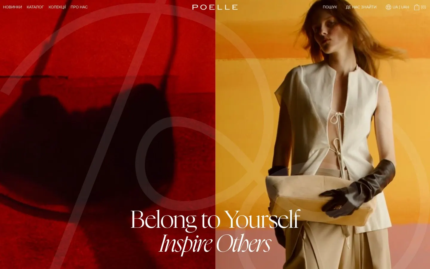 PoelleUkrainian leather bags brand. E-commerce store, built and supported by us.
 Ministry of DessertsShopify store and SEO for a Kyiv dessert boutique.
 KFC UkrainePromo site with Apple-style depth scrolling for a KFC campaign.
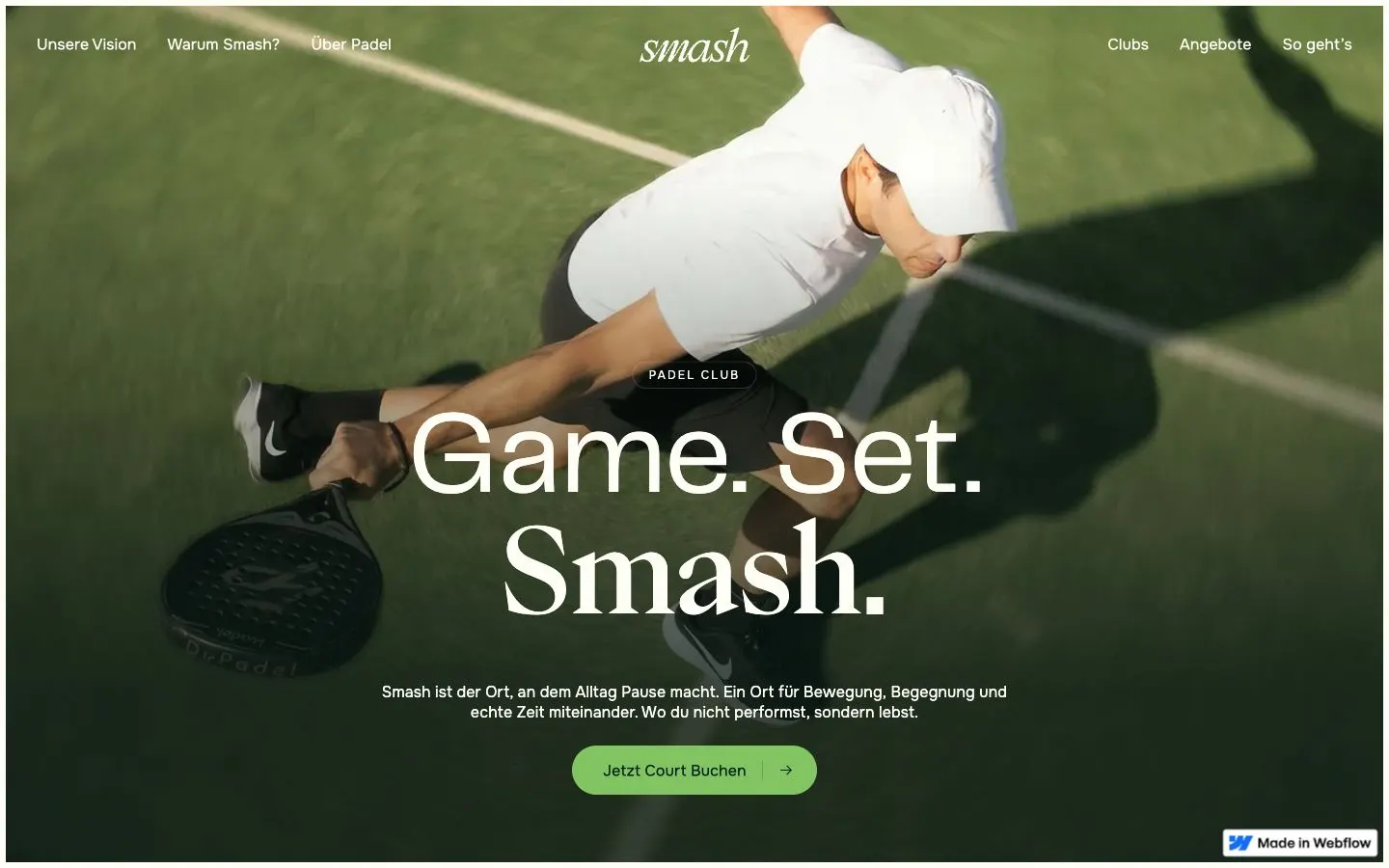 Smash.Landing page for a tennis brand.
Every extra click costs conversion
This is the rule we build every store by. A buyer who likes a product and has to go looking for the button starts to doubt: maybe later, maybe another colour, maybe another shop. So in our stores the Add to cart button is on every screen where a buyer might decide, and it never makes them leave what they are looking at. GUD, a Ukrainian brand of backpacks and bags that sells in Ukraine and abroad, shows how that works on a product page.
First, a lot of product photos. The ROAD 2.0 page opens with a grid of them: the bag from every side, the straps, the inside, the laptop compartment, the details up close. Beside the grid the right column stays in place as you scroll: name, price, colour, Add to cart. The buyer studies the bag, and the button is always a glance away.
Second, the button inside the gallery. Click any photo and it opens full screen, with thumbnails down the side, arrows, zoom, and at the bottom the name, the price and Add to cart. That is rare: most stores make you close the photo and scroll back up to buy. Here the buyer adds the bag while still looking at it, and the cart slides in with three things that go with it, a shoulder strap, a pouch and a shopper, each with its own Add to cart.
Third, the bag in real life. Further down the page, a block called In real life: photos and short videos of the bag on people, in a supermarket, on a motorbike in the mountains, in a car, at a workshop. Every card opens full screen like a story, with play, pause and sound. A buyer who has seen the bag on a shelf now sees it on a body, which answers the question a photo on a grey background cannot: how will it look on me.
And all the way down the page a sticky bar follows the buyer: ROAD 2.0 SAND, $225, Add to cart. Whatever convinced them, the photos, the materials, the laptop compartment, a video on a motorbike, the button is already there.
Around it, the rest of the store follows the same rule. The home page opens with one bag, ROAD 2.0 BLACK, its description and one button, and the bestsellers begin right under it; from the first screen the cart is three steps away. We started from a UX and structure analysis of the old store and set four goals: a shorter path to the product, simpler navigation and filters, a stronger identity, more room for conversion.
On the phone the catalogue is one long list: categories as pictures at the top, then sorting and a filter, then product cards with a price and an add-to-cart button on each, so a buyer can add a bag without opening its page. The design took 5.5 weeks: a week of research with interviews and competitors, a week of UX with personas behind every decision, a week and a half of prototypes, two weeks of UI. The full board is in the GUD case.
Focused and contextual vision: one store, different eyes
How much to show on one screen depends on who is looking. For a long time interface design leaned on the figure-and-ground idea: the brain separates the main thing from the background, so give it one clear main thing. Cultural psychology found that this works differently across cultures. In Masuda and Nisbett's experiments, Americans described the central object of a scene first, while Japanese participants described the context and the relations between things. Focused attention is more typical of users in the US, Canada and the UK; users in Japan and Taiwan show contextual attention, scanning the periphery of an interface and the links between elements before the centre.
In e-commerce you see it from the first screen. A Western store is binary: shop women, shop men, one screen, one decision, a short path held by the hand. An Eastern store opens as an overview of scenarios: by collection, by category, by price, straight to a product, so the buyer chooses the logic of the purchase first and the product second. Its product pages open every photo at once, from every angle, and put many actions side by side, down to adding a specific size in one tap. A Western designer would call that a mistake on a mistake; a Japanese buyer explained why she likes it: the more information, the more certain she feels she is doing everything right.
So a store has to know whose eyes it is built for, and a store that sells to several markets can borrow from both. GUD keeps one clear action on every screen, the Western habit, and gives the buyer many photos and videos of the product, the richness a contextual eye looks for. Mykhailo Yemchura breaks down the difference between Eastern and Western web design, on e-commerce, corporate sites and landing pages, in a video on the Figmatica channel: Eastern vs Western web design, why the difference.
Seven DTC brands side by side
| Brand | Product | Store type | Valuation | The move to take |
|---|---|---|---|---|
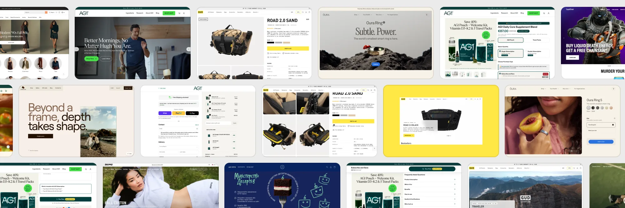
| AG1 | Solution | One product + upsells | $1.2B | Bundle, pre-selected subscription, bumps, a 30-day journey |
| Oura | Wow + solution | One product + membership | $11B | A free sizing kit, LTV in the membership |
| Skims | Wow + solution | Brand store | $5B | Drops as repeat orders, SMS with cart reminders |
| Quince | Solution | Brand store | $10.1B | A price in the menu, 365-day returns |
| Olipop | Solution dressed as wow | Brand store | $1.85B | A 12-pack, a free shipping threshold |
| Liquid Death | Wow | Brand store | $1.4B | A promo that stops the scroll, merch |
| The Farmer's Dog | Solution | Niche store | $1.46B | A personal plan before the price |
E-commerce website checklist, floor by floor
If you are writing a brief for an online store, take this list along with the references and check each floor.
- TOF: the ad and the first screen say the same thing. One offer carried from the creative to the top bar, faces or a spectacle that earn the click.
- MOF: one offer, few choices. A bundle instead of a catalogue, two quantities, the recommended option pre-selected with proof above it.
- MOF: objections next to the button. Guarantee, shipping, returns, cancellation, sizing, in one line each.
- MOF: Add to cart on every screen. Beside the photos, inside the full-screen gallery, in a sticky bar, on every card in the catalogue.
- MOF: upsells at the right moment. A bump under the button, add-ons at checkout, a free shipping threshold in the cart.
- BOF: a reason for the second order. A subscription, a membership, a refill, a new drop, a map of what the first month brings.
- BOF: a way back. Cart reminders by email and SMS, a member account, referrals.
We design and build online stores on Shopify, Webflow and Next.js: brand stores, one-product stores with upsells, niche stores. If your folder of references is already open, send it with the product and your funnel numbers, and on a call we will go through which floor loses the most and what to fix first.

Websites and products we shipped
 CheckMyRate2 months from research to launch: a Webflow site for an Australian mortgage broker
 BloxFi80+ country pages from one template: how a fintech API went global
 Acvian30+ pages in 60 days: a new Webflow site for a global HR partner
Want the same for your site? 30 minutes, free.
Book a free call ↗