Ukrainian Startup Fund. How Ukraine's state startup fund became one tap from its grants
Updated
- Year:
- 2023
- Industry:
- Non-profit & public sector
- Stage:
- Public institution
Frequently asked questions
Common questions about this topic
How do you redesign a government fund website?
Start with research and structure. For the Ukrainian Startup Fund Figmatica ran competitor analysis, rebuilt the information architecture and user flows, and tested low-fi wireframes and interactive prototypes before designing the final screens.
How can a state institution look modern online?
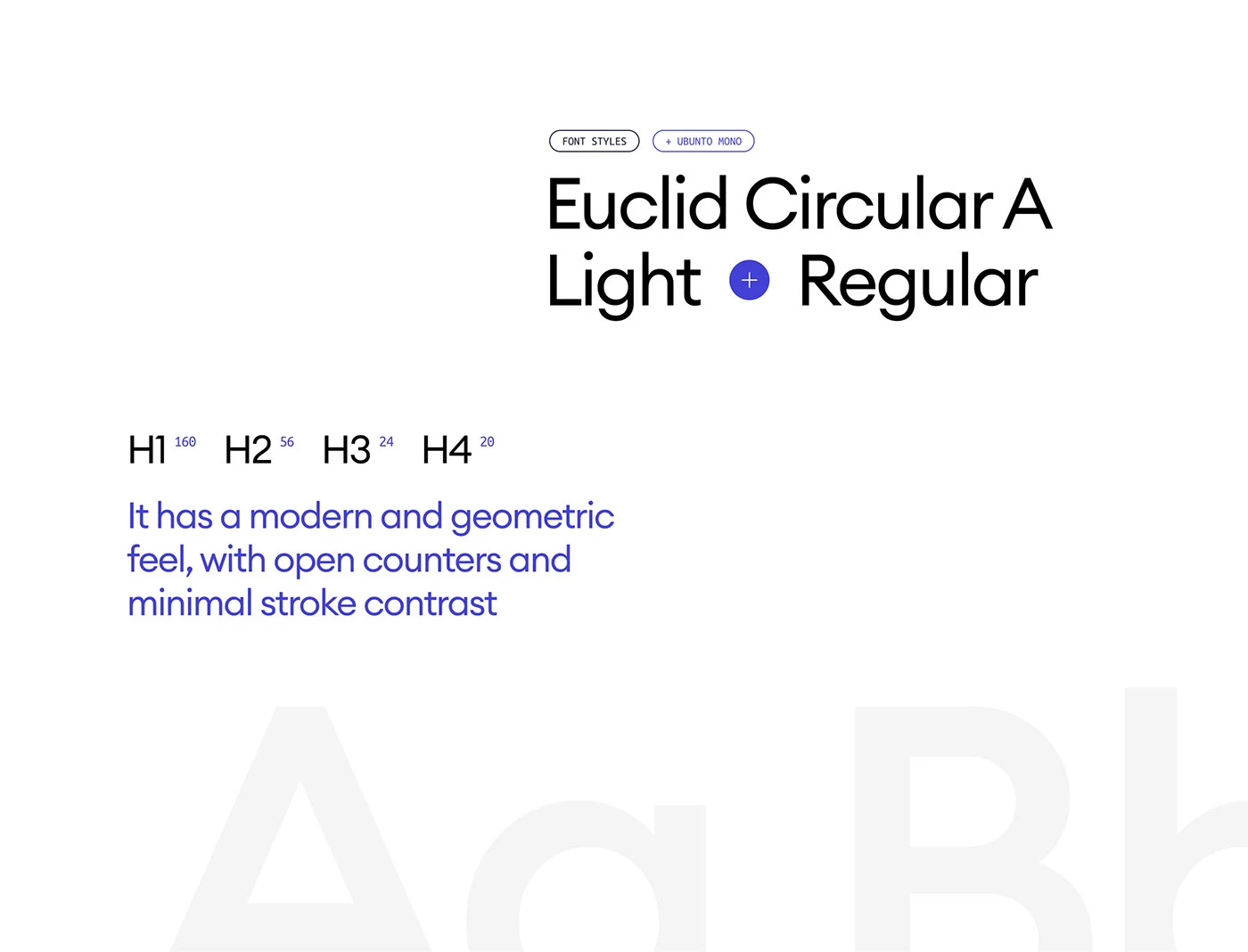

Speak the language of the audience you fund. The Ukrainian Startup Fund talks to tech founders, so we gave it the look of a tech investor: 3D spheres, one electric blue, a lime accent and a clean geometric typeface instead of official symbols.
How do you organise many funding programmes on one website?
Give every programme the same shape: a card with one idea and one action. On the Ukrainian Startup Fund site grant support, innovation vouchers, mentoring and partnership each get their own card and page, so founders compare options at a glance.
Why add animation to a public sector website?
To guide attention and make the institution feel alive. Figmatica designed the UI animation for the Ukrainian Startup Fund, from the drifting spheres on the homepage to the page mockups. We kept the motion slow because the audience is serious.
Should a fund's website be designed mobile first?
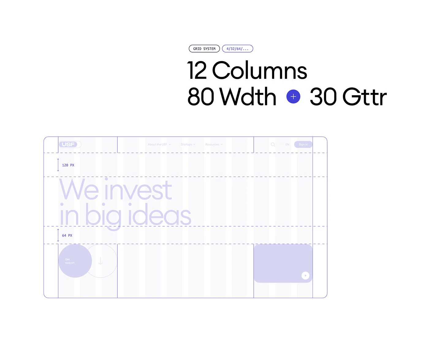
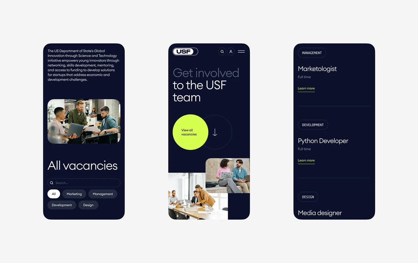
Yes, a fund's audience reads on phones as often as on laptops. For the Ukrainian Startup Fund every main page, from grant support to vacancies and experts, was designed for mobile as carefully as for desktop, on a 12-column grid that adapts cleanly.
Related work